Tuesday, October 14, 2014

Tinkov's Triple Tour Challenge: 10 Fun Facts

OK, so Oleg Tinkov has made an offer and it's got people talking. Which is probably his main aim, he's like that, never shy of a bit of entertaining nonsense or stirring the pot with ideas from outside the cycling box.

But I'm not so sure it's an offer too good to refuse.

So unless you've not kept an eye on any cycling news media channel over past week, then you'll no doubt have seen news of the challenge.

Here's the cyclingnews.com link:
Tinkov offers a €1 million to Contador and his Grand Tour rivals

In a nutshell, this is Tinkov's offer as quoted in the above article:

"If Quintana, Froome, Nibali and Contador all agree to ride all three Grand Tours, I'll get Tinkoff Bank to put up €1 million. They can have €250,000 each as an extra incentive. I think it's a good idea,"

Personally I just don't see it happening, simply because the risk to a rider's peak performance is too great and the proposed reward too little to compensate for throwing away the prize money and sponsorship attainable from a GT victory, especially a Tour de France victory. I'm just not convinced on the ROI.

Others have written about it and I don't propose at this time to add much to those discussions. For a couple of perspectives, see Inrng's comments about the practicality and marketing, and Science of Sport's take on the (not unsubstantial) physiological consideration:

inrng: Oleg Tinkov’s Indecent Proposal

The Science of Sport: Tinkov’s 3 Grand Tour challenge: Physiological, or folly?


Instead I thought I'd list some fun facts about the history of riders who have completed all three Grand Tours in the same year. Remember that the Vuelta a EspaƱa only began in 1935, compared with 1909 for the Giro d'Italia and 1903 for the Tour de France. So we about talking about 70 years of all three grand tours, however due to various wars and a calendar gap, in 12 of those years not all three grand tours were contested.

So here are 10 fun facts about riders who have completed all three grand tours in the same year:

#1
Only 32 riders have ever completed all three Grand Tours in a season (the same year).

#2
The completion of all three Grand Tours in same season has only been been done 41 times.

#3
Marino Lejarreta (ESP) did it four times between 1987 and 1991.

#4
Adam Hansen (AUS) has completed 10 consecutive Grand Tours, the most by any individual. The first of this remarkable feat being the 2011 Vuelta and since the last was the 2014 Vuelta, he can extend that record in 2015 if he completes the Giro d'Italia.

#5
Only one rider ever has won a Grand Tour and completed all three Grand Tours in one season. Gastone Nencini (ITA) won the 1957 Giro.

#6
Podiums are rare from riders who complete all three Grand Tours. Including Nencini, only five riders have ever managed that feat.

#7
Others podium finishers who also completed all three Grand Tours in the same year include:
Marzio Bruseghin (ITA) 3rd Giro 2008;
Marino Lejarreta (ITA) 3rd Vuelta 1991;
Bernardo Ruiz (ESP) 3rd Vuelta 1957;
Raphael Geminiani (FRA) 3rd Vuelta 1955

#8
No rider ever has won or placed on podium at the Tour de France and completed all three Grand Tours in the same year.

#9
The nearest to completing that feat was Carlos Sastre (ESP) with 4th place Tour de France 2006.

#10
Only two riders have completed all three Grand Tours in a season and finished top 10 in each: Geminiani in 1955 and Nencini in 1957.


Read More......

Monday, October 13, 2014

Alpe d'Huez: TDF Fastest Ascent Times 1982-2013

In this June 2013 post I outlined the average speed of the five fastest times up Alpe d'Huez each year during the Tour de France since 1982.

The data was sourced from the posts by Ammatti Pyoraily on this Finnish forum. Thanks to him we have lots of data on times to compare over many years.

At the time of writing I hadn't the data for the 2013 ascent (since TDF is in July each year), so here is an updated chart for reference:


Here are the top 5 from 2013:


The Tour visits Alpe d'Huez again in 2015.

Read More......

Sunday, October 12, 2014

Power Meter usage still on the rise at Kona

Last year in this post I put together a chart showing the trends in power meter usage at the Kona World Ironman Championships since 2009.

Lava Magazine have once again done a complete bike and equipment count for Kona 2014, and I've been looking at the power meter part of that count. The data I have is preliminary as posted by Brad Culp of Lava Magazine. I'll post the online link with the count data when available.

2014 Kona IM Bike Count

Here's an updated chart and table for the six years from 2009 to 2014. Just click on the image to see a larger version.


In brief, we can see there has been a continuation of the strong trend in use of power meters, with 45% of all bikes now fitted with a power meter.

The two long established brands, SRM and Powertap, have fallen away a little in absolute numbers as well as total share dropping, while Quarq usage has grown again and it remains the dominant power meter brand for Kona IM athletes with more than double the usage of the next most popular brand, SRM.

Most of  the growth in total power meter usage is attributed to the use of newer power meter brands, with Power2Max, Garmin Vector and Stages being prominent in increasing the overall size of the power meter pie.

Speaking of pies, here is the 2014 breakdown in pie form:


It's interesting to note how evenly split the major power meter brands are.

What will 2015 show? I guess we'll see the number of bikes with power meters out numbering those without for the first time.

Read More......

Sunday, September 28, 2014

W/m^2, Altitude and the Hour Record

More hour record stuff to follow on from the item on Jens Voigt's hour ride.

This time to look at the physics impact of increasing altitude. I'll layer on top of this the physiological impact in a future post.

tldr version, click on this chart:


In brief:
- for a given W/m^2, you'll go faster as altitude increases
- for a given speed, the W/m^2 required reduces with altitude
- for a given altitude, to go faster the W/m^2 required increases

Now the long version:

There are two major factors which determine the speed a rider can maintain on flat terrain such as a velodrome, that being their power output and the air resistance. Or put another way, these are the primary energy supply and demand factors. There are other smaller energy factors as well (mostly on the demand side) but power output and air resistance are by far the most important when it comes to riding an hour record attempt on velodromes (or any race of individual speed on flatter terrain).

Energy Supply

What power output one can sustain for an hour is a function of several underlying factors that I discuss in this post. We influence that primarily through training, and of course to a large extent it depends upon the genetic gifts we are blessed with*.

There is of course also the physiological impact of altitude, as the partial pressure of oxygen reduces with increasing altitude, and as a result, so reduces the power we are able to maximally sustain aerobically (with oxygen). How much reduction in power occurs with altitude is individually variable, and you can acclimate to some extent as well, but there is no denying that once altitude starts getting high, ability to generate power definitely falls away.

I go through some of this in this post on altitude training, and I will be returning to this and its impact on hour records in a future post.

Energy Demand

For hour records on a velodrome, air resistance accounts for more than 90% of the total energy demand factors. In the case of  indoor velodromes and speeds in the 50-56km/h range, it's of the order of 92-93% of the total energy demand, with the balance mostly being rolling resistance and other frictional energy losses, and a tiny fraction in kinetic energy changes. This dominance of air resistance in the energy demand is why there is such a solid relationship between speed and the ratio of power to aerodynamic drag.

Air resistance & CdA

Air resistance on a cyclist is a function of several factors, being:
- the bike and rider's coefficient of air drag (Cd),
- their effective frontal area (A),
- the speed they are travelling at,
- the speed and relative direction of any wind, and
- the density of the air.

The coefficient of drag (Cd) and frontal area (A) multiply together to give us a measure of a rider's air resistance property - CdA. A lower CdA means you can go faster for the same power, or less power is required to sustain the same speed.

CdA is something a rider can change through bike positional and equipment choices (e.g. using an aerodynamic tuck position reduces your CdA compared with sitting more upright, or using deep section wheels with fewer spokes lowers CdA compared with using shallow box section rims with lots of spokes).

So to ride faster on an indoor velodrome where there is no tail or head wind to aid or hinder, you'll need to either:
- increase your power output, or
- reduce your CdA, or
- reduce the density of air you are riding through.

Or of course some net combination of all three that results in more speed.

It is possible that one can produce less power but have a significant reduction in air resistance factors such that the resulting speed is higher. For example, sometimes there is trade off between the advantage gained from use of an aerodynamic position on a bike, even though there may be a sacrifice of some power output due to the impact the aggressive bike position has on a rider's bio-mechanical effectiveness.

It all boils down to W/m^2

Robert Chung some years ago published a nice chart that shows the equivalency of speed on flat terrain with the ratio of power to CdA:


What we can see in this chart is how well Power/CdA can help estimate speed on flat road terrain over a wide range of power outputs and CdA values. Of course it's not a perfect correlation, as you can attain a slightly higher speed with the same W/m^2 as the power (and CdA) increases. So even if you share the same W/m^2 as another rider, the rider that has more absolute power will still be ever so slightly faster.

Not by much though. As an example, if we compared two riders on a low rolling resistance velodrome, one with 400W and another with 10% more power (440W) and both had the same power to CdA ratio of 1700W/m^2, then the more powerful rider will only be ~0.1km/h or 0.2% faster (all else equal). Like I said, there's not much in it.

I also showed this in the chart from my previous post on the Jens Voigt hour ride, where estimating his W/m^2 with reasonable precision is much easier than his absolute power. If the power was lower, so the W/m^2 must be a little higher, but not by much. Over a 100W (25-30%) range of possible power outputs, the W/m^2 required to attain the same speed varies by only 2%.

So even if we consider a range of power outputs typical for elite riders of the calibre likely to attempt an hour record ride, the W/m^2 ratio required for a given speed on a given velodrome will be within a pretty tight range.

Air density

Air density however isn't quite as easy for an individual to control, as it is largely a function of environmental conditions, in particular:
- air temperature,
- barometric pressure, and
- altitude.

Air density drops with an increase in temperature and altitude, and with a reduction in barometric pressure. Humidity also affects air density, but only by a very small amount (humid air is marginally less dense than dry air). So while a rider cannot control the atmospheric barometric pressure, they can choose a velodrome with a temperature control system, or one that will likely be warm, as well as choose from a range of tracks that are at different altitudes.

Altitude and its impact on speed

So given all that, I thought I'd look at how the combined effect of the power and aero drag values required to ride at certain speeds varies with altitude. As is typical of me, I've summarised this in a chart shown below. As usual, click on the image to see a larger version.


It's not overly complex, but let me explain.

On the vertical axis is the ratio of power output to the coefficient of aero drag x frontal area (CdA). Power / CdA in units of watts per metres squared.

On the horizontal axis is altitude in metres.

Then I have plotted a series of slightly curves lines, one each for speed ranging in 1km/h increments from 47km/h to 56km/h, and another line for 56.375km/h, which is the speed Chris Boardman averaged for his hour record.

For the sake of comparison, I've fixed the air temperature, barometric pressure, bike + rider mass and rolling resistance to be constant values for each. I did a little variation of power, but not much, and as I have demonstrated, the impact is very small.

So if we look at any particular line, we can see how the W/m^2 required to sustain that speed reduces as altitude increases. And of course we can see that for any given W/m^2 the speed you can sustain varies with altitude.

e.g. let's take 1800W/m^2. At sea level, the 1800W/m^2 line crosses the 51km/h line. As you trace horizontally from left to right, the 1800W/m^2 crosses the speed lines roughly as follows:
51km/h @ sea level
52km/h @ ~500m altitude
53km/h @ ~1000m
54km/h @ ~1450m
55km/h @ ~1950m
56km/h @ ~2450m

So naturally there is interest in using tracks at higher altitudes in order to ride faster and set records.

Now of course different tracks have variable quality surfaces, and so the assumption of rolling resistance being equal at all tracks is not valid, so any comparison of actual tracks should also consider impact of changes to coefficient of rolling resistance (Crr). Even so, since Crr accounts for only ~ 5-6% of the total energy demand, then track smoothness, while a factor, is more important when considering tracks at similar altitudes.

But what about power output at altitude?

Well of course there is a trade off between the speed benefit of lower air density at increasing altitudes, and the reduction in a rider's power output as partial pressure of O2 falls.

Hence as altitude increases, while a rider's CdA will not change, their power output will fall and hence their W/m^2 will also fall accordingly. So the W/m^2 line for any individual won't be horizontal, but rather trend downwards from left to right.

How quickly an individual's W/m^2 line drops away with altitude then determines the real speed impact of altitude.

So, what's the optimal altitude for an hour record?

I'm going to explore that in a future post (although I'm certainly not the first to have done so). So stay tuned.


* Pithy Power Proverb: "Choose your parents wisely".

Read More......

Tuesday, September 23, 2014

Hour record: Jens Voigt

Plenty has been written about Jen's Voigt's successful attempt at the new UCI hour record, set under the recently revised rules which permits the same bike set up currently used for the individual pursuit.

I thought I'd just add a chart to illustrate what sort of power and aerodynamic drag would be required to attain the result Jens achieved. The chart below summarises these key numbers and plots the CdA v power required, and shows the ratios of power to coefficient of drag area and power to body mass.

Where on that line Jens was, I don't know exactly, but it will be somewhere along there, or nearby. Click on the chart to open a larger version so you can see the numbers.


Jens' power to CdA ratio was in the range of
1715 - 1750 W/m^2.

Let me add some detail as to how the chart is derived, the assumptions used and key sensitivities. First the numbers we know.

Distance travelled and speed
Jen's official distance for the hour was 51.115km, which is calculated by the number of whole and partial laps completed x 250m per lap. Now we know from video that Jens did not always ride a perfect line around the track, and so his wheels actually travelled further than the official distance. Riding a good line is all part of the skill of track racing, so Jens likely cost himself some official distance.

So when calculating what speed Jens was actually doing, we'd need to know his actual wheel speed or distance per lap. However since air resistance acts mostly on where the centre of mass of the bike and rider is, which on a velodrome travels a distance less than that of the wheels, then we'd also need to factor in the lean angle of the bike and rider. Now I'm not going to attempt to do that. The data does actually exist as it was recorded by the Alphamantis Track Aero System which performs such calculations on the fly, but I don't have it.

In any case, I am going to assume that the extra distance travelled by Jens' wheels was cancelled out by the lean angle meaning Jens' centre of mass travelled about the same as the officially recorded distance. It's difficult without more data to be more precise than that, but it's a reasonable assumption.

Complicating the speed equation was Jens' pacing, which was somewhat variable, starting strongly, falling into a lull and then increasing somewhat in the final 10-15 minutes of the ride. So there would have been quite some variations in the power output during the ride. Of course the event starts from a an electronic gate that holds the rider, and there is some extra effort require to get up to speed which takes 10-15 seconds, so while it's a factor, it's a pretty small one in the the overall hour.

Here is a picture posted by Xavier Disley on his twitter account, showing lap by lap speeds, and when Jens got up out of saddle briefly:


In any case, I am going to work with the overall average speed of the rider as 51.115km/h.

Environmental conditions
Based on Weather Underground link the following conditions existed at the time of the ride:

Air pressure: 1012hPa
Humidity: 60%
Outdoors there was a light wind of 2-3km/h and no precipitation.

Temperature:
A spectator at the track reported the temperature indoors was 26C. Outside it was 20C with a maximum of 23C, so the reported indoor temperature is plausible and I'll go with that.

Altitude:
430m at Grenchen, Switzerland.

All of this provides an air density value of 1.114kg/m^3.

Rider and equipment mass
Trek reported via social media Jens' body weight to be 76kg. It may have been a little more but it's not a number that is particular critical to the calculations, as this is all about power and air drag.

Bike/kit mass - I'm going to assume ~ 8kg, again the calculations are not overly sensitive to this value.

As an example of this insensitivity, changing rider's mass by 5% only introduces a 0.3% error into the W/m^2 calculations.

Rolling resistance
I'm going to assume a coefficient of rolling resistance (Crr) of 0.0025, which is about typical for a quality set of track tyres on a quality wooden indoor velodrome. I did some calculations for Crr of 0.002 and 0.003, which is quite a broad range for such tracks and tyres and it only changes the power demand by approximately  +/- 1.5%. This is because rolling resistance accounts for less than 10% of the total energy demand for the event.

Power and coefficient of drag area
OK, so given all that, what power and aerodynamic numbers would be required to do what Jens did?

Well we can't really know what power Jens averaged for the effort unless Trek release the data, but what we can say is what his power to air drag ratio was. To ride that speed, it would be in the range of 1715 to 1750 W/m^2.

That's an average, as of course Jens' actual instantaneous CdA did vary as he changed position on the bike at times. He was mostly in his aero bars but was occasionally standing up on the pedals or making other adjustments.

This chart shows the line along which Jens likely falls somewhere. If his power was lower, then his CdA must have also been lower in order to maintain power to drag ratio in the range of ~ 1715-1750 W/m^2.

The chart also then shows what his power to body mass ratio would be (assuming 76kg), so we can see the wide range of power capability possible to attain such a speeds. You don't need big power, if you are very slippery through the air.

Aero matters. A lot.

Read More......

Thursday, August 14, 2014

The Null Hypothesis

Recently a new aerodynamics cycling product came to my attention, and the company behind it makes some extraordinary claims about the speed improvement attainable. As Marcello Truzzi would say, extraordinary claims require extraordinary evidence. So let's have a look at one such claim.

The product is the Nullwinds Upper Wheel Fairings. Here's their weblink:
http://www.nullwinds.com/products-fairings.html


The idea is pretty simple, add some fairings that cover the upper part of the wheels and bingo, instant aerodynamic improvement. Well that's not so remarkable, it's pretty common to attain an aerodynamic improvement through use of fairings. It's also why such things are banned in competition for cyclists and triathletes, but that's not the issue here as Nullwinds is targeting this to non-competitive riders looking for a speed advantage.

OK, that's fine, we all could use a boost.

Just so it's clear, an aerodynamics improvement means the drag coefficient of the bike and rider is reduced so that you require less power to sustain the same speed, or for the same power you can ride faster. Nice.

So let's examine one such scenario as listed on their website as being a Strong Headwind Test:

NOVICE RIDER February 9, 2014 
1. Test Summary 
The best available data taken on February 9, 2014, indicates that the use of our Upper Wheel Fairings on a typical road bike with a novice rider under strong headwind conditions yields gains in average speed exceeding 20 percent (22.2 percent was recorded). (The full report is available for download.) Power measuring tests in severe headwinds were conducted on identical multi-speed road bikes configured with and without wheel fairings. A novice cyclist was the rider. Data was recorded using an i-bike Newton power meter. 

2. Implications The results confirm that the use of our Upper Wheel Fairings can dramatically increase headwind penetration speeds of a novice rider under strong headwind conditions. Gains exceeding 20 percent are possible.

So, Nullwinds claim a novice rider riding into a strong headwind will be able to achieve a speed gain of more than 20% by putting these fairings onto their bike.

Well to Nullwinds credit they have at least published some information in an attempt to back up their claims. They:
  • did some testing to attempt to demonstrate the effectiveness of their product (tick)
  • attempted to establish some testing controls (tick, but they were not so successful as we'll see later)
  • published data for some of those tests (tick - more detail in pdf here)
  • claimed some impressive results (hmmm, no tick)
Unfortunately, Nullwinds missed an important step before the final one, which was to examine their own data before making their extraordinary claim. So let's do that step for them.

The details of their testing protocols and measurements are outlined in the document and I won't repeat them here, just summarise: They used two identical bikes each with an ibike Newton bike computer/power meter as a data logger, one bike fitted with the Nullwinds Upper Wheel Fairings, and the other without. They asked a novice rider to ride into the wind over a designated section of pretty flat road, doing a run or runs on each of the bikes, and to keep their effort level about the same for each run.

All the bike/rider data was recorded by the ibike, charts are shown in the pdf document along with other information such as weather conditions, details about the venue and tests controls. I'll list all the important details below.

Wind: Headwind of 23mph (10.3 m/s)
An attempt was made to ride each bike in similar wind conditions, so I'm going to take their word for it. You can read details of how they managed that in the document. Whether this is the actual headwind faced by the rider is hard to know, they are relying on the ibike Newton to provide the data.

Power: 149.4W
They reported 149.4W for the rider on the non-faired bike. I'll crunch the numbers to see what reduction in CdA is required to attain the claimed speed improvement at the same power. I'll also come back to this, as the power output reported for the faired bike run was not the same as for the non-faired bike run. Power is of course being reported by an ibike Newton, so who knows how reliable the data really is, but nonetheless let's assume that's the actual power and check the numbers to see if it makes sense (turns out it does, more or less, if you believe the wind speed data).

CdA: 0.372m^2 (non-faired bike)
They report a coefficient of drag area of 0.372m^2 for the non-faired bike. I've no reason to question whether that's correct or not, it's a plausible number for a novice on a standard steel framed road bike. We are of course testing relative changes due to the fairing in any case, and we'll just have to assume the rider maintained the same or very similar position on the bike.

Crr: 0.0054
They report a coefficient of rolling resistance of 0.0054 and again I've no reason to suspect that's wildly wrong as it sounds plausible for road bike on a road. I will keep that constant (as they did).

Gradient: +0.29% (unfaired) and +0.55% (faired)
This one is tricky as they report a different average road slope for each test. +0.29% non-faired test and +0.55% for the faired bike test. While the test was conducted over the same 1.5-mile stretch of road, they chose slightly different 1-kilometre sections from each run's data to make the comparison. They did this to choose a section which provided the same average headwind speed.

Mass: 188lbs (85.3kg)
They report 188lbs. I don't know if that's bike + rider or just rider but I'll assume that's total mass, and there was no mass change between the rides. On flat terrain, the outcomes in terms of impact on speed are quite insensitive to changes in mass anyway.

Air density: 1.108kg/m^3
They report 70F (21.1C) and 1020hPa for their calculations, no humidity reported but weather report they provided shows that to be between ~30% and 50%. I'll use 40% (the air density calculation is very insensitive to changes in humidity anyway). They don't report elevation but the road used was right next to Fox Airfield in California and the airfield is reported to be at an elevation of 2351 feet (717 metres) above sea level. That gives an air density of 1.108kg/m^3.

Speed:
So with those power and other assumptions, using the model by Martin et al, you'd expect a rider on an non-faired bike to attain a speed of 3.32m/s = 11.93 km/h = 7.42 mph

They reported an average speed on the non-faired bike run of 7.2mph. So on the whole, the numbers seem to be in the right ball park.

OK, so what improvement in aerodynamics, that is, what reduction in CdA would be required, all else the same, to attain the claimed speed increase of 22.2% (i.e. from 7.42 to 9.07 mph)?

The CdA required at same power would be 0.244m^2.
That's a reduction in CdA of nearly 0.13m^2, a 34% reduction!

That's the equivalent of removing all of the air drag of the entire bike and some of the rider!

Houston, we have a problem.

Now here's the kicker: the faired bike run reported average power of 202.9W, some 53.5W (+35.8%) more than during the non-faired bike run. Nullwinds also reported the rider's heart rate was 10% higher for the faired bike run than the non-faired bike run.

It's no wonder the rider went faster on the faired bike.
They simply rode harder.

So knowing that, what did Nullwinds report the faired bike CdA to be?

0.369m^2, a drop of only 0.003m^2 or just 0.8% less than for the non-faired bike.

It's a real marketing bugger when the actual size of your "benefit" is quite a bit less than the error in measurement, and doesn't sound anywhere nearly as impressive as a 20+% gain in speed.

Sorry Nullwinds, your claims of big speed improvement attainable as a result of using your Upper Wheel Fairings are not plausible. Unless perhaps there are secret stashes of EPO hidden behind them.

Read More......

Wednesday, June 18, 2014

Positioned for Speed

Last week I had the pleasure of co-delivering the first "Positioned for Speed" Course held in Australia, which is part of Retül University's growing list of international course offerings. Many thanks to Matt and Nick at Retül and Andy and the guys at Alphamantis for the opportunity, it was a lot of fun. Looking forward to doing more of them (if they'll have me back that is!).

The two day course was aimed at bike fitters and coaches primarily, and gave attendees an introduction to the theory of aerodynamics relevant to cycling, an understanding of how the theory applies to the practical considerations of bike fitting, what elements of aerodynamics we can influence and improve, how we quantify the impact to performance, as well a chance to design and conduct an aero testing session with a test subject.

I had fun explaining the theoretical aspects, then helping the participants understand and experience exactly how to translate these into actual testing scenarios, and using the Alphamantis track aero testing technology to measure the impact they have on a rider's performance.

We tested bike position options, equipment options (helmets and wheels), body shaping options while riding, and clothing options. Over the course of the session, incremental improvements in the rider's aerodynamics were identified, all while ensuring the rider's position was still bio-mechanically effective and comfortable for the rider when considering the events they are targeting.

Thought I'd share a few examples of comparison test results along the way. I can't say much about the rider, or the exact details of each options tested, but suffice to say they are targeting road time trials and track endurance events.

Put a lid on it


Aero helmets are known to give good aerodynamic benefit but which helmet is best for any individual is quite variable. In any case, the team immediately saw the sizeable benefit of one aero lid over the rider's existing standard "mass start" helmet. These were not the only options tested but just shown as a comparison example.


Putting that into perspective, at this rider's Function Threshold Power, that's a gain of more than 0.6km/h or 1.1 seconds per kilometre on flat road terrain. Some people will gain more speed and some less from an aero helmet, and no one helmet brand or model is the best choice for every rider. Some provide more speed gains than others.

The value of a good shrug


Next example is how you can gain speed by "shrugging" (or "turtling") such that you bring your head down and narrow your shoulders while riding in the TT position, but do so without compromising your power output. Sometimes riders learn to be able to do this for extended periods of time, but it's a technique mainly for shorter road TTs and individual pursuit, not so much for the Ironman athletes out there. The gains can be well worth it if you are able to hold onto a shrug for a while.


In this rider's case, they can increase road time trial speed by nearly 0.5km/h or gain nearly 0.9 seconds per km while they shrug. For some riders there are bike position set ups and helmets that enable the rider to shrug more easily or hold it for longer. Ideally you'd like to set up the bike such that the effect is a full time enhancement, however this is not always feasible, so being on the lookout for more free speed-gaining opportunities is worth a go.

Skinsuits. Choose wisely.


The final example I thought I'd share from the testing session was some skinsuit options. Here we can see the difference between three suits tested.


The best suit is about 0.4km/h or 0.6 seconds per km faster than the team issue suit at this rider's pursuit power on a track. That gives them a 25 metre lead over the slower suit by lap 12.

Overall we identified a 0.033m^2 reduction in this rider's coefficient of drag area, which is equivalent to a 35 watt power saving, or a little over 3 seconds per km or a speed gain of 1.7 km/h.

Talk about a winning margin.

Discussing track test routine with one of the course participants.

Read More......

Saturday, May 31, 2014

Swings and Roundabouts

Today I thought I'd look at how rider's relative abilities play out in Grand Tour stage racing. I was prompted to do so after watching this year's Giro d'Italia's Stage 19 mountain individual time trial.

It's no surprise that to be competitive on general classification (GC) in a grand tour requires, amongst a variety of traits, phenomenal physiological capabilities, and each rider has their strengths and weaknesses relative to their opponents. Clearly climbing ability is a key factor in success, but also a rider's ability in individual time trials (ITT) is also an important factor for success.

Success in the ITT, is more suited to those riders with the highest sustainable power to aerodynamic drag ratio (power to CdA, W/m^2), while climbing steeper gradients a rider's sustainable power to weight ratio (W/kg) is the dominant factor for success.

Some riders are a bit larger and have more power and are relatively more aerodynamically shaped and set up, while others have better power to weight ratios. If you can nearly equal your opponents in one discipline and beat them in the other, then you're well on your way to GC success.

The balance between these two key attributes does vary from race to race as grand tours vary the total number and distance of ITTs, and the number of mountain top finishes. While total metres climbed during a grand tour is a factor for overall fatigue levels, it's the summit finishes and individual time trials that account for the majority of time gained and lost between leading contenders, and these are the critical stages for GC riders.

As an example of this game of physical swings and roundabouts, note the differences in make up of race defining stages in recent editions of the Tour de France:


We can see that the 2012 TdF was far more suited to TT ability than it was for climbing ability, but this year is more weighted towards the climbers. Of course you can't badly falter in either discipline, but 2012 was never one for a pure lightweight climber.

In this 2014 edition of the Giro d'Italia, there have been three time trials: a team time trial, an individual time trial over flat/lumpy terrain and an individual time trial (MTT) up a mountain. There are also 5 high mountain summit finishes. So while ITT performance is important, it was always going to be a rider's climbing prowess and their power to weight ratio that dominated this Giro.

What is interesting with this race though was the inclusion of the MTT, giving us a chance to directly compare riders' flatter ITT and MTT performances.

Both the individual TTs arrived fairly deep into the contest, with the ITT on stage 12 and the MTT on stage 19. I thought it interesting to plot the relative performance of the top GC riders in each of the time trials (click on the pic to see a bigger version). I chose the top 25 on GC (after Stage 19's MTT) as these are the riders more likely to be actually competing on such stages, rather than holding back somewhat to save the legs as much as possible for other duties or race ambitions.


The dots represents each of the top 25 riders on GC after Giro Stage 19. The top 10 riders are highlighted with red dots and text.

The rider's time for the Stage 12 ITT is plotted on the horizontal axis versus their time in the Stage 19 MTT on the vertical axis. e.g. we can see Uran's time in the ITT was a bit over 57:30, and in the MTT a little over 1:07.

When plotted this way we can see whether riders fared relatively better in the flatter ITT, the MTT, or if they performed relatively similarly in each. Of course the further a rider's dot appears to the bottom left indicates faster TT times overall.

The further away the rider's dot is from the diagonal line indicates a dominance of either the ITT (upper left) or the MTT (lower right). If their dot appears close to the diagonal, it indicates their relative performance for the two time trials was balanced.

Those in the upper/left side of the chart are more skewed to perform better in flatter ITTs, and hence their power to aero drag ratio is relatively better than their power to weight ratio, while those in the bottom right side of the chart performed relatively better in the MTT and so their power to weight ratio is relatively better than their power to aero drag ratio.

This Giro is clearly one for the climbers over the TT men given there is an MTT and 5 high mountain summit finishes, and only one (not totally flat) ITT and one TTT.

The balance between each of these two key attributes will play a factor in a rider's likely chances of success in any grand tour and which side of that balance is more dominant depends in large part to the make up of the critical stages. It also points out what element of performance a rider may need to look at in order to improve their overall standing relative to their opponents.

Looking at the chart, there are some riders that would do well to refine their ITT performance, something that's more possible to address with a focus on aerodynamics. Losing weight and gaining power is much harder for a top Grand Tour GC rider to (legally) achieve.

Aru, Rolland and of course Quintana will be dominant riders for the future if they are able to improve their power to aero drag ratio. Of these three, I'd say Rolland and Quintana have the most to gain from aero refinements.

Pierre Rolland
image: velonews.competitor.com
Fabio Aru
image: www.gettyimages.com
Nairo Quintana
image: www.gettyimages.com


Read More......

Thursday, February 06, 2014

Sands through the hour glass

A couple of charts for a bit of fun.

Recently we read about 102 year old Frenchman, Robert Marchand, who last week set a new best distance of 26.925 kilometres for the hour at the new velodrome in Saint-Quentin-en-Yvelines, France. It was widely reported in many journals and blogs. Here's a link to cyclingnews.com item but a quick Google search will show lots of reports. Chapeau to Robert!

Having been involved with a number of age group category hour records, I thought I'd chart all the current records, including the two outlier points of Marchand, and Chris Boardman.

Here they are in table form with details as at February 2014:


I included Chris Boardman's record in the men's list for reference, and because it was set using the then pursuit bike set up rules which are the rules that masters age category records are run under (although those rules have been modified somewhat since Boardman's phenomenal ride).

I note however that our famous centenarian used a regular (Merckx-style) bike set up, but let's not be overly concerned with that. Being upright, let alone riding is super stuff at that age!

Here are all the age group record holders plotted showing age and distance covered in the hour. Click on the pic to see a larger version.


For some added fun I drew a line linking Boardman's and Marchand's records. The slope is just a touch under 400 metres less per year of age. With the exception of the younger masters age categories up to about 40/45 years, the men's records seem to roughly follow that level of performance decline with age, perhaps with a decline closer to a metre per day of age.

There are fewer masters women's records and none past 66 years old, so it's harder to say if their rate of performance decline is comparable, so while eye-balling suggests the rate of decline is less severe than for the men, I'm not sure I'd draw too many conclusions from these data. There are so many variables, and as the ageless TV soap used to tell us... like sands through the hour glass, so are the days of our lives.

Read More......

Monday, November 04, 2013

Left Right Out of Balance

One of the more recent features to emerge with on bike power meters has been the reporting of something called "Power Balance". It's meant to provide an indicator of the split in power production between your left and right legs - an indicator of asymmetry in power output. It's a pretty simplistic indicator of what's going on with pedalling forces, and masks over much detail. It's also not all that clear whether it's of much value.

How's your power balance?
Power balance is now available via compatible ANT+ head units paired with power meters that supply power balance data (e.g. some Quarqs, Power2Max, Garmin Vector, Rotor). Other power meters can also provide such data via their own proprietary data recording systems (e.g. SRM, Polar/Look, MEP, Axis Cranks), and of course some indoor trainers have provided similar data for many years (e.g. Computrainer and Wattbike).

So if your Power Balance is reporting as 46%-54%, then it's reasonable to assume that means 46% of the total power output is coming from your left leg and 54% from your right leg. Except that maybe it's not.

So then, what is it really measuring?
Is it important/useful?
And is the L-R power balance data accurate?

What is Power Balance actually measuring?


You see, while some of the more popular ANT+ power meters are each reporting a power balance number, there isn't a standard as to what power balance actually means, and these meters are not reporting the same thing.

There are two main types of power balance data reported (there's actually more but I'm going to leave those others out for now), and which of these a power meter reports depends on where and how the forces are measured. I've decided to give each a name, it's possible others have already done the same and used a different name and quite possibly there are better ways to distinguish between each type. It's also possible I'm wrong with some details, and I'll be (happily) corrected if that's the case.

The issue comes about primarily because different power meters measure the forces at different points along the drivetrain, somewhere along the transmission from the pedals to the rear tyre. The dividing line is whether the measurement is done upstream or downstream of the spindle or bottom bracket connecting the left and ride side crank arms. Upstream means measurement of the forces applied to each crank arm, or to each pedal (or even cleats or shoes), and downstream means measurement of the forces applied to the crank spider, or chainrings, chain, rear cogs, rear hub, wheel or tyre.

You see, the downstream measurement locations cannot distinguish from which crank arm the force is being applied, whereas measurement done upstream on each crank arm or at each pedal can make that distinction (but they must measure both sides independently to do that). Downstream measurement of power balance is therefore split based on a crank's rotational location whereas upstream measurement of power balance is based on which side of the bike the forces have been applied.

1. Downstream power balance
This version of power balance is calculated from the power applied during the time when one or the other crankarm is forward of the bottom bracket, irrespective of which leg or crank arm is applying the forces. In other words, the left side power balance is the net contribution to power from both legs while the left hand side crank arm is forward of the bottom bracket, expressed as a percentage of the total power. Right side power balance of course must then be the same for when the right crank arm is forward of the bottom bracket.

This is the power balance values the Quarq and Power2Max reports, and also what the Computrainer, Wattbike and SRM systems report via their own data systems.

2. Upstream power balance
This version of power balance is calculated from the power applied to either crank arm for the entire pedal stroke. This version of left side power balance is then the net power applied by the left leg only to the left crank arm for the entire pedal stroke. And of course the same applies to the right side.

This is what Garmin Vector, MEP, Axis Cranks etc report.

1. and 2. are not therefore, measuring the same thing, and nor is one necessarily better than the other in its current simplistic guise.

As an excellent demonstration of the differences, Ray on his DC Rainmaker blog did a test showing the live power balance numbers reported from a Quarq (a downstream device) and the Garmin Vectors (an upstream device). Here's a link to the youtube video:

http://www.youtube.com/watch?v=k0i_jV9ygLI

It's quite obvious how much difference exists between these two versions of power balance. That also assumes of course that each was accurately reporting their version of left and right side data. I'll get to that later.

There is a little more to understand with these data, for instance because the cranks are a connected system, then what happens on one side is affected by what's going on with the other. So while we may see net torque and power reported from each each side (be it the upstream of downstream version of power balance), it is still masking what's actually going on. As yet, data streams with sufficient frequency are not available via ANT+ since it's constrained by transmission of data packets at 4Hz. To do that requires alternative means, which is what SRM's torque analysis, Wattbike and some other solutions provide.

Is power balance data important/useful?


In short, we really don't know. I think there will be times when such data may prove to be somewhat helpful, perhaps in assessing things like bike fits, but one needs to be careful with any assumption that achieving symmetry is the objective. It's not. Better performance is the objective.

And then we also need to learn how to interpret the difference between upstream and downstream power balance data.

So let me start by stating something already very well established in scientific study of pedalling.

Asymmetry in power production is normal and everyone will have a different L-R power balance. It's also well established that asymmetry is also variable and will vary with:
  • power output, absolute and/or relative
  • cadence (or torque)
  • fatigue
  • and likely a few other factors such as bicycle position, seated v standing and so on
Here are just a handful of links (updated October 2014) to study abstracts to emphasise this point about asymmetry being both normal and variable:

Asymmetry in bicycle ergometer pedalling
The influence of pedaling rate on bilateral asymmetry in cycling
Bilateral pedaling asymmetry during a simulated 40-km cycling time-trial
On the bilateral asymmetry during running and cycling - a review considering leg preference
Assessment of bilateral asymmetry in cycling using a commercial instrumented crank system and instrumented pedals
Age-Related Differences in Bilateral Asymmetry in Cycling Performance
Analysis of the pedaling biomechanics of master’s cyclists: A preliminary study
Interlimb asymmetry in persons with and without an anterior cruciate ligament deficiency during stationary cycling
External work bilateral symmetry during incremental cycling exercise

There are others that go back to the 1970s but quick link abstracts are not available. This is not a scientific review, but you get the idea.

So, for instance, it's pretty common to see a different power balance at different power outputs as well as at the same power output but at different times during a ride.

So now that you have a power balance number and a trace of how that balance varies during your rides, what now? I mean we all have such asymmetries, some of us more than others, and yet it doesn't always appear to be a significant impediment to performance improvement, certainly not in my own case of a sizeable acquired pedalling asymmetry as shown in this item, but perhaps I'm the exception and not the rule.

Some asymmetries we might be able to address, and some we might not. Of those that we can, should we be concerned with them? Like I said, I'll leave that question open for others to address but it is my view that we should really only be concerned with those that will demonstrably lead to an improvement in performance, and I'd consider a reduction in potenital for injuries as an improvement (not that I am in any way implying there's an established causal link between power asymmetry and injury).

So far we really have no strong evidence either way to know whether this infomation provides us with any actionable intelligence. And so we progress instead with anecdote, personal experience and experimentation, belief, and all the biases and lack of controls that go with it. Anecdata if you will. Over time I'm sure better information will arise as more research is conducted into pedalling biomechanics.

For now, I'd put power balance data into the category of a curiosity, of limited practical value until some better research is conducted into its use and validity.

Accuracy


Another factor to consider is accuracy of the left-right power data. Don't just assume your shiny new Vectors are accurately reporting power balance or that your Computrainer spin scan data is correct either.

As yet, there really hasn't been much in the way of an assessment of the accuracy of left - right power data, nor for that matter any investigation of the accuracy of many power meter devices in the scientific literature for quite a long time. Please direct me to any if I've missed them.

Downstream power balance data
I would say that the downstream power balance data from a Quarq, Power2Max etc is quite likely to be about as accurate as the total power reported. This is because the same set of strain gauges are used to measure and parse the forces, and all that's required is a means to establish the crank's postion each revolution. Even so, this could use verification, and something as simple as checking the variance in left and right side static torque measurements can provide some decent clues.

Nevertheless, we also know that some ANT+ head units and meters often suffer this tendency to falsely repeat 2-3 seconds of power values when you stop pedalling, and these ghost power readings can readily result in quite sizeable discrepencies in overall power accuracy. Are such false power readings also affecting power balance calculations? If you tend to stop pedalling on one side more than the other, it may well be that such power ghost data is mostly attributed to that one side. I really don't know.

Upstream Power Balance data
The left-right upstream power balance data from a Garmin Vector could well be brilliant or it could conceivably be out by some margin. The other day I saw someone post on Facebook some ride data from their new Vectors. Nearly three hours of solid riding with a 61%-39% L-R power balance, and they were inclined to actually believe it. Knowing the rider, I know his asymmetry is not even close that level.

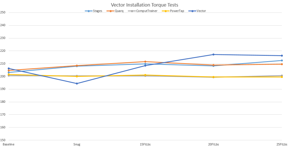
We already know from DC Rainmaker's blog review the accuracy of the Garmin Vector is affected by how tightly the pedals have been installed. This is summarised in this chart showing how the Vectors Ray was testing reported power relative to other power meters when they were installed into the cranks with different tightness:

Vector's accuracy as a function of how tightly the pedals are installed into the crank arms.
Chart from DC Rainmaker's blog

Given the total variance in reported power for both pedals can be of the order of around 10% depending on how tightly the pedals were installed, then I can readily imagine a large bias error in reported pedal balance would be very easy to create if each pedal is tightened differently.

Indeed it's quite possible a bias error already exists even if both pedals are installed to specification, simply because you have two separate measurement devices, each with its own error range.


So, even if you consider power balance data is of value, you'll need a means to verify its accuracy, as well as understand the difference between upstream and downstream power balance, lest you make poor decisions about a training or positional intervention.


Never fear, you could always wear a power balance bracelet and solve all your problems.


For those that are not aware, it's a forum custom that pink font indicates sarcasm.

Read More......

Monday, October 21, 2013

Crash test dummies

Following my Aero Testing for Dummies post the other day, I've been getting questions about aero testing services and when people can start getting tested, as well as general interest in progress with the project. I won't go into business plan detail but will post casual updates here every so often, and eventually when it's ready for full professional service delivery, I'll update our website (this is a primarily a personal blog, not a commercial one).

This is a sample of the comments:

Sounds like a terrific service. Good for you Alex, am sure it will be a big hit. Be cool to incorporate with a 'dynamic bike fit' service too - make a change to bar drop/saddle height etc, do a lap while you test comfort and aerodynamics. 
It's right up my alley - am trying to think of an excuse to get back to Sydney now.

This technology and service is a perfect complement for bike fit services.

I have no personal desire to do professional bike fitting, I'd rather provide aero test consulting services to professional fitters and/or work in tandem with them. Indeed I'd prefer a bike fitter be involved, so they can learn about the impact of their fitting and equipment decisions on the rider's aerodynamics, power and speed, and make the adjustments with the benefit of my analysis, feedback and advice. I'm sure over time they will get better for seeing such information, as will I.

I can't say much about what's in the pipeline but I expect the system may well ultimately integrate with professional fitting tools so that rider/bike fit and aero data can be managed for ongoing reference and development.

And similar to bike fitting, much of the quality comes with the knowledge and professionalism of those providing the service. The tools are an enabler and/or help with efficiency. The difference with this tool is the results are immediately apparent, objectively measured and precisely quantifiable.

Next up for me is what I've called Phase II - Demonstration testing

This is where I'll do some properly controlled testing over next month or so, but the emphasis will be on nailing the process, getting good aero results and giving people the opportunity to see it in action, and not so much on commercial considerations beyond refining operational processes for efficient use of testing time.

I already have some crash test dummies lined up.

Once I am satisfied with that I'll move to full professional service delivery, and provide some clearer guidance on services and pricing.

I'm hoping to get to Melbourne at some time before long and there's reasonable a chance I might be heading to Tour of Bright to work at the race and perhaps I could do something at the Wangaratta track around that time if anyone is about and logistics can be arranged - but that's just a thought bubble for now.


Read More......

Saturday, October 19, 2013

Aero Testing for Dummies

Just lately I've been having some fun with the Alphamantis aerodynamics testing system here in Australia.

In a nutshell, this system enables me to precisely assess changes in a rider's aerodynamics in real time while they are riding their bike.

The rider does not need to do anything special other than ride their bike around a suitable track. Any regular oval-like cycling track or velodrome will do, although an indoor velodrome is preferred as environmental conditions are far more predictable indoors and of course you won’t get rained out.

All that's needed is an ANT+ power meter and speed sensor on the bike, and a clear track to ride around, one where the rider can maintain position and does not need to brake.

Do a handful of laps, and we have your CdA baseline number. Then make a change to your bike position or change a piece of equipment (e.g. helmet or wheel), do a few more laps and we can tell immediately if you are getting an improvement, and by how much. Lather, rinse, repeat.

Test while riding, know if the position is rideable, how it feels at race pace, as well as whether or not it is faster for the power you have, and by how much.

Simple.

Here's a 7-minute long video showing a sample of it in action, with me explaining in voice over.


That's just a sample of the data capture, there are lots of other things but that's the essence of it.

I've been in a systems testing phase these past couple of weeks, and have successfully tested the system with two riders using different power meters (one an SRM, the other a Powertap) at the Dunc Gray Velodrome. Apart from Rod, who's data was featured in the video, the other rider was my mate Tony. It was only a systems test, not a properly controlled aero test, nevertheless we were able to quickly discern for Tony a difference between two good aero helmets.

The next phase will be to demonstrate for those interested in seeing it in action, in particular those with a professional interest in aerodynamic related cycling performance improvement such as bike fitters, coaches, squad development people, and organisations that have tracks. Australia has over 90 velodromes/tracks to choose from!

The system is portable, meaning I can set it up anywhere with a suitable track, so if there is sufficient interest and access to a clear track, I can travel. All I need is access to a regular 240V power outlet and maybe a table and chair for convenience.

How it works:

Power and speed information from your bike's ANT+ device is transmitted wirelessly to special software on my laptop which, along with various parameters (e.g. rider morphological data, track geometry data, rolling resistance and environmental data) and track timing tape data, calculates and plots charts of power output, speed, CdA, exact track position and so on. It does all this in real time.

There are lots of calculations going on underneath (viewable if desired) such as centre of mass speed, lean angles, precise lap distance actually ridden and so on. And more work is being done to further refine the already sophisticated physics modelling, e.g. modelling the intra lap variation in rolling resistance/tyre scrub, as well as integration with individual track timing data systems for even more frequent precise positional data.

The system also works with the Alphamantis "aerostick" device that can additionally capture the relative wind speed and yaw angles, enabling the software to parse out the effects of any wind during testing.

All the data is also captured for reporting, additional analysis, as well as replaying the data to the rider afterwards if desired.

It is, very, very cool.

Read More......

Monday, October 14, 2013

Power meter usage on the rise at Kona

The Kona World Ironman Championships is over for another year. As part of event registration, the organisers do a count of equipment choices, and this includes power meter brand if fitted to a competitor's bike.

So just for fun, I thought I'd look at the prevalence of power meter usage by Kona competitors for the last five years, including this year. I managed, with a little help from the wattage forum and Google, to locate the data and compiled them into table and chart form. Click on the images to see a larger version.


So while competitor numbers at Kona increased by 36% over the five years 2009-2013, the number of power meters installed on competitor's bikes over that same period increased by 174%!

We can see three major power meter brands: SRM, Powertap and Quarq, have dominated the Kona power meter landscape to date, with Quarq in particular showing strong growth over this period.

Power2Max have begun to make inroads in recent years, and we can also see the emergence in 2013 of newer power meter offerings from Rotor, Stages and Garmin. The old Polar power meter is a distant memory, and ergomo usage never really got going, although a few souls were still using them up to 2012.

It appears the overall solid increase in usage of power meters by those competing at Kona has largely been satisfied by uptake of newer power meter brands. It would be risky to assume this translates directly into general market trends for power meter usage but it certainly provides a good snapshot of the trends for Ironman athletes.

The data on total bike numbers and power meter counts were obtained from these website links by Lava Magazine (2010-2013) and Triathlete Magazine (2009):

2013 Kona IM Bike Count
2012 Kona IM Bike Count
2011 Kona IM Bike Count
2010 Kona IM Bike Count
2009 Kona IM Bike Count

Links were active and  available at time of writing this post.

Read More......

Monday, August 26, 2013

Resistance is futile, even for MTB

In February I posted an item, The sum of the parts, which discussed the energy demands of cycling, and explored the age old "wheel weight versus wheel aerodynamics" debate, and gave some examples of wheel choice by way of modelling the weight vs aero performance trade offs using a forward integration model to consider dynamic acceleration scenarios.

I'm going to return to dynamic modelling one day to explore more realistic acceleration power outputs than the constant power examples used, but not today. Modelling a dynamically changing scenario is a bit trickier than steady state (constant velocity) scenario, and it's the latter I'm posting about today, more for the record than anything else in particular. Hey, I was asked, so here goes.

Relative energy demand for steady state road cycling


In the introduction to that item was the chart below, which shows the relative energy demand for steady state cycling for each of the main resistance forces, for gradients ranging from flat (0%) to steep (10%). The idea being to show how the relative importantance of each resistance force varies with zero or positive gradients. The assumptions used are listed in the table on the chart. Click on the chart to see a larger version.


I didn't include negative gradients (descending), as the charting starts gets a little funky - since gravity in that scenario is aiding our forward motion, rather than resisting it. Suffice to say that air resistance is still dominant when going downhill. Besides we tend not to put out nearly as much power going downhills, and brakes also come into play depending on the terrain.

So back to non-negative gradient chit chat.

We can see how air resistance is the dominant resistance force on flatter terrain and hence why aerodynamics matters a lot on flatter and shallower gradients, gradually giving way to gravity which dominates as the climb becomes steeper and our speed slows. This is why weight is an important performance factor on the slopes but much less so on flat ground.

The assumptions used to generate the chart were for a road cyclist in a fairly aerodynamic road bike position, although one would expect them to ride in a less aerodynamic position as the slope steepens. These minor assumption variations don't really change the overall chart trend much.

How about for MTB?


If we change the input assumptions (e.g. CdA, rider mass) all that will happen is the overall trends will shift a bit to the left or right, so having those assumptions precisely right isn't really the point of the chart, it's more about how the components of proportional energy demand vary by gradient.

As an example of modifying those assumptions, a while back for Mountain Bike Magazine, to assist with an article discussing the relative merits of 26" and 19" wheels (see those wheel arguments happen everywhere!), I created the same chart shown below but used alternative input assumptions more akin to MTB riding.

We can see that the same pattern appears as for the road cyclist, however the relative importance of the various forces is somewhat different, and in particular note the larger relative energy demand of rolling resistance due to MTB tyres and rougher terrain. Still, aero still matters in MTB on the shallower terrain, and is something to consider with bike set up depending on the type of racing you do and course profile.


Of course cycle racing is not just about the physics of the energy demand factors or the physiology of energy supply (power output). Skill, experience, strategy, tactics, technical factors and psychology all play their part. This was simply to demonstrate the relative importance of the key physical factors involved.

Get more aero, get lighter, get quality tyres and get fitter. Simple really.

Read More......

Saturday, August 24, 2013

Looking under the hood

Today I'm going to take a look under the hood of Functional Threshold Power and explore the relationship between four key underpinning physiological parameters that determine FTP:

  • VO2max
  • Energy yield from aerobic metabolism
  • Efficiency
  • Fractional utilisation of VO2max at threshold
I've prepared a chart (sample below), which I will come back to later to explore this relationship a little more. Those with an existing understanding of the relationship will likely need not look further than the various charts posted, and as normal you can click on them to reveal a larger version.

Scroll down and you will see several versions, showing the relationship between FTP, VO2max and GE at fractional utilisation of 75%, 80%, 85% and 90% of VO2max.

Our maximal sustainable aerobic power is primarily a function of our VO2max,
our gross efficiency, and our fractional utilsation of VO2max at threshold.

For everyone else, I'll introduce and explain the significance of each of these factors and then give an example of how changes affect the power we can sustain.

VO2Max
VO2max testing by the AIS
as reported by Katya Crema


VO2max is a measure of the maximal rate at which we can utilise oxygen. Normally it's also defined by how it is measured, e.g. during an incremental exercise test where the power demand is increased at a specified rate, and how long VO2max is sustained for, so that we don't rely on instantaneous peak values. Measurement of oxygen utilisation requires laboratory testing equipment that records the flow and composition of the body's respiratory gases while performing exercise.

VO2max will typically occur eventually when attempting to sustain a power output above functional threshold, and once reached is typically not sustainable for more than a handful of minutes. How quickly we attain a state of VO2max, and how long we can sustain it are determined by how far above functional threshold power we are attempting to ride, our fitness, power profile and some other individual characteristics.

VO2max is expressed in units of oxygen consumption per unit time, either absolute, i.e. litres of oxygen per minute, or relative to body mass, i.e. millilitres of oxygen per kilogram per minute.

e.g. if a 70kg rider has a VO2max of 60ml/kg/min, it means that for every kilogram of body mass, they can maximally utilise 60 millilitres of oxygen per minute, or 70kg  x  60ml/kg/min  /  1000 ml/litre = 4.2 litres of oxygen per minute.

VO2max sets the ceiling on our aerobic performance capability and as such is a reasonable determinant of our endurance performance potential, however it's not a particularly good predictor of performance. All one can really say is that to be an elite and/or professional cyclist, you will need a relatively high VO2max, typically in excess of 70ml/kg/min, however higher doesn't necessarily mean you will perform better. It just gets you a ticket to the game, but won't necessarily mean you'll be good enough to play.

That's because power output matters far more than how much oxygen we happen to use to generate it, and VO2max is not the sole factor in how much power we are capable of sustaining. And of course there are other factors beyond physiological that determine performance, but all things considered, in endurance cycling power output is a major factor.

VO2max is trainable, although it is also significantly genetically determined (perhaps half), so in a sense, you need to have chosen your parents wisely. You may not see much improvement in absolute VO2max from training, or quite a lot, or something in between. Trainability, which differs by individual and also has a sizeable genetic component, and starting fitness level are big factors. Improvements in VO2max of around 10-25%, can occur in a matter of months. Of course one can attain improvement in VO2max when expressed per unit of body mass simply through weight loss.

There have been some phenomenally high VO2max values occasionally recorded, well into the 90+ ml/kg/min range, with young Norwegian cyclist Oskar Svendsen reported to have the highest recorded VO2 max of 97.5ml/kg/min. Greg Lemond, the American professional cyclist of the 1980s and early 1990s and winner of three Tours de France, was reported to have had a VO2max of 92.5ml/kg/min, and he responded in an interview once that it was in the 92-94ml/kg/min  range. I don't vouch for the validity of these numbers, merely pointing out some of what's been reported.

Energy yield from aerobic metabolism
Citric acid cycle as per wikipedia


Without oxygen we'll die (well duh), and it's critical for sustaining our body's energy production needs, and just like many means of releasing energy through chemical reactions (e.g. rockets, campfires, internal combustion engines and many other chemical reactions), our bodies also use oxygen to help release useful energy from fuel.

Of the biochemical reactions that release energy aerobically (i.e. with oxygen), we utilise two primary fuel sources, one being glycogen and the other free fatty acids (from our body fat stores). Most of the time we obtain energy from both, but when exercising at near threshold power and above, we are heavily, if not solely, reliant on glycogen to meet the energy demand.

Using glycogen as fuel, our body can release around 21.1 kilojoules (kJ) of energy per litre of oxygen. We get a little less from aerobic fat metabolism, around 19.8kJ per litre. So in general the energy released per litre of oxygen utilised is somewhere around 20-21 kJ depending on the mix of fuel substrate used.

We do have the means to also produce energy without oxygen (i.e. anaerobically), however such energy pathways are available to us only for brief periods and are not sustainable, but are good for rapid energy demand (e.g. sprinting) and to supplement the energy provided via aerobic means when the energy demand exceeds our ability to supply via aerobic metabolism alone. Due to the limited supply of such energy though, such efforts are of short duration (seconds to minutes).

Here's a summary of the main energy pathways used by our bodies. It's a fairly complex topic (e.g. just look up the Kreb's Cycle for starters), and is one for the physiologists to chat about over a beer, beer being another key fuel substrate and one of the major food groups, along with burritos, donuts, caffeine and chocolate.

Efficiency


The basic definition of gross efficiency (GE) is the ratio of work done during the specific activity to the total energy expended and expressed as a percentage.

In the case of cycling, GE is the ratio of the energy delivered to the cranks of the bicycle to the total energy metabolised by our body. Sometimes this is referred to as gross mechanical efficiency (GME), just to emphasise the relationship between the mechanical work done at the cranks, to the total energy metabolised by the body.

There are a number of definitions of efficiency in exercise physiology and if you'd like to read about them in a little more depth, then this paper: The reliability of cycling efficiency by Lukh Moseley and Asker Jeukendrup (MSSE 0195-9131/01/3304-0621/$3.00/0 ) is a reasonable place to start and I'm sure there are others. That's just the PubMed extract which doesn't say much about the definitions, but you can find full text version online if you search, and it's a little more instructive.

As highlighted in that paper, trained cyclists typically perform with a GME of around 19-24%, meaning that of the energy metabolised, only about one-fifth to one-quarter actually ends up propelling us forward on a bike. The balance is mostly given off as waste heat, with a little energy of course needed for life support functions!

Have a quick think about that: for every watt you generate at the cranks, you are geneating around another 4 watts of heat. A rider performing longer intervals at 300W is generating somewhere in the vicinity of 1200W of heat! This is precisely why cooling is so vital for performance, as we need to dissipate that excess heat in order to continue to perform at that level.

To measure efficiency we need to measure both our energy output to the bicycle (via a power meter) and our total energy metabolised, which is done via the same respiratory gas exchange analysis equipment used to test VO2max, indeed the two factors are usually measured from the same test. Perhaps one day there will be practical and portable means to measure energy metabolised in the field but for now, the only reliable means is in the lab.

Gross mechanical efficiency can be acutely affected by things such as fatigue, hydration status, glycogen levels, environmental conditions and so on. Chronically we have an efficiency level granted to us by genetic inheritance plus however much we can manage to improve over the course of our cycling careers.

Efficiency is trainable, in particular over the long term, perhaps not to the degree of VO2max or lactate threshold, however other than by performing large volumes of training over many years, it's not totally clear whether or what specific training one can perform to achieve short term improvements. There's lots of noise from many purveyors of a fast performance gains to do with changing pedalling "techniques" or equipment choices, and while some are based on sound science and worth paying attention to, some are far more speculative, while others fall into the snake oil category.

One thought on efficiency is it's related to mix of muscle fibre types, as slower twitch fibres tend to operate with greater efficiency than their faster twitch cousins (which are better at utilising rapid energy release but less efficient metabolism), and so a fast twitch dominant sprinter is more likely to have a lower overall gross effiiency than their diesel mate. The science demonstrating the scope for chronic improvement in efficiency is a bit more limited than for VO2max and lactate threshold, and longitudinal studies are not common.

One thing efficiency is not: it isn't how you pedal, nor the way in which you apply forces to the cranks. It would really help if manufacturers of various cycle training aids would stop misusing the term - it confuses people no end.

Fractional utilisation of VO2max at threshold


This is the percentage of your VO2max you sustain when riding at your functional threshold power. It might range for example from 75% of VO2max to ~ 90% for very fit riders and is an aspect of our fitness and performance that is very trainable over the short to medium term, and can be the element of fitness we gain the greatest improvement from, but it is also something that can be developed over many years of training.

To briefly illustrate, if two riders have an FTP of say 300W, and one is doing so at 80% of their VO2max, while the other at 90% of their VO2max, the rider at 80% of VO2max has quite likely far more scope to further improve their threshold power output.

Ok, so how do all of these factors relate?


There have been suggestions VO2max and efficiency are inversely correlated, although I'm not sure how firm that relationship is, if indeed it exists across the board, or if there is a sound physiological reason why that might be the case.

The maths of the relationship is pretty straighforward though:

FTP = Energy per litre O2 (J)  x  VO2max (ml/kg/min)  x  Fractional VO2max at threshold (%)  x  GME (%)  /  60 (seconds/minute)  / 1000 (ml/litre)

e.g. 
Energy per litre of O2: 20,900 joules (say, refer above for details)
VO2max: 65ml/kg/min (say)
Fractional utilsation of VO2max at threshold: 80% (say)
Gross mechanical efficiency: 22% (say)

FTP = 20,900J  x  65ml/kg/min  x  0.80  x  0.22  /  60,000  =  3.98W/kg

So, now we can see that FTP is a function of those four variables, although we can reasonably assume the energy released per litre of oxygen at threshold is fixed, leaving us three variables to tinker with, and of course you can flip that equation around to ascertain any of the variables chosen given the other factors are known or assumed.

So back to the chart I posted earlier, see this example:
FTP W/kg for a fractional VO2max of 80%.
This rider has scope to improve threshold power by
increasing the fraction of VO2max they can sustain at FTP

On the vertical axis is gross efficiency, the horizontal axis VO2max, and plotted are curves representing various threshold power to body mass ratios, in steps of 0.5W/kg from 2.5W/kg through to 7.0W/kg, for a rider whose threshold power (FTP) occurs at 80% of their VO2max.

So for instance, if a rider has a VO2max of 65ml/kg/min and a GE of 22%, then we can see these intersect at around the 4.0W/kg curve. They could also have the same FTP with higher VO2max but lower efficiency (and vice versa).

If this rider managed to improve their fractional utilisation of VO2max at threshold from 80% up to 90%, then this is what happens with the very same GE and VO2max:
FTP W/kg for a fractional VO2max of 90%.
At same GE and VO2max, rider can sustain a far high power output

All of the W/kg curves have moved down and to the left. Now we can see that the same combination of GE and VO2max results in an FTP of ~4.5W/kg. 
Check the maths: 20,900 x 65 x 0.90 x 0.22 / 60,000 = 4.48W/kg.

To attain the same level of power improvement without increasing fractional VO2max utilisation, it would require an increase in GE from 22% to a little under 25% (not very likely in the short term), or alternatively an increase in their VO2max from 65ml/kg/min to 73.4ml/kg/min.

Of course, one can attain a power improvement via a combination of all three factors, although it's more likely that one will improve VO2max and/or their fractional utlisation of VO2max at threshold in the short to medium term, than attain any short to medium term improvments in gross efficiency.

So what's possible for the freaks exceptionally talented?


The magical troika of high VO2max, high fractional VO2max utilisation at threshold, and a high GE may well be exceptionally rare in the same individual, if it's possible at all, but given a GE of 25% is not exactly unheard of (higher GE values have been reported although some question the validity of those measurements) and we have seen VO2max values reported well beyond 90ml/kg/min, and very fit cyclists will have a fractional VO2max utilisation of ~90% at FTP (I'm not sure if or how much higher that may potentially go), then if we have another look at the above chart and see where a combination of 25% GE and a VO2max of 97.5ml/kg/min intersects, it's beyond the 7.0W/kg curve. It's actually at 7.6W/kg. Yikes.

Of course no-one we know has been measured to have an FTP near that level, certainly no-one without blood/oxygen-vector doping assistance, but just what is actually physiologically possible or plausible? Who really knows?

And what's possible for us mere mortals?


Well have a look at the chart, find a threshold power line near where you are, or would like to be, or perhaps a VO2max value if you happen to know it, and see what various combinations of W/kg, VO2max and GE are required. See what happens at different fractional VO2max utilisation levels.

I dislike setting limits on what's possible, but it's clear that if your highest VO2max is say 60ml/kg/min and there's limited scope for pushing that up much further, then I hate to be the bearer of bad news but you will never see an FTP of 6.0W/kg, but 4.0-4.5W/kg is definitely within reach. 

What does it mean for training?


Well while it's fun to occasionally look under the hood to see what elements of physiology we need to work on to improve our threshold power, one doesn't really need to get too hung up on these individual factors, as they are all inter-related and power measurement not only conveniently condenses the outcome for us but is the primary physiological measure of performance that matters. So keep training hard and smart. There's still no short cuts to improved fitness. There's also no real need to rush out and get your VO2max tested, the power meter will tell you most of what's important.

When you are the limit of  your current improvement in power, then perhaps it might be time to consolidate those gains, and then consider whether a change of tack is necessary to make the next step up. Do you need to give your VO2max a bit more attention, or have you still room to move in lifting your fractional VO2max utilisation? How well do you personally respond to such training?

We can gain some insight into these relationships though inspecting our power profile, and relationships between shorter and longer range power outputs, or for example, how our Functional Threshold Power and our Maximal Aerobic Power relate.

Of course a focus on training to improve one element can and does impact the others, but not always. Perhaps some additional weight loss is required. What one chooses to focus on may be different for a seasoned pro than a local club amateur, but the principles are the same.

OK, enough of that for now - it's time to close the hood, get back into the saddle, and rev the engine!

OK, here are the same charts for each of the fractional VO2max levels I mentiioned earlier:

75% of VO2max:


80% of VO2max:


85% of VO2max:


90% of VO2max:


Read More......