Showing posts with label Normalized Power. Show all posts

Monday, June 17, 2013

You can't touch this, Part III

NP Busters again today.


This is third part in a chat about Normalized Power and NP Busters.

In Part I, I reviewed the concepts of Average and Normalized Power and how and when they are useful tools for assessing your ride, the differences between them and how NP accounts for the highly variable nature of our power output as well as the non-linear relationship between the strain we experience and our power output, both things that are masked by inspection of Average Power alone.

In Part II, I expanded on how Normalized Power, well, normalizes rides by providing a reliable indicator (i.e. NP) of the metabolic strain experienced from rides of quite different types, and demonstrated this with an example by comparing a time trial with a criterium race by the same rider.

Part II also provided a definition for an "NP Buster", a term coined many years ago to indicate a ride with an NP somewhat higher than is typical or higher than what would normally be associated with the level of strain experienced. IOW, it significantly over estimates the rider's steady state power output capability. And by significantly, I don't mean double, but by more than 5%.

So, how common are NP busters, and what can we learn from them?


Just to quickly recap, an NP Buster is a ride (or part of a ride) of about an hour's duration where the NP is > 105% of a rider's well established Functional Threshold Power (FTP). There are a few caveats about accurate power measurement, correct application of the NP algorithm, and a valid FTP setting before we declare an NP Buster, but assuming those requirements are satisfied, then we can declare a buster.

Like cyclones, NP busters do happen, and there are places and times when they are more likely to happen. They are also relatively rare, especially when compared to the vast "weather system" of all rides performed. But unlike cyclones, they don't represent some vast destructive force to be feared, but rather provide an opportunity to learn something.

Over the years, of all the files from riders I've coached (and myself of course), I have seen maybe one or two true NP Busters. That represents less than ~0.01% of all rides. Of course I have seen multiple ride files with an NP > 1.05 but they don't qualify for one or more reasons as true busters.

Now it's entirely possible that I have a lower than normal representative sample of NP busters in all of my client's data, but even if NP Busters are under sampled by a factor of 10, that still means they only occur less than 0.1% of the time. For a large proportion of riders, they will just never happen. And that's because for a large proportion of riders, they are just not capable of generating a buster. More on that later.

Over the years the creator of the NP concept, Andy Coggan, did actively seek and collect files from those who had genuinely generated an NP Buster, and I have data on those 20 examples to share (thanks Andy). Yep, only 20 examples out of many tens, perhaps hundreds, of thousands of power meter files. OK, perhaps not a brilliant statistical indicator of their true frequency, but you get the idea that these are not exactly an every day occurrence.

As an exercise in testing his Normalized Power algorithm, Andy also issued a challenge in 2009 at the Google Groups wattage forum for riders to attempt to complete one of a series of suggested workouts, any of which would have resulted in an NP buster. There were few, if any, takers.

Below is a chart showing information about each of the NP Busters Andy had collected files for. Click on the chart to see a larger version.

Let me take you through what is shown.

Each horizontal green and blue bar on the chart represents an NP Buster. The green bars on the left show how far below FTP the Average Power of the NP Buster was. The blue bar on the right shows how far above FTP the Normalized Power of the NP Buster was. Hence, only rides with an NP more than 5% over FTP are shown.

On the right side of the chart I have also included the Intensity Factor (IF) and the Variability Index (VI) for each ride. IF is simply the ratio of NP to FTP (IF = NP/FTP). VI is the ratio of the NP to the AP (VI = NP/AP). So looking at the first bar at the top of the chart, the Average Power for the ride was 22% less than the rider's FTP, the Normalized Power was 5% higher than the rider's FTP, the IF was 1.05 and the VI was 1.34.

Now we can see something interesting when you look at all of the examples of true NP Busters. Even though the Normalized Power over estimates the rider's well defined capability of sustaining an equivalent steady state power output for about an hour, on most occasions NP is significantly closer to the rider's FTP than is Average Power, and by quite some margin. On only four occasions out of the twenty was the rider's AP closer to FTP than NP, and not by much. These four are highlighted by the red translucent boxes.

So even though all of these rides are NP busters (and hence by definition are extreme examples of stretching the NP algorithm) and are clearly nothing like steady state efforts (see the VIs), 80% of the time the NP was still somewhat closer to a rider's FTP than was AP.

So if you have a ride or part of a ride of about an hour with an NP > FTP (and the data and calculation of NP is valid) then it's very likely your FTP will be closer to NP than AP, even if it's an extreme case of an NP Buster.

Indeed, if you are still trying to work out your FTP, and you haven't really performed any testing or settled on a reliable means to establish it just yet, but do have some very hard one-hour ride/race data, then you can peg a reasonable initial estimate of your FTP to be somewhere in the region of 95-100% of the NP.

The other thing to note is if you are in the majority of people who can't or don't produce NP Busters, then charting your 60-minute mean maximal NP, for example with a periodic chart in WKO+ software, is a reliable means to track longer term aerobic fitness changes. Here's an example chart of quarterly progress in 60-minute mean maximal Normalized Power over two years:

Plotting progress with 60-minute mean maximal NP
is a handy way to track longer term fitness changes.

Can you generate an NP Buster?


Of course there are going to be people who see instances of NP Busters a little more frequently, and it comes down to two things:
- the physiological profile of the rider
- the type of rides/races they do

To generate an NP Buster you need to execute a ride which includes a lot of very hard efforts of 30+ seconds duration which are substantially higher than your FTP. Many riders simply do not have the physiological profile to do that, as it requires a rider to posses both high neuromuscular power and a high anaerobic work capacity, especially relative to their aerobic capabilities.

NP Busters often involve out of the saddle efforts that engage the upper body musculature to enable the high power outputs necessary to generate them. An example of the sort of ride where this is likely to occur is in a criterium, and in particular one where there is a 20+ second long hill and/or a U-turn to negotiate each lap. Of course you could design a training session with such efforts or try your hand at one of the challenge sessions posted by Andy Coggan.

The ride file shown below is an example of an NP buster candidate course - a U-turn at the bottom of a hill in a criterium. In this example the rider has an FTP of ~315W (shown by the horizontal dashed line) and was able to continually punch out of the corner hard enough and long enough to contest the race finale. Yellow line = power.

Races such a crits with U-Turns and hills are likely NP Buster candidates
for riders with the right physiological capabilities

To better illustrate the file, this is what it looks like when you apply a 30-second rolling average to the data. This makes it pretty clear how frequently and how hard the rider had to push themselves. And this was with a small break away group, not a large group of riders.
  Using a rolling 30-second average power trace
helps to see why a ride might have been an NP buster

In this case AP was 276W (13% less than FTP) NP was 354W (12% more than FTP).

Now whether we should include rides which involve out of the saddle efforts as examples of NP busters or not is a consideration, but since it's not an uncommon thing in bike racing (especially criteriums like the one above), then I figure we may as well since that's how bikes are raced.


OK, so if you are a rider that can generate an NP buster, then that tells you something about your unique capabilities as a rider, that is you likely posses both a good sprint and a high anaerobic work capacity. You are also in the minority that possess very potent race winning weaponry, provided your aerobic fitness is good enough to use it. But it also means that you'll need to take a little more care in how you choose to interpret the NP from such rides, and don't go immediately assigning yourself a high FTP on the basis of such rides.

For most everyone else, NP provides a robust and reliable means to assess the metabolic strain for a wide variety of rides, and if you see an NP > 105% of your FTP, then there is a very strong likelihood that you've under estimated your FTP and maybe it's time to validate though reliable test methods.

Read More......

Friday, March 29, 2013

You can't touch this, Part II

In my previous post, I reviewed the concept of Average and Normalized Power, more as an introduction to some further thoughts about the topic of NP Busters. I also said that this would be a two part discussion, with Part II on the topic of NP Busters. Well I am getting to that but it will actually require three parts, so here continues the discussion on Normalized Power, as another prequel to an NP Buster chat. I will at least introduce what is meant by an NP Buster.

Previously I demonstrated by way of an example of a proposed interval session how average power can be a misleading indicator of metabolic strain, especially when power output is highly variable, and that Normalized Power represents a better means of measuring metabolic strain. Well we don't need to make up theoretical examples, we can turn to real data.

Criteriums versus Time Trials


Let's consider the Normalized and Average power from hard rides of different types but of similar durations. An obvious example would be to compare a time trial with a criterium race.

A TT is typically ridden solo and involves sustaining a high power in a relatively steady state manner, with perhaps some variability if the terrain is not flat or has some technical elements, while a criterium involves substantially variable power outputs as one deals with or dishes out the attacks and surges, the braking and/or coasting into and accelerations out of turns, the inevitable driving of the pace in or to establish a break, and sitting in the slipstream of others when recovering. As rides, they are poles apart.

The following chart (click on it to see a larger version) shows a comparison of the power output over time for a time trial and a criterium race by the same rider, performed within about five weeks of each other and both on relatively flat courses. There are two plots for each race. The lines that jumps up and down are the second by second power data trace, and the two straight horizontal lines are the average power from each race. The time trial (blue) is a little shorter in duration than the criterium (red).


The instantaneous power output is a little hard to follow since it jumps up and down so much, but even so, it's clear that the criterium power line (red) is far more variable than the time trial power line (blue). This is pretty typical. So while both of these races were hard efforts by the same rider and over reasonably similar durations, there was a substantial 40 watt difference in the average power.

On closer inspection we can see a period in the crit race from around the 33-minute mark where power dropped substantially. It happened that the rider had a puncture and "took a lap out" to replace a wheel and rejoin the race (annoyingly as they had established a breakaway prior to that). So we would expect this lower power period would account for some of the lower average power overall, even so, the average power up to that point was 272W, still 25W less than the average power in the time trial.

But let's not forget that time spent not pedalling affects what you can do when you are pedalling, and so that mini break no doubt meant a little freshening up before rejoining the race, and an ability to go a little harder than might have been the case with no recovery.

A good way to gain some insight is to view the power trace after applying a filter to the data, and one simple filter is a rolling 30-second average (i.e. each point on the chart represents the average power for the preceding 30-seconds). Here's the same plot showing the rolling 30-second average power:


The vertical scale is now halved which means variances are amplified. The 30-second rolling average makes it easy to spot differences in the power sustained during sections of a ride. In this example we can readily identify periods during the criterium of sustained harder and easier effort. Likewise, the time trial also shows two brief drops in power output, which correspond to a steep decline on the course with speeds too fast for continued pedalling.

A 30-second rolling average power filter is of particular interest as metabolic responses to changes in effort really start to kick in at around that time frame - many have what we call a "half-life" of around 30-60 seconds. Very brief forays (a handful of seconds) at higher powers are not all that metabolically stressful but sustain the higher power for longer (>20-30 seconds) and it gets ugly, fast. How fast depends on how hard you go.

Hence it's no coincidence the algorithm used to calculated Normalized Power is based (partly) on a rolling 30-second average power filter. There's a couple more important elements to the NP formula than that (although it's not a very complicated formula) but it starts with this 30-second rolling average.

So what was the Normalized Power for these two races? Well here they are plotted on the chart as the two horizontal lines:


In effect, the Normalized Power from each race was the same (OK, one watt different). So even though the races were very different in style, they were both hard and produced a Normalized Power that was more representative of the metabolic strain experienced.

OK, so that's pretty nifty, and is why Normalized Power is a good way to glean from races how your fitness is tracking despite the lack of a formal testing protocol.

It should also be of no surprise there is very little difference between the Average and Normalized Power for the time trial (297W and 299W respectively), since the effort was already relatively steady state, and NP is about providing a steady state power equivalent (hence the name "Normalized").

By definition, Normalized Power will be equal to or greater than Average Power, and the gap between them will depend on the amount of variability there is in the rolling 30-second power, and especially the duration and number of forays at very high power levels.

Using Normalized Power to estimate Functional Threshold Power


Since Normalized Power is providing a steady state power equivalent for longer (dominantly aerobic) durations, then it follows that one can consider NP from hard rides/races of about an hour as one means to estimate FTP.

The well established rule of thumb is for durations of about an hour, Normalized Power will be no more than 5% higher than the maximal quasi-steady state power a rider is truly capable of. Since maximal quasi-steady state power for about an hour is the definition of Functional Threshold Power, then we can simply state:

~1-hour NP <= 105% of FTP

or at least that it will be for the large majority of riders, a large majority of the time.

So if you notice from a hard ride/race of about an hour that NP is > 105% of FTP, then it's quite possible your FTP is higher than you think it is.

Caveats and fruit salad


There are of course caveats to this rule of thumb. I'll go over these as they impact the definition of an NP Buster and can help explain what some perceive to be anomalies when interpreting their own NP numbers.

The duration caveat
Since we are primarily concerned with obtaining a measure of equivalent aerobic metabolic demand/strain, then the duration of any comparison of highly variable versus steady state efforts needs to be sufficiently long to reduce the confounding impacts from individual differences in anaerobic work capacity and neuromuscular power capabilities relative to a rider's aerobic capabilities.

For this reason, NP numbers from rides or parts of a ride of less than 20-minutes duration are not suitable for such comparisons, nor as an indicator of a metabolic steady state power equivalent. I generally take more notice of NP for durations of at least 30-minutes, but it depends on the rider's individual circumstances and capabilities. As the duration of a ride reduces (e.g. down towards 20-minutes), then the difference between NP and a rider's actual maximal steady state power can become somewhat wider.

The circumstantial caveat
There are circumstances where no matter how one rode (steady state or variable), their power output would be somewhat different when compared to another circumstance. Examples of this might be comparing riding on an indoor trainer to an outdoor ride as some people experience a sizeable difference in the power they can sustain indoors versus out.

Another might be comparing long steep hillclimb to flat terrain, or on a road race bike versus an aggressive time trial bike position that might compromise power output for some aerodynamic gains, or really hot day, or at altitude and so on. Another is the use of frequent out of the saddle efforts engaging upper body musculature versus staying in the saddle.

So while Normalized Power enables a comparison of some apples with some oranges, we need to be thoughtful when using it to compare all types of fruit.

The power meter data accuracy caveat
Well it should go without saying that power data needs to be accurate for the interpretation to make sense. While basic accuracy is a factor, there are ways in which data integrity can be compromised even though the individual data points might still be accurate. This mostly concerns the way some power meter head units collect and store data, especially the sampling rate. If the fruit is bad, well no point in trying to use it.

An example of this is/was Garmin's use of "smart recording", which should in current firmware versions be automatically disabled when using a power meter, but it makes sense to ensure it really is disabled. This was also a factor for older model power meters with memory space restrictions, and options to "down-sample" data (e.g. older Powertap head units). You could get away with 2-second sampling (just), but any more than that would compromise data integrity to the extent that the data might not be all that useful.

The software algorithm caveat
While the Normalized Power algorithm is pretty straightforward and in the public domain, not all software (be it commercial desktop software such as WKO+, home designed spreadsheets or websites) produce the same results. There may be a number of reasons for that, e.g. use of an incorrect algorithm (I've seen it many times with people claiming an NP that was incorrectly calculated) or more subtle matters such as how gaps in power data or variable duration time stamps are handled.

So when doing such analyses and/or comparisons, then consider the software you are using as well and validate it is correctly applying the algorithm. Some food processors take the goodness out of the fruit.

So what is an NP Buster?


An NP Buster is a ride that breaks the rule of thumb, or put this way:

~1-hour NP > 105% of FTP

provided:
  1. the above caveats are taken into consideration (especially power data accuracy, correct calculation of NP, but also the circumstantial caveats), and
  2. FTP at around the time of the claimed buster ride has been well established using one or all of Andy Coggan's Sins 5, 6 and 7 referenced in this post on establishing Functional Threshold Power, i.e.:
    • using critical power testing and analysis
    • from the power that you can routinely generate during long intervals done in training
    • from the average power during a ~1-hour TT

Such NP Buster rides have occurred, and there are riders who can produce them. They are however rare, and I'll talk more about them in Part III.

Read More......

Wednesday, March 27, 2013

You can't touch this, part I

NP Busters 

are the spark for today's musing. It's an old topic but a fun one. I am however going to break this into two parts, first (Part I) to review the concept of Average and Normalized Power, and then (Part II) to chat a little on NP Busters.

An NP Buster?

So before getting into the discussion of NP Busters and just WTF I'm on about, let's just go back to Power 411 to remind us what Average and Normalized Power is all about. This is mostly for those that are new to the concepts, even though NP has been with us for a decade, the number of people beginning to use power in training and racing is ever growing and besides, a refresher is never a bad idea.

For those well versed in power meter analysis and associated software, they are no doubt familiar with the concept of Normalized Power and perhaps don't need to go over old ground the rest of this post covers. Much of what I am covering in Part I is also in this original item by Andy Coggan introducing Normalized Power. I suggest reading it if you have not done so before (and you're interested in learning about this stuff).
In summary, Normalized Power is neat a way of enabling us to make sense of rides that are, by their nature, highly variable in power output, especially when a straight numerical average of a rider's power output is often not that helpful in assessing the "damage" done during a ride.
With that said, you can wait for Part II, the NP Buster chat, or read on...

Average Power

Average Power is by definition fairly straightforward – being the average of a rider’s moment by moment power output over part or whole of a ride. For example, 5-minutes at 100 watts followed by 5-minutes at 200 watts equates to a 10-minute Average Power of 150 watts.

A measure of work done
Average Power tells us how much mechanical work was performed during a ride. This knowledge has numerous benefits, in particular when assessing daily energy intake requirements:
Average Power (watts) x Ride Duration (seconds) = Mechanical Work Performed (joules).
e.g. 150 watts x 600 seconds (10-minutes) = 90,000 joules (90kJ) 

Of course that's just the mechanical work done at the cranks propelling the bike forward, and not the total energy metabolised, which will be approximately 4-5 times that value depending on a few things, primarily a rider's individual gross mechanical efficiency (GME - the ratio of energy reaching the cranks as a proportion of total energy metabolised). The vast majority of energy we metabolise ends up as waste heat. That's just the warm blooded Mammalian way.

A (good) indicator of energy metabolised
Somewhat serendipitously, since 1 Cal (kcal) ~= 4.2kJ, we can as a reasonable first approximation use the kJ reading from a power meter file (e.g. 700kJ) and make a straight conversion of that number to energy metabolised (e.g. 700 Cal) since the GME and conversion of kJ to Cal (almost) neatly cancel each other out. The real conversion is probably more like in the range of:
1.05 - 1.15 x kJ of mechanical work done  = Calories metabolised.

A measure of fitness
The Average Power a rider can maximally sustain in a well-paced steady state effort such as during a flat time trial or on an indoor trainer is one of the most direct and objective measures of fitness. It is usually expressed in terms of maximal average (mean maximal) power for various durations (e.g. 1-minute, 5-minutes, 1-hour), and in terms of watts per kilogram of body mass (W.kg-1).

It should come as no surprise that we can sustain a higher power output over shorter durations. Over the course of a training block, we seek to raise the power a rider can maximally sustain per kilogram of body mass for durations of relevance to the rider's target events. The higher the mean maximal W.kg-1 number, the faster one can ride and/or the longer a rider can sustain a given pace. Along with a consideration of the specific demands of a rider's events, this is a fundamental principle that should guide a rider's training.

Normalized Power

So what happens when power output is highly variable, such as typically happens when we ride outdoors over variable terrain, or with a group, in a road, criterium or track race or over a mountain bike course; or perform interval efforts at various power levels with rest periods interspersed?

Racing, group rides, hills all provide for highly variable efforts.

In these common scenarios, Average Power can be a misleading indicator of intensity and understate the level of difficulty of a ride (often substantially so).

That’s because, and to quote Andy Coggan:
1. the physiological responses to rapid changes in exercise intensity are not instantaneous, but follow a predictable time course, and
2. many critical physiological responses (e.g., glycogen utilization, lactate production, stress hormone levels) are curvilinearly, rather than linearly, related to exercise intensity.
This latter point is really important. As power output goes up, the level of strain experienced increases exponentially.

Steady state
By way of example, let’s say a rider is capable of maximally sustaining 200 watts for about an hour . If we asked them to perform a 20-minute steady paced effort at 200 watts, then assuming they are not unduly fatigued, we should expect the rider could actually complete such an effort, since by definition they are capable of sustaining that power output for longer than 20-minutes. It would be hard, but do-able (indeed, over 20-minutes, a rider could typically maximally sustain ~ 104-109% of their 1-hour power).

Not so steady state
But what if we asked the same rider to perform a 20-minute effort with the same average power of 200 watts, except this time the rider is asked to perform 10 x 2-minute interval repeats comprising 300 watts for 1-minute followed by 100 watts for 1-minute?

Those with any experience of this sort of effort will know the rider would be very unlikely to successfully execute the prescribed session, despite the average power being the same. This is because the strain experienced during the 300 watt sections is far greater than the relative increase in power, and is not equally matched by the reduced level of strain experienced when riding the 100 watt '"recovery" sections.

Normalised Power is a clever means by which reported power output is adjusted to take into account the typical and natural variability in power output. To quote Dr Coggan:
“Normalised power provides a better measure of the true physiological demands of a given training session - in essence, it is an estimate of the power that you could have maintained for the same physiological "cost" if your power output had been perfectly constant (e.g., as on a stationary cycle ergometer), rather than variable. Keeping track of normalised power is therefore a more accurate way of quantifying the actual intensity of training sessions, or even races.”
This is one reason why we track Normalised Power, as it represents a more accurate indicator of the level of difficulty and is a helpful guide to changes in fitness over the medium and longer terms when the vast bulk of training data comprises rides of variable effort levels.

Feasible training sessions
Interval training, i.e. the use of periods of higher intensity work coupled with recovery periods, is quite a common feature in many training plans (usually because it can be highly effective in improving fitness). Normalized Power is very helpful in establishing whether a proposed training session is "physiologically feasible".

In the interval example quoted earlier (the 10 x 2-min 300W / 100W intervals), the Normalised Power for such a session would be 234 watts, meaning the equivalent physiological cost of riding at a sustained steady state 234 watts. Typically you would expect a rider with an FTP of 200 watts to be able to maximally sustain ~ 104-109% of their FTP for 20-minutes, or ~ 208-218 watts.

Hence the original prescribed session was unrealistic from the outset. You can use Normalised Power in this manner to guide the level of difficulty of training sessions, so that they are hard enough to provide sufficient stimulus to improve fitness but are not so hard they become impossible to execute. Nifty huh?

The underlying physiological principles and the mathematics of the Normalised Power algorithm are described in more detail in an article by Dr Coggan quoted earlier in this post.

Caveats
There are limitations and caveats to how one uses and interprets Normalized Power, and that's for Part II, so stay tuned....

Read More......

Friday, November 11, 2011

Mean Maximal Power: A Unique Comparison

It's been a while since I posted. Just too busy for the most part so my apologies.  I'll do an update at some stage!

I had a long break from training due to a prosthetic leg changeover in June (had a few transition problems with that) and a lot of travel in August and September. I've been back on the bike for a few weeks now (the hardest part sometimes).  I sure have some fitness to catch up on.

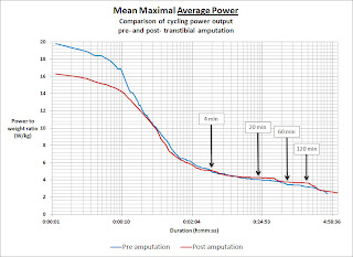
For some personal motivation, I thought I'd post up a couple of charts comparing my performance before and after the leg amputation (I get asked about it occasionally, and my data is being analysed for a science write up at the moment).

So I thought I would summarise it in a neat chart known as a Mean Maximal Power (MMP) chart.

MMP charts show your best power ouput for all durations from very short periods (seconds) through to very long periods (hours). Because the horizontal axis represents durations from second to minutes to hours, we turn that into a logarithmic scale, so we can inspect best power outputs for durations covering a wide time spectrum.  Power is represented on the vertical axis.

As you would expect, one can produce higher power for short periods (seconds), and somewhat lower power over longer periods (hours), so the chart trends downwards as you move to the longer durations on the right.

By using WKO+ software, I made a comparison of my all time personal best power for the time before my accident and amputation and since then.

Two versions plotting mean maximal power to weight ratios, one for Average Power and one for Normalised Power. The blue line is before amputation, the red line is since then.

Click on the chart to see a full sized version:


The chart above shows my best W/kg for all durations.

What is very clear from that chart is the wide performance gap for very short durations but the closeness in performance over durations longer than a minute or so.  This suggests my sustainable aerobic power and my anaerobic work capacity hasn't been significantly hampered by riding with a prosthetic, however my neuromuscular power (used for sprinting and short duration hard accelerations and efforts) has been significantly compromised.

What about Normalised Power?


When plotting NP data, WKO+ restricts the output to a minimum of 5-minutes.  For most analysis and application, we really don't read too much into NP for durations shorter than about 20- to 30-minutes.  But nonetheless, the chart shows an interesting change in my power profile when viewed through the lens of Normalised Power.

NP appears to amplify the difference in performance over a wider part of the primarily aerobic duration spectrum (> 5-minutes) when compared with the Average Power chart

A reduction in my ability to perform those short high power bursts (up to ~ 30 seconds or so) definitely comes though in the NP for durations from 5- minutes to about 30-minutes.

For longer durations than half an hour though, I have been able to equal or somewhat exceed my best pre-amputation NP outputs.

This I think is reflective of the type of racing I do - which is lots of track and crit racing, some road races and only occasional time trials.  So for an apples to apples comparison, I certainly think this NP chart is pretty telling.

I no longer have that weapon of short high end power, but have instead found other ways to make up for it.

Of course this is just one way to use MMP charts. Once can plot one season over another and make comparisons as to their overall progress. Or any time periods they care to compare.

Read More......

Wednesday, March 25, 2009

Matchfinder

No, this isn’t a chat about online dating websites! It’s about a method to quickly identify when, during a race, you “burnt a match”.

The concept of a “burning a match” isn’t a new one in cycling – basically it’s a metaphor for saying you did a hard effort, hard enough that it might impact on your ability to do other hard efforts later on in the race, since a match can only be used once. While not a perfect analogy, it’s not a bad one.

How many matches we can burn and how brightly and for how long those matches can shine for might be thought of as the size and quality of our personal matchbook. It’s one measure of our race specific fitness.

Performing well is as much about knowing when to "light one of your matches" as it is about doing the training to build up the size and quality of your matches and the number of matches in your matchbook.

Burning a match is also relative to the race in question. In a 3-week Grand Tour, a match might be akin to a long solo/small group break away or an attack on an alpine ascent, but in a 20 or 30-km points race on the track, it would be an attempt to gain a lap, or go for lots of sprints.

Typically, burned matches are attempts at race winning moves
or, for some, race survival moves.
In any case, often riders like to analyse their power meter files to see when, how many and how big were the matches they set off while racing. It's one way to help assess, post-hoc, the tactical decisions taken while racing (did you really burn an unnecessary match going on a fruitless escapade?) or simply as a way to assess how many and how often matches were lit before you cracked, or even an indication that your matchbook is getting bigger with training.

In the book, Training and Racing with a Power Meter, it shows one way to locate such efforts by using the fast find feature in the WKO+ software. I’m going to show another method, one, that with just a little bit of spreadsheet help, is pretty easy to do and which shows up matches quite clearly.

Again, as with much of what I write, it’s not an original thought. It is based on the Normalised Power concept developed by Andy Coggan and just such a chart can be seen on Slide 15 of his PowerPoint presentation hosted on Google docs:
“Making sense out of apparent chaos: analyzing data from on bike power meters”


OK, so let’s look at an example of what I’m talking about.

Let's take my points race at the recent State Masters track championships. Here’s what the power meter trace looks like for the race:


It shows my power output for the race, as well as horizontal lines showing my Functional Threshold Power (FTP) and my Maximal Aerobic Power (MAP). As is typical with these sorts of races, the power output is highly variable and while you can see some spikes, it is difficult to make all that much sense out of the information presented like this.

But with a little bit of maths applied to the power data, here is a plot of exactly the same race:


Now this really shows up where I burned my matches. In this instance it clearly shows the 6 sprints in which I either contested (the first and the last) or simply needed to put the power down to stay in the race (the other 4). It also shows the periods where I didn’t sprint at all (sprints are every 10 laps in these races about every 2.5 - 3 minutes depending on the race speed), which is when I was in a chasing group as laps were being taken/lost by various riders.

By showing the data in this way, it is really clear when matches were lit. My first one was a pretty big flare, as not only was there a strong sprint but it was clearly an extended effort, perhaps covering an attempted attack after the sprint. But it also shows that after a couple of sprints, I simply didn’t respond when the inevitable attack came. I needed another match but my book was getting a bit thin at that stage.

Here are a couple of other similar plots:

This one is from the State Masters Criterium Championships in 2006:


As is evident from this plot, the first 10-minutes were pretty brutal with some very hard efforts necessary. In this period the field was whittled down to a break of just 6 riders. Then the break settled somewhat, before some more attacks started in an effort to ‘break the break”. It is also clear that on this course, if you couldn’t repeatedly make such hard efforts, you would be toast, limping back to the hotel for an early shower. It was a "repeatedly go hard and recover" kind of course.

Here’s another example from a different type of crit race:


This time I made a solo break very early, then was joined by another rider after about 15-minutes or so and we stayed together up to the finish. You can see the large match early on, and then the smaller efforts while solo, which diminished somewhat when I was joined by my break companion and we established and consolidated our lead. This enabled me to save a big match for when it really counted - the final sprint.

So how are the above plots made?

Well it’s not hard and if you know about Normalised Power, then you’re well on your way.

1. Just take a normal power meter file and open it in Excel (or your preferred spreadsheet software).
2. Then calculate a rolling 30-second average of the second by second power data.
3. Then raise that rolling 30-second power value to the 4th power (watts^4).
4. Then chart that 30-second power raised to the 4th power by time.

That’s it.

I also added lines to show both FTP and MAP raised to the 4th power.

Hint: The chart is a x-y scatter plot, with horizontal (x) values being time and corresponding vertical axis (y) values the power^4 values.


Why 30-second averaging and why raise to the 4th power?

Well, in essence the 30-second averaging and the raising to the 4th power is because (and I quote from Andy's own item on Normalised Power):

  1. the physiological responses to rapid changes in exercise intensity are not instantaneous, but follow a predictable time course, and
  2. many critical physiological responses (e.g., glycogen utilization, lactate production, stress hormone levels) are curvilinearly, rather than linearly, related to exercise intensity

As for #1, as Andy has shown us in the Google docs presentation referenced above, the half lives of many physiological responses to the intensity we are riding at (i.e. our power output) are indeed not instantaneous. The time period for such responses to show up is typically around 30-seconds or so. Some, and I quote, include: PCr kinetics, heart rate/cardiac output and sweating all having half life response times of around 25 seconds. VO2 ~ 30-seconds, VCO2 ~ 45 seconds, ventilation ~ 50-seconds and core temperature changes ~ 70-seconds.

So from the point of view of assessing our body’s responses to intensity (power output), it makes sense to view power meter data as a rolling average power over a 30-second window*. It doesn’t actually have to be 30-seconds but changing the duration of rolling average (to say 25-seconds or to 40-seconds) doesn’t have a large impact on the outcome of the plots.

* except perhaps when assessing maximal neuromuscular sprint type efforts, since the energy systems in use fatigue over a handful of seconds (although our "recoverability" for sprints is still linked to our aerobic or "matchbook" fitness).

This is also why we sometimes refer to things like heart rate as being a "lag indicator" of effort and is one reason why HR is a poor guide to managing shorter harder efforts while training.

As for the #2, the research Andy shows suggests an exponential relationship exists between blood lactate concentration and power expressed as a ratio of 1-hour power (power:FTP, often referred to as the Intensity Factor). In the same presentation one can see (on slide 13) that the best fit for the data shows a relationship very close to the 4th power (3.91).

Again, the use of a nice even number of 4 rather than say 3.9 is simply more convenient and choosing numbers either side really doesn’t affect the nature of the plot all that much.


So if you cracked in a race, or couldn't go with the winning break, then what does your match analysis look like? Did you not have a match when it counted, or did you not use them wisely enough?

Just remember, playing with matches is dangerous, so take care out there!

Read More......

Friday, May 02, 2008

The seven deadly sins

This will be old hat to anyone that's been around the world of training with power meters for some time. However, having monitored the cycle training forums lately, it seems the question about how to estimate a rider's Functional Threshold Power (FTP) is something that comes up quite regularly.

So I thought I'd write a post about it in the hope that it will at least help clarify one or two things for people.

Before I go into the various methods used, it's probably worthwhile quickly revisiting what FTP is and why it is important to know.

FTP is a practical and readily measurable indicator of a rider's aerobic fitness. It was introduced to the world by Dr Andrew Coggan and for all intents and purposes it removes the confusion that exists over the term "threshold" and all of the various terms associated with it.

It is important to know FTP for a number of reasons:

-- threshold power is the single most important physiological determinant of endurance cycling performance (covering events from individual pursuits of 2 km long, up to stage racing lasting several weeks). Hence improving FTP needs to be the primary focus of our training, and measuring FTP on a regular basis is an excellent means of tracking fitness changes through the course of a season.

-- it enables a rider to define and measure intensities of riding (or power levels) relative to their own current level of fitness, expressed in a manner that relates to the primary physiological adaptation that occurs at each intensity (power) level. This is very useful for guiding training and making sure that the mix of intensity and duration during a workout or training cycle is appropriate for gaining the specific fitness required for a rider's target events.

-- it is a key input into other metrics which enable a rider/coach to monitor overall training stresses, both long term training loads and recent fatigue levels.

-- it also provides an excellent guide to how a rider should most effectively pace themselves, especially in races such as time trials (or during a breakaway in a road race or criterium)

Of course you need to have an on-bike power meter or a stationary ergometer that measures power in order to measure or estimate FTP.

FTP is simply defined as follows:

"FTP is the highest power that a rider can maintain in a quasi-steady state without fatiguing for approximately 1 hour.

When power exceeds FTP, fatigue will occur much sooner, whereas power just below FTP can be maintained considerably longer".

Okay, so that's easy. If you want to know your FTP, just go out and ride your bike as hard as you can for an hour and see what the average power was. In essence this is the gold standard measure of a rider's FTP. Unfortunately it is not always possible nor practical for everyone to do a one hour time trial like test. And not all such tests are well paced. A poorly paced effort may result in a lower average power than a well paced effort.

So what are all the alternatives available to us to estimate FTP?

Well, Dr Coggan kindly made a list of these, titled "the seven deadly sins" and posted them to the wattage forum in June 2004. Here is the original post reproduced:

"the seven deadly sins....

...er, ways of determining your
functional threshold power (roughly in order of increasing certainty):

1) from inspection of a ride file.
2) from power distribution profile from multiple rides.

3) from blood lactate measurements (better or worse, depending on how it is done).

4) based on normalized power from a hard ~1 h race.

5) using critical power testing and analysis.

6) from the power that you can routinely generate during long intervals done in training.

7) from the average power during a ~1 h TT (the best predictor of performance is performance itself).


Note the key words "hard", "routinely", and "average" in methods 4, 6 and 7..."


Okay, so #7 is obviously the "Gold Standard". What about the others?

Inspection of Ride File / Power Distribution Profile
#1 and #2 require you to inspect data using power meter data analysis software. The method is described in more detail in the book "Training and Racing with a Power Meter" by Allen and Coggan. In general these two methods are more useful as a means to check whether a rider's FTP may have changed, than for estimating FTP itself. With #2, it is important that the selection of ride files chosen contain efforts such as races or very hard training.

Blood Lactate Measurements
#3, done properly, usually requires you to visit a sports science laboratory or a well set up cycling coach's facility. Even then, interpretation of the blood lactate data may not result in practical information for the rider. If you have a power meter, there really is no need to have a blood lactate test performed.

Normalised Power (from a Hard ~1hr Race)
#4 is pretty handy, particularly as an indicator of when a rider's FTP may have changed. Frequently riders who do not do time trials, but do other races such as shorter road races or criteriums of approximately 1 hour duration, can use this as a crosscheck of their current FTP. Assuming the race was hard (that is, you were pretty much on the limit for most of the race), and you were not overly fatigued beforehand, then the 60 minute maximal Normalised Power should be at least at your FTP if not a little higher (up to about 5% higher). If your 60 minute Normalised Power is reported as more than 5% above your FTP, then that is a strong sign that your FTP needs re-setting (upwards).

Critical Power
#5 is also a very useful means of estimating FTP. It explores the relationship between work performed (kJ) and duration (seconds). Essentially all you need is at least two (or more) maximal efforts of at least three minutes and less than 30 minutes duration, say one of five minutes and another of 20 minutes, although the choice is arbitrary and up to the individual. You then enter the average power and durations ridden into the Critical Power model. The model will calculate what is called "Critical Power", which is essentially equivalent to FTP (or at least a very good estimation of FTP).

A couple of notes: the "test" rides chosen should have been performed within a reasonably close timeframe (say within the same week), and should not be cherry picked from other rides. They need to be stand-alone maximal efforts. It is also preferable to have two very good data points rather than three or more unreliable data points. I recommend reading about it here (this links to a pdf document by Eddie Monnier) and downloading the spreadsheet as well. It also helps to use the same (or very similar) durations for all future Critical Power test inputs.

Interval Training
#6 is great for riders that regularly do hard aerobic interval work, especially indoors. The intervals need to be of sufficient duration, I would say at least two efforts of 20 minutes (with a short break between) at time trial power/pace. When done on an indoor trainer, then it is common for longer maximal effort intervals of 30 to 40 minutes be nearly equivalent to FTP. As training progresses over the weeks and months, then changes in sustainable power during these intervals is a great guide to changes in FTP.


I'd suggest the Seven Deadly Sins also include the following methods:

MAP Testing
5a) by conducting a Maximal Aerobic Power (MAP) test, using the test protocol on Ric Stern's website . FTP typically falls within the range of 72%-77% of MAP.
An example of a MAP test can be viewed here.

Shorter Time Trials
5b) by conducting a time trial effort of sufficient duration (say at least 20-min), with FTP typically falling into a range of percentages for TTs of this duration e.g.:
- FTP = 93% +/- 3% of 20-minute maximal average power
- FTP = 94% +/- 3% of 16km (10-mile) TT avg power
Of course everyone is different and some may fall outside of these ranges.

There really is no reason to nail it down to the nearest watt. Setting FTP to the nearest 5 watts is sufficient. I only change the FTP setting if there is hard evidence of a change of at least 5-10W.

Of course, getting the number right does depend on ensuring that a rider's power meter is correctly calibrated and any zero offsets needed are done. Strange numbers are usually strange for a good reason.

Remember, these are all just ways of estimating FTP and some are better than others at nailing down the number (and for many, some are more practical to perform than others). The final two methods for example, would typically get you to within a few percent either side and can then be cross referenced with another method.

It all depends on a rider's circumstances. Not everyone is in the position to do a ~1 hour time trial with sufficient regularity.

What do I use?
For the purposes of tracking aerobic fitness changes, and the setting of training levels, then performing a Maximal Aerobic Power test, combined with one of the other tests for FTP (usually a 16km or 40km time trial), is the method that I typically use with my coaching clients. Having this combination is particularly useful when assessing the training priorities for an athlete.

Of course, you can always track fitness and base training levels on a mean maximal power for a duration of less than 1 hour (e.g. a 20-minute test, or as has been suggested, 2 x 8-minute test efforts). However, by doing so you start to introduce the influence of anaerobic energy production into the test result, which means you may not be entirely sure which component of your fitness is changing, and hence be uncertain as to what type of training is needed in order to progress further.

So which sin will you choose?


This isn't the end of it of course. There are still a multitude of factors to consider, such as the impact of the following on FTP:
- Environmental effects
- Point of training cycle
- Chronic Training Loads
- Training Stress Balance
- Altitude
- Hills vs Flat terrain
- Different trainer types
- Different bikes and rider positions
- Motivation

I'll save that for another post.....

References:
1. Coggan, A. Ph.D, Allen, H. Training & Racing with a Power Meter, Velopress 2006.
2. Monnier, E.
Using the Critical Power Model to Predict Various Points Along the Power-duration Curve. http://velo-fit.com/articles.htm, 2004
3.
Stern, R. What is MAP?, http://www.cyclecoach.com/pageID-news-Test_yourself.htm, 1999

Read More......

Saturday, October 28, 2006

2 Races in One Day

Here I am (yellow shoes) sucking wheel as usual! For the uninitiated - this is the exit to a fast left hander, note how I am right on the wheel in front. Letting gaps form when cornering in a crit wastes lots of energy. Note the riders behind - they have to put in extra effort to close the gap. All those little extra efforts mount up and can send you out the back in a hurry.

Today was the annual Snowy Wilson Memorial criteriums open racing carnival hosted by RBCC at Heffron Park, Maroubra (one of Sydney's beachside suburbs). As is typically the case at Heffron, the wind was blowing - and it was pretty strong Southerly today, making the long home straight a real slog fest. With 10 corners per lap, Heffron is a real tester of a circuit, with handling skills combined with race nouse and brut power needed to be successful. The race format was graded scratch crits, followed by an all-in handicap criterium.

What's a Handicap Criterium?The handicap crit format is where riders of all grades race together, with graded bunches sent off at different times. First past the post wins. So the front bunches are trying to stay away while the back markers are chasing hard. It means groups have to work together well in order to maximise their chances of catching and/or staying away. It is very different to scratch racing - we'll see the difference in the race power stats.

Race #1 - Team tactics take their toll
My first race was the Mens Masters A/B grade scratch race. I commented last week that this was likely to be a team dominated affair. Well I was right with team riders taking turns to attack forcing the rest of us to cover moves constantly. During that early softening up period, being a bit jack of the tactics I countered a couple of times myself but of course the teams chase you down.... With Easts riders attacking until one, John Kenny, got away with Liam Kelly (SCC), then it was simply a matter for the rest of the Easts boys to mark the counters and generally spoil the chase effort. Still, I had a go where possible but we just couldn't overhaul the front two. The large field was pretty well shelled by now and the chasing bunch was eventually down to about 8 riders. Liam Kelly (a former World Masters Crit Champion) ended up winning the day. I managed top 5 or so (can't really recall) after trying another surge with 2.5km to go (and getting caught).

Then I had a couple of hours to kill before the next race, so with a few mates we rode up to Queens Park for a cafe stop and a quick bite to eat/drink. Then back to Heffron for Round 2!

Race #2 - At the Handicapper's Mercy
I felt good in this race - since you have to work more together as a bunch, there is less surging and little likelihood of attacks happening, so while you are on the power all the time, it is less taxing mentally. Having said that, it seemed to me the pace was insufficient to overhaul the front bunches, so I thought, hell why sit back - it's not that big a race, so I just put myself up the front and drove hard. Unfortunately not all could come with me, so I was constantly finding myself having to ease off and go back to the bunch.... The best method is for the group to roll over like a TTT but not everyone is willing and/or capable on the day, so sometimes a few have to take charge. Well we swept up all but one rider and had not been caught ourselves by the A-grade scratch markers, so everyone else thought - we've got this guy in our sights, no need to hammer now. Boy were they wrong. He held on for the win and good luck to him. It served our bunch right - all those glory boy sprinters not doing enough work and missing out on the big cheque.

I placed 5th overall (after starting the sprint a bit early in the headwind and having the glory boys roll me), which in this race was a podium spot and some prize money to boot. Sponsor doubles our prize monies, so I asked it be donated to the Multiple Sclerosis Societies' fund raising ride to the 'Gong, being ridden by a couple of club members next weekend.
Special thanks to Stan, who rode a strong last couple of laps to give me a break before the finale. Onya mate!


Race Day Stats:CTL: 94
TSB: 0 recovery week - thanks coach ;)
TSS: 279

MMAS A Grade Scratch Crit (5th place or so?):
Duration: 30:48
Avg Power: 295 Watts
Norm Power: 338 Watts
NZAP: 320 Watts (8% coast time)

All in Handicap Crit (5th place - podium):
Duration: 31:19
Avg Power: 310 Watts
Norm Power: 338 Watts
NZAP: 328 Watts (5% coast time)

Normalised & Average Power

Note how Normalised Power was exactly the same for both races, yet Race #1 had an Average Power 15 Watts less than race #2. This is a perfect example of how comparing Normalised and Average Powers is a great means by which to assess the physical demands of two quite different race types.

Normalised Power takes into account the highly variable nature of power output and is a clever means to provide an estimate of what average power you could have attained had you ridden the same course at a steady pace (rather than the surge then coasting style of riding common in a crit or road race). It also enables you to sensibly compare the physical demands of quite different rides/races.

So what this is telling me is that I rode both 30 minutes races with a Normalised Power of 328 Watts but my average power in Race #1 was less as the nature of the race involved much more coasting (after surges and attacks) than Race #2 which was a smoother effort. So it looks like I put in a pretty good effort in both races!

A more detailed explanation of Normalised Power can be found here.

All up, another successful day's racing and power numbers are looking good (especially average power numbers which are up near all time highs).

Always nice to get some prize money too!

This coming week I do a performance test - a 16km TT. Hoping to set another power PB. Wish me luck....

Read More......