Monday, February 18, 2013

Pour me a draft

Drafting in cycling is a term that refers to practice of riding in close proximity to another rider or riders ahead of them or riding behind other moving objects, such as a motor bike or other vehicle. Taking draft, riding in the slipstream, and keeping your nose out of the wind are some of the phrases used to describe this phenomenon. It even has a Wikipedia entry.

The fact that far less energy is required to ride at a given speed when behind another moving object than when you are the one pushing the wind is without dispute, and many have measured the benefits.

It's a tactic that bike racers make good use of, in order to save as much energy as possible during a race, so they can use that energy when it really matters, such as the final sprint. Often in racing it is those that are least fatigued that win, and is why teams send their workhorses to the front of the group to "do all the work". There is even an anecdotal report from Prof. Asker Jeukendrup of one professional cyclist completing a stage of the Tour de France with an average power of 98W. Now that's an impressive level of drafting skill.

In some cycling events though, drafting is akin to a bowler chucking a cricket ball down the wicket, it's just not cricket. It's against the rules to take draft in events such as individual time trials and in many forms of triathlon (e.g. Ironman) which are also solo competitor timed events. It is cheating. And when it happens it annoys the crap out of many people.

For a cycle racer, drafting is a skill, a craft to be learnt, developed and honed.
However, in time trials and non-draft triathlon, someone accused of illegal drafting usually also has their parentage questioned.

Of course there are rules that apply when two riders end up in close proximity, and usually it involves a  minimum distance the rider behind must maintain, and/or move to another side of the road, and/or pass the other rider within a set amount of time.

The minimal distance in triathlon varies depending on the event, and can be 5, 7 or 12 metres. In cycling under UCI rules, the distance between riders must be at least 25 metres and 2 metres laterally, unless of course they are passing the rider ahead. And of course support vehicles and other vehicles (e.g. TV) in cycling must remain behind the rider (a minimum of 10 metres for support vehicles). It does get tricky in the biggest races though, with police motorbike escorts clearing the crowds sometimes providing unintentional wind assistance.

In road cycling time trials, the issue of riders flaunting the drafting rules (deliberately or otherwise) is not all that common as the number of competitors in any event is usually strictly limited and each rider commences their timed ride over the fixed course at specified time intervals designed to ensure most competitors don't end up in close proximity to another. It does happen of course, but nothing like to the extent it occurs in the sport of triathlon.

Triathlon however have set themselves up for an endemic drafting problem. It's a natural consequence of a mass participation event resulting in far more riders being on the course than there is room on the road to enable everyone to obey the rules without pretty much coming to a halt. Just go to any triathlon forum and monitor the number and tone of discussion threads on drafting and passing. It's normally treated with a level of discourse usually reserved for doping topics.
A scene from a non-draft triathlon. Best of luck to those attempting to abide by or enforce the rules.

Well I'm not really intending to debate the merits or otherwise of such rules and their applicability or enforceability - but what I will do is to publish the results of an impromptu experiment to measure the impact on power of a type of drafting legally permitted in triathlon.

The outcome surprised me, and explains why the drafting rules create big problems and often result in heated exchanges between riders and officials.

The experiment

Last November, Rob (aka Fishboy - blog link) mentioned he would do some test runs at his local outdoor track, collect the power meter data and report back. I suggested he send me the power file with no notes attached, and that I would take a look to see what I could discern from the data without actually knowing what he did. All I did know was that he would do some riding behind and in front of another rider also riding at the track.

OK, so what did I find?

This is a chart tracing Rob's power and speed, with horizontal axis being distance. It's shown with 30-second averaging to make it easier to see what happened.
I have also placed several horizontal lines on the chart to help. The power lines are at 200W, 240W and 280W, and the speed lines are at 38km/h, 40km/h and 42km/h.

We can see Rob rode about 35km total, with three intervals of ~10km each, with a bit of warm up and short recovery between each interval. So on that basis I decided to examine each 10km interval in more detail. The speed and average power for each interval was a little different, which each being ~ 20W harder and 0.7 - 1km/h faster than the previous effort.

Upon closer examination, it was clear to me Rob's air resistance (apparent CdA*) varied during each 10km interval. Within each interval, there were four distinct sub-interval sections with relatively stable aerodynamics, each of approximately 2.5km in length. To see this properly requires re-plotting the data using a technique known as virtual elevation, which helps us make aerodynamic sense of what can appear to be quite noisy data. I'm not going to show those charts as there are too many, but I will summarise the results into three charts, one for each 10km interval.

In each summary of results chart I have indicated on the bottom axis where I think the start and end of each of those sub-interval sections was, and the columns show my estimated CdA for each of those sections. Note that the CdA numbers won't be absolutely correct since I am making some other global assumptions about Rob and environmental conditions, but what's important is the measured differences in apparent CdA. I may not have the absolute values exactly spot on, but the differences in the absolute values will be on the money. Here's the first summary chart:


You will see some blue and red columns, showing Rob's apparent CdA was either "low" or "high" during these sections. This can be as result for instance of being in the aero position, and then sitting upright, then back into aero again etc. But for the purpose of this exercise I know he rode with another rider on the track, and was either in front of, or behind the other rider. I didn't know how far the gap between the riders was in any of the intervals, all I am showing is the estimated difference in apparent-CdA between "leading" (red) and "drafting" (blue).

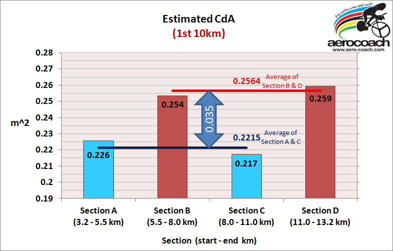
Also shown, are horizontal lines, which are the average apparent-CdA for "drafting" (blue) and "leading" (red), as well as the difference in apparent CdA between each (the fat vertical double headed arrow).

So we can see that the average difference in apparent-CdA for draft vs non-draft in the first 10km interval was 0.035m^2.

Here's the chart summarising the second 10km interval:

which shows an average difference in apparent-CdA between drafting and non-drafting of 0.033m^2, which is similar but slightly less than the difference measured in the first 10km interval.

And the third 10km interval:

which again shows a drafting benefit, but now that benefit has been reduced somewhat to 0.026m^2. There is also a slight increase in non-draft CdA in this interval compared to the first two intervals.

So in summary, the gain by drafting the other rider was a reduction in apparent-CdA of:
Interval 1: 0.035m^2
Interval 2: 0.033m^2
Interval 3: 0.026m^2

In terms of energy benefit for for Rob when drafting over leading, when riding at 40km/h this equates to wattage savings of:

Interval 1: 29W
Interval 2: 27W
Interval 3: 21W

What's interesting is that the non-draft CdA values are pretty consistent across all runs (a little higher in third interval), but that the draft-CdA values in the third 10km interval had increased somewhat more, IOW the drafting benefit had been reduced for some reason. There can be several reasons for this, such as environmental condition changes, on bike position changes due to riding at higher power and/or fatigue (creeping forward on saddle for instance), change in equipment/clothing and so on.

After I had done the analysis, Rob then revealed all the details of what he actually did - these are his words in green, although I have re-ordered some paragraphs for clarity:

The procedure was to ride sections of the interval drafting and non-drafting. It was attempted to hold a constant speed during each section (were aiming for 40kmh, but my front rider went a little slower on the first interval).
In all intervals I trailed on the first segment, then swapped to the front twice.

In all intervals I tried to hold the same aero position. This was very consistent on the first interval, but possibly less so on the final interval.


All intervals were the same draft distance +/- 0.3m, 12m front wheel to front wheel. A l
aser pointer was taped to the frame to aim at the back wheel of the rider in front for a 12m front wheel to front wheel distance. Rig checked after the session and laser was still accurate, so didn't move during the session.

The intervals got harder (3 x 10km E, M, H)

The wind went from dead calm to moderate on the H interval. Distinct head, tail and cross winds on interval 3 (the H one), possibly more than what Moorabbin airport recorded as there was a rain shower that came through with much stronger wind.

The other rider is small, ~65kg, on a very aero bike, in a good aero position. Probably 0.250m^2 or so CdA. If there was something smaller or more aero to draft off, it would be hard to find.

The BOM data for Moorabbin airport, 10km away approx was:
Date/Time EDT Tmp°C AppTmp°C DewPoint°C RelHum% Delta-T°C Wind PressQNH hPa Press MSL
hPa Rain since 9 am mm Dir Spd km/h Gust km/h Spd kts Gust kts -
08/06:00am 12.6 11.3 11.2 91 0.7 NNW 9 13 5 7 1010.6 1010.5 0.0 
08/05:45am 11.9 11.4 10.6 92 0.7 NNW 4 9 2 5 1010.5 - 0.0 
08/05:33am 11.5 11.6 10.2 92 0.7 CALM 0 0 0 0 1010.3 - 0.0 
08/05:30am 11.5 11.6 10.2 92 0.7 CALM 0 0 0 0 1010.2 - 0.0

My weight and bike 95kg.
Crr previously measured many times on this velodrome at 0.0044.
Air density pretty consistent around 1.227.

Bike is TT (P3) with H3 front, H Jet Disc rear, eKoi helmet (no vents).

Track location is Carnegie Velodrome in Packer Park just near East Boundary Rd and North Road. 363m circuit.


Anyone suggesting there is no benefit at 12m is totally incorrect, even in head, cross and tail winds on interval 3 there was close to 20w difference - which is significant. When it is calmer, there is more benefit, which makes perfect sense.

There is also a high likelihood that there could be even more benefit that could be found from a bigger test rider in front, being 3rd or 4th wheel, or being closer than 12m.


So, there we have it. Even under the 12-metre rule the power savings from drafting are quite significant, and as Rob says, if you are following a larger rider, and add more of them into the line of riders on the road ahead, one can only imagine the power demand will reduce further. Not by as much as this initial benefit of course but it all adds up.

A larger rider adhering to the 12-metre draft rule when following a single smaller rider at speeds of ~40km/h   in calm conditions gained a benefit of ~27-30W reduction in power required, and ~20W saving in moderate cross winds.

It's no wonder there are big problems with riders deciding they can go faster than the guy ahead, attempting to pass, and then being unable to maintain the pace because the power demand is still so much higher even with a 12-metre draft rule, creating all sorts of headaches for riders who find themselves stuck in drafting hell.

Aside from the drafting issue, this was a nice example of being able to correctly infer a lot from analysis of a naked power meter file, and with no specific prior knowledge of its content other than it was from a ride at a track somewhere looking to test the impact of drafting. OK, so it's not a formal scientific test, but I have to say, as a way of blinding one element of the analysis, this is a pretty cool outcome.

It's not the only time I've done this - I used this blind analysis technique to spot things like a rider's bike position changing during an event, as well as assess rider's physiological capabilities in events such as team pursuits.


Big thanks to Rob and his mate for conducting the experiment. Nice one Fishboy!

* I say an apparent-CdA, because when riding in a slipstream it's not Rob's actual CdA that changes so much, it's the air flow he is riding through that is changing. What these numbers represent is the equivalent impact of that beneficial air flow in both CdA and in wattage saving terms.

Read More......

Monday, February 11, 2013

The bathroom scale analogy

Power meter accuracy and calibration 101


This is not a complex item, but I often see confusion* over the issue of power meter calibration, torque zero, zero-offset etc, so I thought I would use a simple analogy to help people understand the basic differences in what these terms mean.

There are many things that can affect the accuracy^ of power meters, but let's talk about one of the most important, i.e. the person using the power meter.

Most common on-bike power meters in use today (e.g. SRM, Powertap and Quarq, and more recent offerings from Power2Max and others) require a user to do three things for accurate data:
  1. Pair the handlebar computer with the right power meter – this might be via a wireless protocol such as ANT+, or by simply plugging the two together via their wiring harness
  2. Check the torque zero before and occasionally during a ride (torque zero or "zero-offset" as referred to by SRM are interchangeable terms in this context)
  3. Check / validate the correct slope calibration of the power meter is being used
How you do #1 will vary depending on the type of handlebar computer and power meter used and as always, reading the manuals is a worthwhile investment of your time (ugh I hear you say). Typically it's not a difficult thing to do.

However I want to elaborate on #2 (torque zero / zero-offset) & #3 (slope calibration) via an analogy – the ubiquitous bathroom scales that many have a love/hate relationship with.

To demonstrate the difference between  "zero-offset" and "slope calibration" and their importance, I'm going to share with you a simple experiment - checking the accuracy of an old set of bathroom scales I have. They are the old fashion type with an “analogue” display that rotates around when you hop onto the scales.

Here’s a pic of the scale's reading before I place a known weight on the scales. The lower scale is kilograms (kg) and the upper scale is stone and pounds. I'll stick with kg for now.
We can see they are reading +4kg when there is nothing on the scales. Clearly the “zero-offset” is wrong. So if I placed a known mass on the scales, I should expect the scales will read 4kg too high.

So, let’s place an accurately known weight on the scales. I just happen to have an accurately known weight of 31.210kg. Rounding to 31.2kg will do for this example. This is what we see: 
That’s reading 34kg. But hang on, shouldn't we expect the scale to read 35.2kg  = 31.2kg (actual weight) + 4kg (the "zero-offset")? 
Well yes, we should, but it isn’t. Hang on to that snippet - we'll get back to it shortly.
The scales have a small “zero control” knob, which I can turn so the scales are reading zero when I am not standing on them. All we are doing is validating that, when no weight is on the scale, it displays a zero value. OK, so let's correctly set the “zero-offset” on the scales: 
and now put the weight back on the scales again: 
Now it says 30kg. Hmmm, so even though the “zero-offset” setting is correct, my scales are under reading the actual weight by 1.2kg or about 4%.

Let’s plot those readings.

There are four readings. The two for when the scale’s zero-offset was +4kg (the green triangles and line), and the two when the scale’s zero-offset was 0kg (the red squares and line).

The horizontal axis is the actual weight placed on the scales, which in this case is either 0kg or 31.2kg. The vertical axis is the reading provided by the scales.

So now we can visualise two things:
  • the “zero-offset”, which shows us how much the scales read when there is no weight applied, and 
  • the “slope”, of the scale – in other words, how much weight the scales report increasing by for every kg of actual weight placed on the scale.
This slope can be calculated as follows:

[Reported weight - Zero-offset weight] / Actual weight

In this case for both sets of readings, the slope is 0.96.

Hence, if I stood on these scales, and the zero-offset had been set correctly to 0kg, and the scales read 83kg, I would actually weigh 83 / 0.96 = 86.5kg.

So even though the “zero-offset” has been correctly set to zero, this does not mean the scales have been calibrated, nor that they are accurate. All we know after performing a "zero-offset" is they will read correctly when there is no weight on the scale - but that does not ensure accuracy when we step on the scales. 

In order for the scales to be accurate, we need to know not only the zero-offset is correct but also their slope is correct. In this case the slope of the scales is wrong, and hence the weight reading will be wrong unless I apply the correct slope to the "raw" data.

The exact same principle applies to bicycle power meters. Instead of weight on a scale, most power meters measure the torque (twisting force) applied to a bicycle component (using special gauges). The most common meters measure the forces at the crank spider or at the rear hub but forces can also be measured at the pedal or cleat, the crank arms, or the rear cog (or even the chain). Besides measuring the torque applied to the component, all that is required to determine power is the the rotational velocity of the component (revolutions per unit time).
So to complete the analogy:
  • The zero-offset (or torque zero) of a power meter is the torque reading when there is no force being applied to the crank (or hub) and is analogous to the bathroom scale's reading with no weight on them. Various power meters report in different units.
  • The slope of a power meter is a value indicating the increase in the reported torque readings per unit of actual torque applied to the crank (or hub) and is analogous to knowing how much the bathroom scale's reading changes for each kg of actual weight we put on them.

Checking and/or re-setting the torque zero (zero-offset) of your power meter before and occasionally during a ride is a necessary and sound practice, 
however
unless you also know the correct slope of your power meter is being used, then the data may still be inaccurate.

Torque zero / zero-offset is something that will naturally vary, in particular with ambient temperature, but other things can affect it too, which is why it is good practice to always check it and do so regularly. The better meters have predictable and minimal zero-offset "drift", and some have firmware designed to automatically adjust the torque zero while riding, which may or may not be user enabled (depends on the meter).

This auto-zero / correction feature may or may not be a good thing depending on how it has been implemented. In my opinion, I consider knowing how and when such changes occur to be useful and valuable information when evaluating the possible errors in reported power data.

There are also some things that can affect the slope of your meter between when it left the factory to when it is finally installed on your bike, so I encourage you to have the slope validated while the meter is actually on your bike. Slope checks are best done at a 6-12 monthly intervals, or whenever you make changes to the crank's set up (such as changing cranks arms or chainrings).

Some power meters have far more stable slopes than others. It’s not a difficult thing to check yourself, but I’ll look at providing an example of that process in another post.

In the meantime, the good folk at Quarq have provided a video to demonstrate the slope checking process for their power meter. It's a similar process for other meters but the means to obtain the torque numbers and calculate the slope will vary.

As a final comment - it's possible to post-hoc correct power data that has had an incorrect slope applied but an incorrect zero-offset/torque zero can be a lot more difficult (if not impossible) to correct, and especially so if that zero-offset has been drifting. For SRM users, applying a slope or zero-offset correction is pretty trivial to perform using SRMwin software.


*  The confusion hasn't been helped when one of the major manufacturers of bicycle computer recording devices (i.e. Garmin) use the terminology "calibration" for their device, when the specific function they refer to as "calibration" it is not a true calibration. If you use a Garmin computer, and "calibrate", I suggest in your own mind to replace the Garmin word "calibration" with the words "torque zero".

^  When using a power meter, we want to ensure that the data is as accurate and precise as possible. We do this for many reasons, in particular so we can make valid comparisons of performance changes over time (keeping in mind that the gains at high levels of relative fitness are only a handful of percent and people may not use the same power meter their entire lives). There are also many performance analyses that require accurate and precise data to make valid but important choices about performance matters, e.g. the testing of aerodynamics, or tyre rolling resistance. Anyway, I’m not going to labour why accuracy and/or precision is important, that’s for another discussion.

Read More......

Sunday, February 10, 2013

An hour at a time - photos

Refer to yesterday's post for details on Jayson's record ride.

I'll post images, credits and links to images here.

Thanks to Donncha Redmond:
http://www.flickr.com/photos/47663040@N00/sets/72157632721745241/

Only one hour to go...

Getting lap splits, pacing instruction and time checks from coach

hold a good line Jayson...

387 turns...


last lap c'mon!!

A couple thanks to Nour "TrinewB" on Transitions:

can be lonely out there even though people are watching

on target...

These came from Jayson, from Ernie Smith I think...

track's that a way Jays!

tight suit

coach showing off his coach's physique

Read More......

Saturday, February 09, 2013

An hour at a time

A short and sweet entry today. I'm just back from the Dunc Gray Velodrome, having coached rider Jayson Austin to a new world masters hour record for M40-44 category.

48.411km
which adds 1.284km to the previous record of 47.127km held by Dave Stevens (December 2011).
Great work Jayson, it was a bit of a fight with some challenges during the ride.

Coach is pretty darn pleased with his chargers - Jayson having previously set the record for M35-39 back in 2009 (you can read about that here) and just recently Charles McCulloch of the UK set the M50-54 record a few months back at the Manchester velodrome.
Charles' record for M50-54 is 47.96km. 

Across town and across the world. Good work fellas.

For those interested, here's Jayson's speed and cadence plot. I'm leaving the power data out for now, for reasons I won't go into here.


Photos later.

Post script: For reference, Jayson's ride is the second fastest hour ride ever by an Australian. Brad McGee holds that record at 50.052km, set in 1997 aged 21. Different and slightly more relaxed aero equipment rules back then.

Read More......

Tuesday, February 05, 2013

The sum of the parts

A perennial favourite argument on cycling forums is the cost-benefit of choosing a wheelset with superior aerodynamics vs a wheelset that is lighter (or an aero vs a lighter frame).

It is of course a false dichotomy that one must chose only one or the other. But that does not stop people having fun arguing the merits of each, or of holding onto beliefs/myths/folklore handed down through the generations. Of course there are a multitude of things that go into what is a suitable choice of wheels, and I'm not going to delve into those, suffice to say they involve a range of factors aside from aerodynamics and mass, including, inter alia (and not in any particular order):

  • strength
  • durability
  • ability to stay round and true
  • lateral stiffness
  • cost
  • repair-ability and service cost
  • suitability for the purpose/race/riding situation
  • braking demands
  • handling characteristics
  • available tyre choices
  • bearing and freehub quality etc
  • rules of competition
  • suitability for the bike (e.g. will it fit?)
  • sex appeal / bling factor
  • and so on.....
Then one needs to weigh up those factors and apply their own personal judgement as to which factors matter most. That will of course be different for everyone. It's no wonder wheel manufacturers have a field day with all the various possible points of difference available when marketing their wares.
But let's get back to the issue of wheel mass and aerodynamics, and what actually matters if for instance we could assume that all other factors between two wheel sets were identical.

Just before diving into that - to slightly complicate matters, one might assume the rotational inertia of a wheel plays a big part in its performance during accelerations (over and above the simple difference in wheel mass itself). Well of course one should expect some difference between wheels with different moments of inertia, but is it really a factor of significance when it comes to acceleration performance?
Now this question has already been examined by others, including a good item on wheel performance by Kraig Willett at Bike Tech Review. In that item, Kraig runs through the physics and demonstrates how (in)significant a difference in wheel rotational inertia during accelerations is, relative to the other primary resistance forces encountered on a bike. In another, more simplified look, Tom Anhalt also examined this and illustrates the same finding in this article on Slowtwitch.
So one can reasonably ignore the difference in moments of inertia when considering overall acceleration performance. But for those who still care, the equations of motion for a cyclist have been developed, thoroughly tested and do include the moment of inertia. I'll get back this this soon.

So, back to weight v aero - the classic prize fight.

First let's consider the relative energy demands of the various resistance forces encountered when cycling, primarily:
  1. air resistance (bike and rider's aerodynamics, speed and wind)
  2. gravity (weight of bike and rider, and gradient)
  3. rolling resistance (tyres and road surface)
  4. drive-train friction losses
  5. changes in kinetic energy (accelerations)
We can examine the difference in relative energy demand of the various resistance forces a rider encounters when riding at steady state speed on roads of various gradients. An example is shown in the chart below:

In this example, we can see the relative importance of each resistance force, as gradient changes from flat terrain (0% slope) to very steep (10% slope). As the road gets steeper, the influence of gravity takes over, and as the road flattens, then air resistance is the dominant force.
Our speed when climbing steeper gradients is directly and almost linearly proportional to our power to mass ratio. Hence why weight is a primary consideration when the road tilts upwards. Lose 2% mass for same power, as you'll go nearly 2% faster. Pretty simple.
However when the terrain is flatter, then it's not so simple as the relationship between speed and power is not pseudo-linear, but rather a cubic relationship with relative air speed, meaning that to sustain a speed that's 2% faster (1.02 times), you'll need nearly 8% 1.02^3 or approximately 6% more power*. Ouch. Talk about diminishing returns. That's why aerodynamics matters so much.

* when you really account for all the forces correctly, then the increase in power demand for an increase in sustained speed from say 40.0 to 40.8km/h (a 2% speed increase) is more like 5.5%, and you can use a exponent of 2.7 rather than 3 as a slightly better ROT.

But what about accelerations?

Well the power required to accelerate is directly proportional to the mass and the rate of acceleration. Of course there will also be a power demand to overcome the varying air and rolling resistances at those varying speeds, as well as deal with gravity for any hill we might be climbing at the time.
So it all starts to get a little more complicated. Bear with me...

Back in the 1990s, a group of bright sparks did a lot of testing to develop and validate a mathematical model for the physics of road cycling, and have that published in the peer reviewed scientific world. The model was developed after extensive testing at highly variable wind speeds and yaw angles, and has been tested against real world data collected using SRM power meters. It's since been adapted and validated for velodrome track scenarios including standing start accelerations by world class track sprinters. I don't have a website link for the paper, but here's the reference details. OK, I found the website link to the paper:


Some of you might recognise a few of the author's names. In summary, the equations look like this (as per a slide from one of Dr Coggan's powerpoint presentations):

At first glance it looks a bit OTT, but really it's not that bad once you break it down to its constituent parts.

What this fancy pants maths enables us to do is something called forward integration - which is a way of being able to predict the second by second speed of a rider if we know their second by second power, and a handful of key variables like their aerodynamic drag coefficient, weight, tyre rolling resistance, gradient, wind and so on.
Now there are some websites that have been doing this stuff for years, and the best example I can think of is Tom Compton's analyticcycling.com. Check it out, Tom does some cool modelling.
For a bit of fun though, I thought I'd examine two acceleration scenarios using the forward integration technique to examine the performance trade off between a wheel set that's more aerodynamic versus one that's a bit lighter.
Here are the two scenarios.
Scenario 1:
A rider accelerates from a standing start with an average power of 1000 watts for 10 seconds.
Scenario 2:
A rider accelerates from 30km/h with an average power of 1000 watts for 10 seconds.

I'm going to use the following as assumptions on the differences in key variables:
Bike set up A: CdA of 0.320m^2 and mass of 80.0kg (lighter but less aero)
Bike set up B: CdA of 0.297m^2 and mass of 80.5kg (heavier but better aero)

and the following assumptions apply to both bike set ups:
Air density: 1.2kg/m^3
Crr: 0.005
Drivetrain efficiency: 100%
No wind

I chose that difference in CdA as it is representative of a real world difference I have measured between two rear wheels (one a low profile light-ish 32 spoke wheel, the other a wheel designed solely for aerodynamic performance), although for the purpose of this exercise, I have exaggerated the mass difference.
By using the equations of motion, and the technique of forward integration, in this case using a time interval of 0.1 seconds, we can show what happens when we accelerate from a standing start. Here is the speed plot for those 10 seconds for each bike set up:

Well, the lines pretty much overlap, but as you get closer to the end of the acceleration  we can see that the heavier, but more aero set up results in a higher top speed after 10 seconds. But does that mean they are ahead? If they were initially slower in the early phases of the acceleration, will they catch up? Well to examine that, we simply inspect the difference in cumulative distance travelled at each time point:

So, now we can see that initially after starting together, the rider with the heavier but more aero wheel falls behind slightly in the opening seconds and the distance grows initially until they lose a maximum of 4.6cm on their "rival" after 4.3 seconds. But after that point, the rider on the heavier and more aero wheel begins to catch up, eventually overtake his rival after 7 seconds, and wins the 10-second sprint by 17cm, or about 1/4 of a wheel. For even just a half lap track sprint, that's way more than enough to justify the aero option over the weight penalty. But if your speciality events lasts less than 6 seconds from a standing start, then go for the lighter rim.

OK, but what about accelerating from a rolling start?
Well let's examine the same scenario, with the only change being that we start at 30km/h, then apply an average of 1000W for 10 seconds. Speed difference plot:
Again we can see that the speed lines are closely matched, except now the top speed reached after 10 seconds is higher and the top speed difference of 0.5km/h between each set up is larger than the top speed difference in the standing start scenario. And the gap in distance? 
Well this time the lighter/less aero wheel loses out straight away and never gains an advantage. The guy with the heavier but more aero wheel wins the 10-second sprint by 60cm - nearly a full wheel width.

OK, so if flattish terrain is your thing, and regular accelerations are part of the game, then perhaps a re-think about the relative merits of aerodynamics and weight when considering which wheels to use. And keep in mind that for the purpose of this exercise I over exaggerated the typical mass difference, while using a fairly typical improvement in aerodynamics attainable from using a deep section aero wheel set over a lighter low profile wheel.

For my next trick, I will examine the shape of a typical power curve during such accelerations, and apply that variable power supply to the models, since nobody really accelerates with a flat power curve. Look out for Part II.

And as they say in the trade, YMMV.

Read More......

Monday, January 21, 2013

Retro-respect

A recent forum post about recovery and returning to cycling and/or competition following serious injury prompted me to remind myself of my first attempt to cycle following my accident and hospitalisation in 2007. I've had an extended break from the bike and competition  this past 12 months and it's time to start again, at least the riding bit. Competition maybe, we'll see. I'm hoping a few moments of retrospective thought will aid my motivation levels for the days and weeks ahead.

Not counting my miserable attempts at turning the cranks on the hand cycle ergometer in the hospital rehab ward, below is a picture of the power file from my first attempt to cycle post-accident, which was nine months after my accident:


10-minutes at a little over 100 watts.

That was on my bike fitted onto a fluid trainer loaned to me by a mate (thanks Peter B) as by then I'd handed off my awful magnetic resistance unit to an unlucky sod (Peter W). I used a 100mm left crank arm made by another mate (thanks Steve D) as at the time I was unable to bend the knee far enough to pedal with a full length crank.

I didn't have a specific bike leg at the time, just the leg with running shoe (my first prosthetic), and used a flat bed pedal instead of the regular clip-in bike pedal.


I only managed a few similar efforts that week, then a break for a while as I had a bad back problem which took me back to hospital. I tried again in February 2008 which again was only a few attempts before a break of several months because I was having a lot of leg and prosthetic problems. Those were several bad months.

I really got going in June once I had a better prosthetic and a cycling leg system worked out (thanks again to Peter B for the adapter plate idea and prototype). Training in earnest started on my Thunderbird 7 set up on Friday the 13th of June with a similar effort, this time 15-minutes at about 100W. Clearly my lucky day. Thunerbird 7 became my friend.

When rehabilitating for cycling - an indoor trainer set up is ideal. You can try things out, test yourself without being overly concerned about regular outdoor safety matters, ride without the extra strains caused by undulating terrain, adjust the bike set up in a way to help that might not be feasible outdoors, and know that if you have a problem you can stop and not be far from help.

Within two years, I had attained 60-minute maximal race power of 327W.

Recovery from injury takes time and requires patience. The more serious the injury, the more time and patience is needed. It also require persistence and perseverance. There will be set backs along the way which at the time may seem permanent and can be rather depressing, but usually turn out to be temporary and simply serve to encourage one to become creative in finding solutions.

And you'll always be wondering if you'll ever regain full fitness or ride as you used to. One can never really know the answer to that question unless they persist and have patience. Set no limits, focus on applying sound training principles and set some sensible goals along the way. I started out at 30% of my previous fitness level and I ended up eventually beating it. It took three and a half years.

For some it might come more quickly, others will take longer, and some may not get there because the impact of the injury is too severe. Whatever level you get to, the journey back is worth it and is the most important part, and you just may amaze yourself at what you are capable of.

While progress along the way is great and helps motivation, I did ride through pain at times. You can do that when determined enough. Sometimes.

I had a hole in the side of my knee for two of those years (sometimes a small ulcer, sometimes deep and pretty gross). I trained and raced on it and it would hurt, at times badly, other days not so bad. I got good at shutting it out on some days, while on others I would cave in and cry my way home. After one race I had hurt my knee so badly it took several weeks before I could walk again, let alone ride. I never felt it during the two-hour race. Within minutes of finishing, I was a mess and knew I was in trouble.

I learned over time that the pain was not a necessary element to training (it was holding me back no matter how much I tried to block it), nor did I have to put up with it. There were solutions, although sometimes they would be found accidentally which would prompt me to work out why and resolve it if at all possible. A change of leg design eventually cured my knee hole.

So, if you're on the wrong end of an serious injury causing incident, and are making those steps to recovery and rehab, just keep in mind it's definitely possible to improve. Just take your time, have the patience and persistence, find solutions to the inevitable problems and set backs along the way, and record your journey  as you'll never know when you might want to look back and respect the retrospect.


Read More......

Saturday, January 12, 2013

The Mile-High Club

Following is an item I first wrote in March 2010 but it never made it onto my blog - so here it is for the record!

Will “altitude training” help make me a faster cyclist?


I was asked about this a few times recently, and while it seems a fairly straightforward question, the answer is less so. The short answer is “it depends”. There are several methods of altitude training, and many circumstances under which it may (or may not) be applicable, and the impacts on our bodies and endurance cycling performance varies widely.

So anyone who is using or contemplating the use of some form of “altitude training” should do some basic research to firstly define what is meant by it, as well as under what circumstances the application of such training may be beneficial (or indeed detrimental) to endurance cycling performance. So to help kick start that thought process, following is an introduction to the topic.

What is Altitude Training? 


The basic idea of “altitude training” is to train and/or live in a hypoxic environment (lower than normal/sea-level partial oxygen pressure), either by actually being located at high altitude, or by simulating the hypoxic conditions experienced at altitude.

It can also include the use of methods to raise the partial oxygen pressure (hyperoxic training) either by use of supplemental oxygen in training, or training well below sea level (there are places it’s possible). I won’t expand further on the use of hyperoxic training in this post.

Hypoxic (high/higher altitude) conditions have an acute detrimental impact on cycling power output. So why would we use it? 

Well the theory is that exposure to a hypoxic environment stimulates the body’s various systems (pulmonary, cardiovascular, endocrine, skeletal muscles) to respond and adjust in an effort to provide enough oxygen to survive and that these physiological responses may also enhance endurance athletic performance. It is an area of physiological and exercise physiology research that has been widely studied.

How does one do Altitude training? 


Exposure to a hypoxic environment is achieved in several ways, commonly (but not exclusively) through:

  • Actually living and/or training at altitude. This doesn't really apply to most of Australia (or other “low land” countries), although we do have some places popular for training camps with moderate altitudes from 900-1800 metres.
  • Training and/or living in a semi-enclosed atmosphere controlled environment (e.g. “altitude rooms” or “altitude tents”) with either: 
    • hypobaric hypoxia (where the barometric pressure of the air is reduced, thereby lowering the partial oxygen pressure), or 
    • normobaric hypoxia (where the barometric pressure is normal but the proportion of oxygen in the air breathed is reduced, usually by increasing the proportion of nitrogen).
  • Use of “face-mask” connected to a devices that delivers hypoxic air (Hypoxicator). 

Of the above, only being in a location at altitude allows you to train outdoors, the other two require training to be performed within controlled environments on an indoor cycling trainer/ergometer, since the enclosures and equipment are not readily portable.

What types of altitude training are there? 


Altitude training comprises three broad methods, although there are several variations on these basic themes:

  • Live high, train high
    this may be beneficial as a unique early-season overload and also when preparing for competition at altitude. 
  • Live high, train low
    can be specifically used to enhance sea-level performance 
  • Live low, train high
    may be useful for enhancing sea-level and altitude performance 

The above three methods typically require a significant proportion of time spent training and/or living to be done in a hypoxic environment. Even so, not all research supports the use of such training; nevertheless, there is sufficient evidence to support its considered use by well trained athletes in specific circumstances.

The combinations can be achieved by some who live in geography that enable these options, or via the use of simulated environments while living high or low.

Another option becoming available is the use of devices to enable:

  • Intermittent exposure to hypoxia (IHE) / Intermittent hypoxic training (IHT) 

These IHE/IHT devices (typically a face mask connected to a hypoxicator device) are sometimes used on an occasional basis, for relatively short time periods (e.g. once or twice per week for an hour or two while cycling on an ergometer / indoor trainer). However the evidence to support the beneficial performance impacts of such IHE / IHT is equivocal and not supportive of such a method.

To quote Dr David Martin (Senior Sports Physiologist, Australian institute of Sport):
“For those selling devices that allow the athlete to experience IHE, much anecdotal information is cited. It may be tempting to believe that changes in resting hematocrit, haemoglobin and performance after a period of IHE substantiate the effectiveness of this technique. However, rapid changes in plasma volume known to occur after exposure to altitude can explain elevations in hematocrit and haemoglobin without a true increase in red cell mass. Additionally, a placebo effect or a training effect generally can explain improvements in performance. Thus, available evidence does not strongly support the use of IHE”. 

Dr Randall Wilber (sports physiologist at US Olympic Training Centre in Colorado Springs and author of the book: Altitude training and Athletic Performance) also says the following:

“It is unclear whether IHE or IHT improves red blood cell count and haemoglobin production despite increments in serum EPO. Data are equivocal regarding the claim IHE or IHT enhance VO2max and endurance performance in well trained athletes”. 

Should I consider using altitude training? 


When deciding whether and what type of altitude training to use one also needs to consider for each individual, the:

  • Current state of fitness and/or whether they are rehabilitating from injury 
  • Time of season 
  • Type of events being targeted and when 
  • Altitude of events / competition being prepared for 
  • Duration of hypoxic exposure 
  • Unique response to hypoxia (everyone is affected differently and strategies need to account for that) 

As with all things fitness related, if you haven’t already sorted the basic fundamentals of improving athletic performance, then you should not view altitude training as a “magic bullet”. The best way to improve performance is through good training, good diet and ensuring sufficient recovery.

Even when training at altitude, these fundamental principles still apply, indeed much more care needs to be taken as there are many additional impacts that altitude training may create that need to be managed (e.g. heart rate responses; hydration levels; carbohydrate metabolism /glycogen depletion; iron levels; immune system; oxidative stress; exposure to UV light; sleep recovery disturbance; and altitude sickness). Power (or HR) training levels will need adjustment and everyone’s responses are different.

 Some scenarios for which one might consider the use of altitude training include:

  • Athletes preparing for events/competition at altitudes significantly above where they typically live and train
  • A cyclist who is already very fit and requires a novel overload
  • An athlete seeking to enhance sea-level or moderate altitude level performance and has several weeks available for altitude exposure 

Pithy Power Proverb:
The best use of altitude training is when preparing for competition or other riding at altitude. 


How long does it take to attain an improvement and how long do performance benefits last? 


Athletes will need to consider exposure to hypoxic conditions for several weeks. Studies have shown at least four weeks exposure to altitude is required if one is expected to derive associated haematological and muscle buffering benefits.

And this exposure needs to be a minimum of 8 to 10 hours per day.

As to how long beneficial effects last, well if one remains at altitude then they will of course maintain their adaptations accordingly, provided basic training fundamentals are followed. As for returning to sea-level, then this is highly individual and varies widely but studies have shown the beneficial effects may last for up to three weeks post-altitude.

How does altitude affect power output? 


Courtesy of Charles Howe (thanks Charles), below is a chart that summaries the effect of altitude on sea level aerobic power, as modelled by various sources as shown in the chart legend:


We can see there have been various attempts to assess the impact of altitude, and there are substantial differences between the various models. The same sources were used in the following table, which I summarised from the (now no longer available) Wattage forum FAQ:
“The effects of altitude on the volume of oxygen uptake (VO2max) and hence aerobic power are highly individual, so it is difficult to predict to what extent any one person will be affected, although as a general rule it has been shown that elite athletes, as compared to normal individuals, have a greater decline in VO2max under conditions of reduced ambient pO2 (partial oxygen pressure). This is caused by their higher cardiac output, which results in a decreased mean transit time for the erythrocytes (red blood cells) within the pulmonary capillary, and thus less time for equilibration between alveolar air and blood in the pulmonary capillary”. 

The range of impact to aerobic power varies upon altitude, individual fitness levels, whether one has acclimatised and other factors. Different research studies have found performance is impacted as follows (but individual response varies):

Sources: 
via old Wattage FAQ site (now no longer available - archive.org link provided instead):
https://web.archive.org/web/20070129084754/http://www.midweekclub.ca/powerFAQ.htm#Q17

Bassett, D.R. Jr., C.R. Kyle, L. Passfield, J.P. Broker, and E.R. Burke. Comparing cycling world hour records, 1967-1996: modeling with empirical data. Medicine and Science in Sports and Exercise 31:1665-76, 1999.

Peronnet, F., P. Bouissou, H. Perrault, and J Ricci. A comparison of cyclists’ time records according to altitude and materials used. Canadian Journal of Sport Science 14(2):93-8, June 1989.

More information? 


The details of how and when one should consider the use of these training techniques and all of the specific issues to consider is far beyond the scope of this post. For those interested in reading further about the topic, there are a couple of very good chapters on the topic from two excellent references which cover the science and research specifically applicable to cycling, and from which I drew much information in this post:
  • Professor Asker Jeukendrup’s book, High Performance Cycling, includes a very helpful chapter by Dr David Martin on the subject.
  • Dr Edmund Burke’s book, High Tech Cycling, the Science of Riding Faster, has a detailed chapter by Dr Randall Wilber, specifically investigating the use of altitude training in preparation for competition at sea level.  

As well as an entire book on the subject by Dr Randall Wilbur: Altitude Training and Athletic Performance.

These are by no means the only available summaries or information on the research and scientific literature and new studies are published at times - a quick search on PubMed will locate many references. However the above should provide more than enough information for anyone to make sound decisions about how and when they should consider altitude training, and in what form.

Read More......

Wednesday, April 11, 2012

Bon Anniversaire V

5 years today. Rest of post to follow. Maybe.

Read More......

Friday, November 11, 2011

Mean Maximal Power: A Unique Comparison

It's been a while since I posted. Just too busy for the most part so my apologies.  I'll do an update at some stage!

I had a long break from training due to a prosthetic leg changeover in June (had a few transition problems with that) and a lot of travel in August and September. I've been back on the bike for a few weeks now (the hardest part sometimes).  I sure have some fitness to catch up on.

For some personal motivation, I thought I'd post up a couple of charts comparing my performance before and after the leg amputation (I get asked about it occasionally, and my data is being analysed for a science write up at the moment).

So I thought I would summarise it in a neat chart known as a Mean Maximal Power (MMP) chart.

MMP charts show your best power ouput for all durations from very short periods (seconds) through to very long periods (hours). Because the horizontal axis represents durations from second to minutes to hours, we turn that into a logarithmic scale, so we can inspect best power outputs for durations covering a wide time spectrum.  Power is represented on the vertical axis.

As you would expect, one can produce higher power for short periods (seconds), and somewhat lower power over longer periods (hours), so the chart trends downwards as you move to the longer durations on the right.

By using WKO+ software, I made a comparison of my all time personal best power for the time before my accident and amputation and since then.

Two versions plotting mean maximal power to weight ratios, one for Average Power and one for Normalised Power. The blue line is before amputation, the red line is since then.

Click on the chart to see a full sized version:


The chart above shows my best W/kg for all durations.

What is very clear from that chart is the wide performance gap for very short durations but the closeness in performance over durations longer than a minute or so.  This suggests my sustainable aerobic power and my anaerobic work capacity hasn't been significantly hampered by riding with a prosthetic, however my neuromuscular power (used for sprinting and short duration hard accelerations and efforts) has been significantly compromised.

What about Normalised Power?


When plotting NP data, WKO+ restricts the output to a minimum of 5-minutes.  For most analysis and application, we really don't read too much into NP for durations shorter than about 20- to 30-minutes.  But nonetheless, the chart shows an interesting change in my power profile when viewed through the lens of Normalised Power.

NP appears to amplify the difference in performance over a wider part of the primarily aerobic duration spectrum (> 5-minutes) when compared with the Average Power chart

A reduction in my ability to perform those short high power bursts (up to ~ 30 seconds or so) definitely comes though in the NP for durations from 5- minutes to about 30-minutes.

For longer durations than half an hour though, I have been able to equal or somewhat exceed my best pre-amputation NP outputs.

This I think is reflective of the type of racing I do - which is lots of track and crit racing, some road races and only occasional time trials.  So for an apples to apples comparison, I certainly think this NP chart is pretty telling.

I no longer have that weapon of short high end power, but have instead found other ways to make up for it.

Of course this is just one way to use MMP charts. Once can plot one season over another and make comparisons as to their overall progress. Or any time periods they care to compare.

Read More......

Wednesday, July 20, 2011

l'Alpe d'Huez - one for the mortals

About this time last year I posted this item about ascent times of leading professional riders up l'Alpe d'Huez and what power to body mass ratio would be required to do that.

There's a chart which shows the relationship between ascent time and power to body mass ratio (watts per kg - W/kg). It also provides an indication the impact of wind can have on climbing speeds.

Times for leading riders since 2001 are shown on the chart.

The guys over at the Science of Sport blog referenced it in a post here, after seeing it on a cycling chat forum I posted to recently.

Well for a bit of fun (and considering the Tour de France is heading up the Alpe in a few days), I thought I'd post a follow up chart which covers the power to body mass ratio for the rest of us mere mortals.

Here it is (click to embiggen):


It's not a hard chart to read.

Want to ride up l'Alpe d'Huez in 1 hour dead? Then you'll need to be able to sustain around 3.75 W/kg, give or take depending on the wind. If you are 70kg, then that's around 260-265 watts.

If you know your sustainable power is 3.4W/kg, then you can expect to get up the Alpe in around 66 minutes.

In calculating these values, I've made a few assumptions (listed on the chart), although the relationship between speed and W/kg on steep climbs is not particularly sensitive to those assumptions.

After power and mass, wind has the biggest impact on speeds when climbing. Hence the two extra lines for head and tailwinds.

At my best form*, I would expect to climb it in around 56 minutes.

How fast have you been up l'Alpe?


* My power to body mass ratio for 1-hour at best is ~ 4.2W/kg (based on my racing power at the UCI World Cup this year), but I have to allow a bit of extra mass for my prosthetic leg. I'll get to do it one day.

Read More......

Friday, July 15, 2011

Aero Profiling

Earlier this week I posted this item about power to aerodynamic drag ratio for the individual pursuit.

I mentioned in that item a table prepared some time back by Andy Coggan, which was similar to his power profiling table (which lists typical power to body mass of riders - W/kg for various time ), except it showed Functional Threshold Power (FTP) relative to aerodynamic drag (CdA) - W/m^2, instead of as per the original power profiling table.

The top end of the table would represent what's required to set a World Best Hour record.

In this way, a rider's power to aero drag ratio can be compared against the world's best.

Andy has kindly sent me the data, so here is the table for reference. Thanks Andy.

Enjoy!
(click on the pic to superaeronate)

Read More......

Wednesday, July 13, 2011

Individual Pursuit - What Makes us Faster?

A long time ago, in a galaxy far away, a Jedi Knight called Andy Coggan developed an insightful (but often misunderstood) table of numbers known as Power Profiling. Power junkie cyclists have been (mis)using the table to psych out their mates for years now.

The Power Profiling table lists power to body mass ratios for four key durations: 1-hour, 5-minutes, 1-minute and 5-seconds, chosen to reasonably represent the energy systems/physiology that predominantly underpin performance over these duration, i.e. (respectively): lactate threshold, maximal oxygen uptake (VO2max), anaerobic work capacity & neuromuscular power.

Power to body mass ratio is an excellent overall predictor of performance potential. It is especially good for determining performance when climbing hills.

However, performance in flatter time trials and individual pursuits is much more a function of power and aerodynamics than it is of power and body mass. Body mass of course impacts aerodynamics, however the relationship between them is variable, with overall morphology and position on a bike far more influential than body mass per se.

So, when choosing the one performance factor most important for flatter time trials and pursuits, one needs to focus on improving a different ratio – the Power to Aerodynamic Drag* ratio (power to CdA ratio - W/m^2).

The higher the W/m^2, the faster we go. Pretty simple really.

In 2009 Jedi Knight Coggan, being somewhat prescient, developed a draft version of his power profiling table, this time expressing performance in terms of the ratio of 1-hour power to CdA . I’d love to share a link to it, but I’m not sure I have a public location I can point you to (it was originally posted on a discussion forum about two years ago which has suckerific search function). I’m sure either Andy will provide a link, or post up a new blog item about it at some stage.

In any case, I thought at the time it might also be of interest to develop a similar table for the Individual Pursuit, so Andy whipped up one for me, and I then took that data and created a chart and table. Now that was nearly two years ago and I've been meaning to do a blog post about it ever since! Okay, so it's a little late but here it is.

The table show times for 2km, 3km and 4km individual pursuits and the corresponding W/m^2 required to attain that performance (click / right click to show full sized version):


So, for example, if you want to ride a 3km pursuit in 3:35, you will need a power to aero drag ratio of about 1900 W/m^2.

Alternatively, if you know your power and pursuit time (on a fast track), then you can back calculate an estimate of your CdA. e.g. a rider who completes a 4km pursuit in 4:30 requires a power to aero drag ratio of ~ 2200W/m^2.

If we know their power output we can then estimate their CdA. Let’s say they averaged 480W.
CdA = (480W) / (2200W/m^2) = ~ 0.218 m^2

It’s not perfect of course, just a guide and there are many factors to consider. Besides, if you have a power meter on your track bike, there are better ways to determine your CdA.

The chart below plots the same data, as well as show where on the chart the current world record holders appear for the following categories:

Elite Men & Women
Junior Men & Women
Masters Women

Hence, these world records represent the current upper limit of W/m^2 for each category:


The records are from the UCI website here: Track World Records

With the exception of Sarah Hammer’s WR in Aguascalientes, all of the others were set at sea level and in indoor velodromes (and so the assumptions used for the table data will be closer to the mark).

In the case of Sarah Hammer, due to the significantly reduced air density at altitude, it is probable her W/m^2 is overstated and is a little less than previous world record holder Sarah Ulmer whose record was set at sea level. The Power/CdA estimate for Ulmer’s 3:24.537 ride is 2200 W/m^2.

One thing the chart emphasises is just how much one needs to improve W/m^2 in order just to go even just a few seconds faster. When you are near your physiological performance (power) limit, we can see how important aerodynamics are to overall performance.

And just how freakin good those world record rides are.


Now of course there are some assumptions used to make up the data for the tables (assumption are shown on the table and chart). For example, it does assume a pretty fast track/tyres at a typical sea level air density, but really it’s just a guide, and serves to emphasise the importance of aerodynamics and thinking in terms of W/m^2 when working out what to focus on to improve your pursuit and time trial performance.

If your track and/or tyres are slower than the best, then it’s likely the performance suggested as attainable from a given power to aero drag ratio is overstated (or the W/m^2 required for a given performance is understated). Also, the rate of change in kinetic energy and associated variable power demands will also have some impact on these estimates. These data have used typical assumptions for that, but of course everyone’s initial acceleration, mass and fade in speed during their pursuit rides are different.

I’ll look into doing a similar chart for the hour record at some stage.

Where do you fall on the table?


For those interested in more discussion on factors impacting pursuit performance, then these items by Andy Coggan are a great place to start:

Demands of the individual pursuit, part 1
Demands of the individual pursuit, part 2


* Aerodynamic Drag is expressed as the combination of our two factors:

- Coefficient of Drag (Cd), a unit-less measure which is related to the shape of an object and how that affects air flow around it (e.g. think of a brick vs a bullet shape, the bullet shape has a lower Cd); and

- Effective Frontal Area (A), measured in square metres (m^2) which is how much area we present to the air (e.g . compare a van and a Mack truck – the truck has a larger frontal area and has to push more air).

These two factors are multiplied together to determine how "slippery" we are through the air.

Some example typical CdA values:
Commuter cyclist: 0.4 – 0.7 m^2
Road racing cyclist: 0.26 - 0.38 m^2
Time trial/pursuit rider: 0.2 – 0.3 m^2
Sports car: 0.5 - 0.6 m^2

Read More......