Sunday, December 13, 2015

FTP variability (and doping)

In one of the five hundred and twenty five thousand online forum threads about why Chris Froome is or is not a doper, one of the questions raised was about whether a coach could detect if an athlete was on the juice based on their performance (power) data.

That led to a comment about typical changes in a rider's power over the course of a season.

As to the question of a coach's ability to detect doping from performance, performance changes are multifactoral and so that makes it nigh on impossible.

It's relatively easy to measure the performance change (power meters enable that), far more difficult to parse out the specific reasons why it occurs.

Now of course one can wonder if you have known an athlete for a long time and know their training and performance history and have a reasonable understanding of their potential. If they find a sudden large boost when nothing else in particular has changed, well you might naturally begin to wonder.

Consider that I have seen athletes attain Functional Threshold Power improvement of between 5% and 100% in 6 months of training and you can immediately see the problem, especially given doping provides performance advantages well within the range of those attainable by completely legitimate means.

Better training, better diet, better sleep, better psychology, better aero, better planning and support, better race skills and race craft, better equipment and tools, and of course, doping. These are not mutually exclusive means to improve performance.

This is the problem e.g. that makes up much of the discussion about Froome or others. Lot's of Clinic focus on his "transformation". The problem is that there are plenty of legitimate as well as illegitimate means by which such performance changes can be explained.

Balance that with the fact that in the past 30 years half the riders standing on the podium for the major Euro pro races and top 20 in GTs are known to be dopers (let alone the ones that slipped though the net). Objective assessment therefore needs to consider all such possibilities.

However that still doesn't mean one can immediately infer from performance data or even physiological testing data such as lactate threshold or VO2max the reasons for one's performance, or more to the point, their change in performance.

I think the only way an ethical coach is likely to spot or suspect doping is if they are in frequent eye ball contact with the athlete, and it's not so much going to be from their on-bike performance, but rather from observing off-the-bike behaviour.

As much as coaches might like to be in frequent eye ball contact so they can do a better job, coaches are often not in such frequent close quarters with their clients. Riders travel and coach can't be with all their clients all the time. The exception are squad/institute coaches that interact multiple times per week and travel with their athletes that typically attend the same races.

More usually the contact is via phone/skype/chat/email and other social and electronic media style interactions, as well as the athlete's diary notes that accompany their power meter files. For the most part this works pretty well (athlete results demonstrate that to us all the time) but of course there are some things for which seeing the athlete is preferable and some personalities that require more eye ball contact than others.

Anyway, on one of the forums I made a comment about the typical variability in FTP for an active racing cyclist. An often quoted value is about 10% variance from out of form/off season to peak fitness. That was questioned as being quite a large variance. I really had nothing other than my years of coaching and personal experience to suggest whether or not this was realistic.

So I thought about attempting to answer the question with some data.

Fire up WKO4 and create a report using the following expression:

max(ftp(meanmax(power),90)) / min(ftp(meanmax(power),90))

and apply it to ranges covering entire years of data (with power data for >>90% of rides).

That expression calculates the modelled FTP for the date range selected, locates the maximum and minimum values for FTP that are calculated during that date range, and calculates the ratio of the maximum to the minimum FTP.

I did that for a selection of 10 athletes over 2 seasons. These athletes are mostly competitive amateur through to elite level (but no full time pros), and have power data for >> 90% of their rides.

This is the summary:


What I find interesting is the variance as measured by the modelled FTP in WKO4 is larger than I would have expected.

Over 10 riders for 2 seasons each, we have an average maximum to minimum modelled FTP ratio of 1.23, meaning the peak modelled FTP for a season was, on average, 23% higher than the minimum modelled FTP for that same season.

Good luck trying to pick out one specific reason for performance changes when models are showing this sort of variance in FTP.

Do I think their FTP really varies that much? Well possibly not quite, but then with time I am seeing mFTP to be quite reliable indicator, provided the quality of input data is good. One erroneous power spike can mess with the power-duration data and mFTP value. Indeed when there are large changes in the modelled power-duration metrics, it's often due to input data error than anything else.

For reference I also provided an indication of their annual TSS (~27,000) and average CTL (~77 TSS/day) for this selection, just to show that theses are riders on average have quite decent training volume. I would not rely totally on those TSS values though, as they probably need an audit of the FTP history applied in WKO4 to generate them, so I consider them as just indicative for now.

I also looked at my own data for 2009 and 2010, and my annual mFTP variance was 15% each year, so a bit lower than the average reported above.

Now of course with all such things one needs to consider context, and quality of the input data. For now that's a study beyond what I have time for.

Read More......

Friday, December 04, 2015

Looking under Froome's hood

A little over two years ago I wrote about the relationship between four key underpinning physiological parameters that determine a rider's sustainable power output:

  • VO2max
  • Energy yield from aerobic metabolism
  • Efficiency
  • Fractional utilisation of VO2max at threshold


I don't propose to repeat myself, so go here to read that first if you'd like a more detailed explanation.

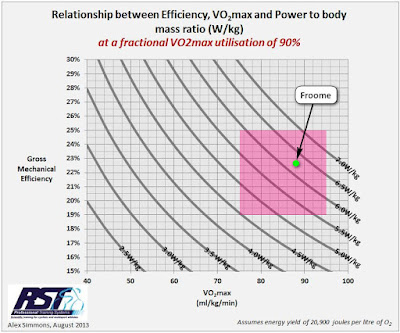
Data on some physiological testing by Chris Froome was released earlier today, so I thought I'd put a marker on one of the charts I posted in that earlier item to see where he sits.

I took the data from the cyclingnews article linked below:
http://www.cyclingnews.com/news/chris-froomes-physiological-test-data-released/

In it the key 2015 data are listed as:

Weight: Test: 69.9kg, TdF: 67kg
VO2max: Test: 84.6ml/kg/min, TdF weight adjusted: 88.2ml/kg/min
Threshold power (20-40 min): 419W
W/kg: 5.98W/kg, TdF weight adjusted: 6.25W/kg

So given we are talking 20+ minute power, a fractional utilisation of 90% of VO2max for an elite athlete is not unreasonable, so here's that particular chart, and overlayed on that is a pink box defining the area covering a range of VO2max from 75ml/kg/min to 95ml/kg/min and gross efficiency range from 19% to 25%. You'd expect elite cyclists to be somewhere in that range.

Froome's estimated TdF VO2max and 20+ minute power/mass are then shown by the green dot:


What can we infer from this?

Not a lot really, other than the data are in line with what you would expect for a rider with the performances of a grand tour winner. Certainly the physiological values are in line with historical data on plausible physiological parameters for elite aerobic endurance athletes.

As far as informing on doping status, as with power meter data and climbing power estimates, it tells us SFA. In any case I doubt it will change anyone's opinion either way.

Edit: here is a link to the lab report:
https://www.gskhpl.com/dyn/_assets/_pdfs/ChrisFroome-BodyCompositionandAerobicPhysiology.pdf

Read More......

Tuesday, October 13, 2015

Kona power meter usage trends: 2009 to 2015

Update for 2015 based on the Lava Magazine bike count data. Previous posts links showing trend data up to 2013 and 2014 are here:

http://alex-cycle.blogspot.com.au/2013/10/power-meter-usage-on-rise-at-kona.html
http://alex-cycle.blogspot.com.au/2014/10/power-meter-usage-still-on-rise-at-kona.html

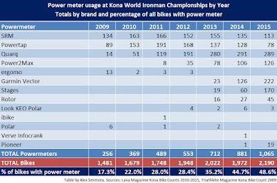
Without further ado, here are the numbers for 2009 through to to 2015 are (click on images to see larger versions):


In brief, 2015 continued the long term trend of an increase in use of power meters by Kona IM athletes, with a tick under half of all bikes now fitted with a power meter.

The two longest established brands, SRM and Powertap, have further fallen away in absolute numbers as well as total share dropping with Powertap suffering the biggest drop in usage, and while Quarq is still the most used meter, its absolute usage has reached a plateau and it is no longer as dominant a power meter brand for Kona IM athletes as it has been in the past few years. It will be interesting to see how Powertap fares in the years ahead with the introduction of their new pedal and chainring based meters.

The use of power meters is more evenly distributed across the various brands than in previous years, with no brand dominating share of usage on Kona IM athlete's bikes.

Newer power meter brands have increased their presence significantly, in particular Garmin Vector and especially Stages being the big movers.

Power2Max maintained their 2014 share of the power meter pie, while newer offerings from Rotor and Pioneer make up the smaller slices.

Edit:
Thanks to Prof. Hendrik Speck of Hochschule Kaiserslautern University of Applied Sciences for picking up a couple of very small errors in the Polar power meter numbers I had listed for 2009 and 2013. I have updated the table and chart above. I also left the linked posts from previous year's summaries uncorrected so that a record of the small error remains.

Read More......

Monday, August 24, 2015

When your ride buddy becomes a real drag

A question that comes up from time to time when chatting about aerodynamics stuff is how much impact does another rider in close proximity have on your aerodynamics, or more correctly stated, does having another rider in close proximity change the power required for you to maintain your speed?

We are all familiar with the reduction in power required when riding behind another rider. This "drafting" benefit is substantial and anyone with a power meter can see the big reduction in power when they move from riding directly into the wind to riding behind another rider. Even if you don't have a power meter the difference is certainly large enough to notice the reduction in effort required.

But what about when your buddy is drafting behind you or rides beside you? Does this impact the power needed to maintain the same speed?

The short answer is: yes, both of them do.
But in what way and by how much?

The question as to whether a rider in front gains benefit from having a rider behind them has been researched before, and the consensus is that yes, they gain a small benefit. There is good reason for this slightly counter intuitive result and it's to do with the "bow wave" of air from the rider behind causing a change in the turbulent air flow behind the lead rider and reducing, by a small amount, the depth of the low pressure zone that exists behind the front rider.

This slight reduction in the fore to aft air pressure differential of the lead rider provides a small but measurable gain. This can be expressed as a reduction in apparent CdA, but since a rider's CdA doesn't really change if their position and equipment hasn't, then in reality it's a change in the forces acting on the rider, and as a result, the power demand at the same speed is slightly reduced when compared with having no rider in close proximity (or alternatively, a rider can travel slightly faster for the same power when they have a rider immediately behind them).

In 2010  Andy Coggan examined data from a 2007 track session ridden by his wife, in which she did efforts on the track both with and without having a rider drafting behind her. In Andy's assessment of the data he remarked "having a rider drafting closely behind them apparently lowered their CdA by 3.2%, i.e., from 0.198 to 0.192 m^2.".

The reduction in energy demand will be of a very similar amount to the reduction in apparent CdA. Assuming ~350W, a reduction from a CdA of 0.198 to 0.192 is equivalent to a reduction in power demand at the same speed of ~10W, or 2.8%. In this case the other rider was riding in pursuit set up, and were themselves very "aero" (an elite track pursuit rider).

So that's one example.

This phenomenon has also been reported in the published scientific literature, examples include:

Racing cyclist power requirements in the 4000-m individual and team pursuits, Medicine and Science in Sports and Exercise, v31, no.11, pp 1677-1685, 1999. J.P. Broker, C.R. Kyle and E.R. Burke.
http://www.ncbi.nlm.nih.gov/pubmed/10589873

where amongst their data they report that the lead rider requires 2-3% less power while riding on the front of a 4-man team than if riding solo at the same speed.

Another more recent study examined this using both computational fluid dynamics (CFD) simulations along with wind tunnel validation as described in this paper:
CFD simulations of the aerodynamic drag of two drafting cyclists, Computers & Fluids Volume 71, 30 January 2013, Pages 435–445,. Bert Blocken, Thijs Defraeyeb, Erwin Koninckxc, Jan Carmelietd, Peter Hespelf
http://www.sciencedirect.com/science/article/pii/S0045793012004446

In this paper they report the lead rider of two riders riding in single file receives a reduction in energy demand of 2.6% while riding in the time trial position.

Above are three examples of data from a similar situation, with reported reductions in energy (power) demand to ride at the same speed ranging between 2% to 3% for the lead rider compared with riding solo.

There's another paper that reports a 5% advantage for the lead rider of team time trial, although I'm not able to see more than the abstract:

Aerodynamics of a cycling team in a time trial: does the cyclist at the front benefit?; European Journal of Physics, Volume 30 Number 6, 2009; A Íñiguez-de-la Torre and J Íñiguez
http://m.iopscience.iop.org/0143-0807/30/6/014

Edit: I've now read the paper and it used two dimensional CFD analysis on ellipses as a simple model simulation of multiple riders in a line and is indicative of the principles involved.

I've had the resources to test this for some time but I've hadn't got around to doing the experiment, mainly because exclusive use of track time costs money and I'm focussed on working with clients on answering more important aerodynamics questions for them than doing experiments just for the fun of it.

But today I had the opportunity to do just such an experiment.

I was doing aerodynamics testing as part of a story being written about a woman masters rider preparing for the UCI World Masters track cycling championships being held in Manchester later this year. Cycling NSW kindly offered and arranged for the track time to make this possible, and a client of mine, Rod Wagner, loaned a special power meter to enable the testing on the rider's track bike, while I offered my time for the aero work.

We'd reached the end of our allotted track time, but as luck would have it no one else was ready to ride on the track, so we had some spare time for the experiment, and willing participants.

I won't comment on the primary aero testing session as that's for another to write about for later publication in magazine and online, but I'll expand on the impromptu experiment.

The method of measurement

With the Alphamantis Track Aero System, I record and monitor in real time a rider's aerodynamics as they circulate around the indoor velodrome. Testing is done indoors as this removes the wind variable and provides for a well controlled environment. The system enables us to monitor speed and velocity and along with other key inputs such as air density, track geometry data, centre of mass height, rider mass and rolling resistance variables, the Coefficient of drag x Frontal area (CdA) is also plotted in real time and lap by lap a picture of a rider's aerodynamics is revealed.

I've briefly explained this system before in this post, which also has a video demo. You can also read more on the Alphamantis site linked above.

The experiment

Normally this testing is done with a rider riding solo on the track but for this experiment I asked her coach, another world level master's rider, to join in. His task was to ride in various positions relative to the test rider (who would continuously circulate around the track at approximately 40km/h) while her coach would change his relative position on the track every 4-6 laps as follows and on my instruction, he would:

- ride in front of the test rider to test the level of drafting assistance, then
- ride next to, and on the outside of the test rider, then
- ride immediately behind the test rider, then
- drop off entirely and stop riding, so that we could obtain data from the test rider circulating solo.

This test process was repeated a second time during the long test run to validate the results from the first run.

For reference, the test rider is a slim 60kg female approximately 172cm tall, and the coach weighs approximately 80kg and is ~185cm tall. The test rider was using a track bike with pursuit bars, while the other rider was using a track bike in regular mass start set up.

The system is really reporting the impact on apparent CdA. It's a quick way to measure how beneficial or detrimental having the other rider near you is, and the measurements are not overly sensitive to the changes in speed during the run (this is the nice thing about the process).

The results

Here's a table summarising the results of all the data runs. Click on images to see larger versions.


In the case of the support rider riding behind the test rider, the test rider gained a benefit of a reduction in apparent CdA of around 0.008m^2, or about 3.8%. Note (i) the error range and (ii) the support rider was riding in a more upright mass start position (and consequently has a larger "bow wave") and is somewhat larger than the test rider.

Also shown are the results of the traditional drafting, being a reduction in apparent CdA to nearly half of the solo value, and interestingly, the apparent CdA increase of ~ 0.013m^2, or nearly 6% when the other rider was riding alongside the test rider.

Since apparent CdA differences are a little harder to understand, I've flipped the data around to show, at a normalised velocity of 40km/h, what the power demand for the solo rider would be for each scenario:


The table below summarises the chart data, and also shows the difference in power compared with riding solo:


Compared with riding solo, the test rider gains a ~7W (3%) benefit from having her ride buddy directly behind her; a 76W (39%) benefit from drafting behind her ride buddy; and a 10W (5%)  penalty when her ride buddy is riding alongside.

So in this experiment, I found a 3% energy demand benefit from having a trailing rider, and that's right in line with (but at the top of) the range found by the other reported data referenced earlier.

This result of a 10W penalty when riding alongside another rider is more novel, although it doesn't surprise me it may be news to some.

It is something to ponder when riding in team formation events, especially when the lead rider pulls aside to make their way to the back of the line of riders. They and their team are better off (at least in low yaw conditions) if the rider pulls over and moves well away from their companions until they are near the back and can return to be in the draft of the other riders. 10W is nothing to sneeze at.

Conclusion

So it would seem that if you wish to ride alongside your ride buddy, it might cost you ~10W give or take. If speed is of the essence, then ride in single file, you'll both go quicker that way.

Read More......

Sunday, July 26, 2015

Alpe d'Huez: TDF Fastest Ascent Times 1982-2015

Update of the Alpe d'Huez climbing times and speed chart previously posted here and here. Read those previous posts for discussion of context.

Edit (28 July 2015): since posting this two days ago, I was alerted to some updates made to the 1991 ascent times. Two sources did work with archive video to better verify these times, the net result being an addition of 41 seconds to each of the 1991 ascent times.

Thanks to https://twitter.com/ammattipyoraily for the posting the data.

This chart shows the average speed of the five fastest ascents up the Alpe d'Huez climb for each year the Tour de France included this climb, with the exception being the times from the 1980s which are the average speeds for fewer riders (as data on five fastest ascents in those years is not available to me).


As a reminder, I chose to average the 5 fastest ascent times for a couple of reasons:
- it reduces the individual noise in the data for year by year comparisons
- the 5 fastest were most likely to have been giving it close to maximal effort and would be representative of the quality at pointy end of the field
- the available historical data I have on ascent times doesn't permit increasing that sample size all that much in any case.

 Here's the data in table format, along with some extra context information. I've also ranked the average ascent speeds of the 5 fastest for each of the 13 occasions during 1991-2015 that Alpe d'Huez was climbed. I left out ranking 1980s ascents as I don't have times for all 5 fastest riders for those years (IOW the actual average speed of 5 fastest would be lower).

As we can see, 2015 ranks as the 8th fastest TdF ascent over that period, when based on the 5 fastest ascents each year.


Here's the same table but with weather conditions for the airport nearest to Boug d'Oisans listed from 3pm to 5pm on the day of the race. I was only able to source data back to 1997. If anyone knows of an online almanac of weather data for near Bourg d'Oisans for years prior to 1996, please let me know.

Weather data source: http://www.wunderground.com/
Note the variability in temperature from year to year, and importantly the prevailing wind direction and speed. 

Now how such prevailing wind actually plays out on the slopes of the Alpe is hard to say, but we should expect some differences from year to year in the speed riders can attain given their power on the day.

Or put another way, any power estimates from ascension rates comparing year to year will have some error depending on how the localised wind plays out. The climb obvious has many changes of direction, and wind at rider level is different to the prevailing conditions (normally measured at 10m above ground level and as a rough estimate it's about half that at rider level). Of course localised wind will be shaped by the Alpe itself as well as boundary layer features such as trees, road cuttings, vehicles and so on.
Map: http://www.alpedhueznet.com/


The prevailing wind was from the North East in 1997, 1999, 2008, 2011 and 2015; from the North West in 2003 and 2013; from the South West in 2001 and 2006 and from the West in 2004.

Course profile shows the climb is not a constant gradient:
Source: http://bike-oisans.com/wp-content/uploads/2013/02/profil-montee-alpe-d-huez.png


Fastest five ascents up Alpe d'Huez from this year's stage were:


and here are the fastest 5 riders by year (click to see larger version), with lines marking the time of the 50th and 100th fastest ascents of all time:


Read More......
Friday, July 17, 2015

Climbing power estimates: Windbags II

No specific comment, I just wanted to create a public link to the following 2014 study investigating the accuracy of climbing power estimates and to include a graphic and quote the study's conclusion.

My earlier comments on this topic of estimation accuracy can be found in this post from two years ago:
http://alex-cycle.blogspot.com.au/2013/07/windbags.html

The study is:
Accuracy of Indirect Estimation of Power Output From Uphill Performance in Cycling 
Grégoire P. Millet, Cyrille Tronche, and Frédéric Grappe
International Journal of Sports Physiology and Performance, 2014, 9, 777-782 http://dx.doi.org/10.1123/IJSPP.2013-0320 © 2014 Human Kinetics, Inc.

Link:
http://www.fredericgrappe.com/wp-content/uploads/2015/01/Millet.pdf


Study Conclusions:

Aerodynamic drag (affected by wind velocity and orientation, frontal area, drafting, and speed) is the most confounding factor. The mean estimated values are close to the power-output values measured by power meters, but the random error is between ±6% and ±10%. Moreover, at the power outputs (>400 W) produced by professional riders, this error is likely to be higher. This observation calls into question the validity of releasing individual values without reporting the range of random errors.

Read More......
Friday, July 10, 2015

Aero for slower riders. Part II

A couple of years ago in this blog item I explained how there really aren't riders too slow to gain speed benefit from an aerodynamic improvement. I demonstrated how the same aero benefit actually resulted in greater time savings for slower riders over a fixed distance course.

That might seem counter intuitive to begin with, but it's simply because the relative speed gains are almost the same for everyone, and that the slower riders are on course for longer, thereby shaving more time from their ride.

Of course as I mentioned in my previous item the development priorities for every rider will be different, and whether or not spending time, effort, money or other resources on improving aerodynamics is a priority depends very much on your objectives and what your other development priorities are. Keep in mind it is possible to work on various aspects of performance simultaneously, it's not an either/or proposition.

That said, this is really just to cover the physics, which shows us that it really doesn't matter what level of rider you are, there is a speed benefit to improving aerodynamics, and the benefit is pretty much the same for everyone.

So here's the chart*:


It shows three sets of data. The lines plot the speed an rider would sustain on flat road at various power outputs from 100 watts to 400 watts. Put out more power, you go faster. That's pretty obvious.

I plot two of those lines, one each for a given coefficient of drag area (CdA) of 0.32m^2 and one for a CdA of 0.30m^2. Note that these CdA values are approximately midway between values typical for a rider of the size modelled on a road bike and position and a time trial bike and position.

A 0.02m^2 (6.25%) reduction in CdA is entirely possible with clothing, helmet and wheel choices. Of course it's also possible to attain such a drop from positional changes.

How much any individual can reduce their CdA depends on many factors, mostly how (un)aerodynamic they are to begin with. Some people have a greater opportunity for improvement than others.

In any case, the line with the same lower CdA shows a higher speed for each of the power outputs which is to be expected.

Below those lines I show with the red columns the proportional increase in speed attained from that 6.25% reduction in CdA. It ranges from 1.96% increase in speed at 100W to 2.09% increase in speed at 400W.

So while a faster/more powerful rider gains more speed from the same drop in CdA, the relative speed gains are pretty much the same at around 2% across a wide spectrum of power outputs.

OK, as I said last time, putting on some flash aero wheels and a skinsuit won't turn a local club amateur into a pro bike rider, but suggesting that a rider is too slow to gain speed from an aerodynamic improvement is nonsense.

And what's interesting is that all riders, be they fast or slow, benefit almost equally from the same aerodynamic improvement.


* And once again the data is derived using the same model as described in this paper:

Read More......

Tuesday, June 09, 2015

W/m^2, Altitude and the Hour Record. Part III

In my previous posts on this topic I explored the impact of altitude on the hour record. You can recap by clicking on the links here:

W/m^2, Altitude and the Hour Record. Part I
W/m^2, Altitude and the Hour Record. Part II

In summary, the primary impacts on the speed attainable (or distance attainable for an hour) are:

1. Physiological - the reduction in sustainable aerobic power as altitude increases due to the reduced partial pressure of Oxygen, and

2. Physical - the reduction in aerodynamic drag as altitude increases due to the reduction air density.

Of course there are other factors - variable track surfaces and geometry, logistical, financial, physiological and so on, but for the purpose of this exercise I have confined analysis to the primary physiological and physical impacts.


These primary competing factors - reduced power and reduced drag combine to mean that in general an increase in altitude means a greater speed is attainable. In other words, the benefit of the lower air resistance at higher altitude typically outweighs the reduction in power. But not always.

The level of impact to speed is individual and is a function of each individual's physiological response to altitude - while the physics side of the equation is the same for everybody. I covered this in more detail in Part II of this series, and used data from several studies which provide four formula for the average impact of altitude on power output.

I plotted the different formula depending on whether athletes had acclimatised to altitude or not.


This chart should be fairly intuitive - further up in altitude you go, the more power you lose compared with sea level performance. The vertical scale of the chart amplifies the differences between them, which are not large, but also not insignificant either. A key element was the difference between athletes that had acclimated to altitude and those who had not.

Then I layered on that the physics impact of reducing air resistance, but the resulting chart was not quite as intuitive to follow and so I decided to revisit this another way.

Hence exhibit A below (click on the image to view larger version):


This should be reasonably straightforward to interpret, but even so I'll  provide some explanation.

The horizontal axis is altitude and the dark vertical lines represent the altitude of various tracks around the world.

The vertical axis is the proportion of sea level speed attainable.

The curved coloured lines represent the combined impact of both a reduction in power using each of the formula discussed in Part II of this series, combined with the reduction in air resistance.

So for example, if we look at the green line (Basset et al acclimated), this shows that as an cyclist increases altitude, they are capable of attaining a higher speed up until around 2,900 metres, and any further increase in altitude shows a decline in the speed attainable, as the power losses begin to outweigh the reduction in air density.

The track in Aigle Switerland represents around a 1% speed gain over London, while riding at Aguascalientes would provide for between a 2.5% to 4% gain in speed. Head to Mexico City and you might gain a little more, but as the chart shows, the curves begin to flatten out, and so the risk v reward balance tips more towards the riskier end of the spectrum.

Altitude therefore represents a case of good gains but diminishing returns as the air gets rarer. Once you head above 2,000 metres, the speed gains begin to taper off, and eventually they start to reduce, meaning there is a "sweet spot" altitude.

Caveats, and there are a few but the most important are:
-  any individual's sweet spot altitude will depend on their individual response to altitude - the plotted lines represent averages for the athletic groups studied;
- the formula used have a limited domain of validity, while the plotted lines extend beyond that, a point I also covered in Part II of this series;
- these are not the only performance factors to consider, but are two of the most important.

I suspect that the drop off in performance with altitude might occur a little more sharply for many than is suggested here. Nevertheless, the same principles apply even if your personal response to altitude is on the lower end of the range, and it is hard to imagine why anyone would suggest that heading to at least a moderate altitude track is a bad idea from a performance perspective.

Alex Dowsett rode 52.937km at Manchester earlier this year. At Aguascalientes he could reasonably expect to gain ~3.5% +/-0.5%  more speed, or just about precisely what Bradley Wiggins attained in London.

Read More......

Monday, June 08, 2015

Density matters

I saw a question today from someone who read recent comments about how high air pressure resulted in Brad Wiggins' hour distance being less than it might otherwise have been with more favourable conditions.

He was wondering if you can control air pressure in velodromes, or choose a time of year when it is lower. So can we do that?

Climate control


While there are velodromes where the inside air temperature is controllable (mostly northern hemisphere tracks located in cold climates), the control of air pressure is not something possible at any currently existing track that I'm aware of.

It would require quite a deal of engineering, in particular to provide an air lock / sealed environment that enables lots of people (and service vehicles) to enter /exit the building without affecting inside pressures and which meets emergency evacuation requirements for a large crowd, as well as fresh air to breathe. I don't see that happening any time soon.

Air locks do exist, e.g. at Aguascalientes velodrome in Mexico they use an air pressure differential to support the roof, but that means the air pressure inside the velodrome needs to be higher than outside. Not by much, but it will always need to be higher relative to local weather conditions, and inside the velodrome air pressure will still vary relative to outdoors.

So what about picking a better time of year?


Well let's look at the daily barometric pressure readings near London for the past three and a half years. Source for these charts is the National Physical Laboratory in the UK.

Barometric pressure London Jan-Dec 2012

Barometric pressure London Jan-Dec 2013

Barometric pressure London Jan-Dec 2014

Barometric pressure London Jan-June to date 2015

Looking at the above, it's pretty clear there is no obvious pattern to suggest a time of year when barometric pressure will be, on the balance of probabilities, lower.

Air density is what matters.

Air pressure of course is not the only variable. What really matters is attaining as low an air density as is physiological sensible. Air density along with a rider's aerodynamics, ie. their CdA, determines the energy demand for riding at a given speed, and lower air density is desirable for greater speed, provided of course the means to achieve that lower density doesn't reduce a rider's power to the extent performance ends up being worse. e.g. by riding at such high altitudes or temperatures that the rider's power output is compromised to a greater extent than the air density benefit provides.

Air density is a function of:
- air temperature
- barometric pressure
- altitude
- relative humidity

You can pretty much discount the latter as the changes in air density is very small with changes in humidity, although for the record humid air is slightly less dense than dry air (at same temperature, pressure and altitude).

Air density reduces with increasing temperature and altitude, and with reducing barometric pressure.

Since attempting to reduce air pressure either via climate control or by picking suitable times of year is not really an option, that leaves us with adjusting the other two variables - temperature and altitude.

I've discussed altitude before in this item. I'm going to revisit it in a future post in an attempt to simplify the impact of the variables involved.

Heating the air inside a velodrome is common, and this was attempted with some powerful portable heating devices during Jack Bobridge's unsuccessful attempt earlier this year, and in the case of attempts at most northern hemisphere tracks, the temperature has been dialled up to the rider's desired level.

Wiggins did specific heat acclimation work and reports are the temperature inside the velodrome was around 28-30C. That's pretty warm - going too hot can be detrimental as power losses can occur with inadequate cooling. As I said earlier, it's a balance between a physical benefit and a potential physiological cost.

Read More......

Wiggo's Hour

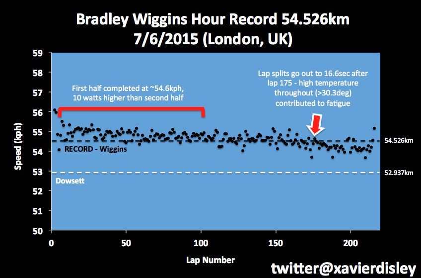
Just a short one today to update the chart from the one I posted here and on other social media forums. Click to see bigger version.


54.526km

Different reports of barometric pressure of 1031-1036hPa and air temp of 30.3C inside the track mean that Wiggins must have been exceptionally aerodynamic and recent work on his bike and position at the track suggest some good aero gains were made.

I estimate a power to CdA ratio of 2500-2550W/m^2 was required.

There are of course a range of assumptions:
Total mass: 82kg
Crr: 0.0023
Drivetrain efficiency: 98%
Altitude: 50m
Relative Humidity: 60%

If drivetrain efficiency is better, say 99% and Crr at 0.0020, then it drops the power to CdA ratio down to 2200-2220W/m^2.

and perfect pacing.

Just on that, my colleague Xavier Disley has once again produced a lap pacing chart - here it is:


That's a very slight fade over the course of an hour, which in my humble opinion is pretty much perfect. Opening few laps a bit hard, but that's understandable as a rider seeks to control the adrenaline rush with thousands in the crowd watching on and cheering.

The high air pressure did cost distance, and on another day perhaps 55km was within reach

As for going to high altitude, well there are many variables, but another 1-2km is feasible. See this item for more on that.

Well done to Brad Wiggins. That's sure a fine ride.

Read More......

Saturday, June 06, 2015

Pressure on the Hour

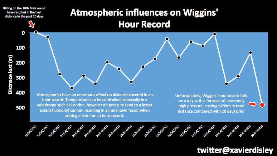
My colleague Xavier Disley did up a neat chart showing the impact the daily variability of barometric pressure can have on the distance attainable for an hour record, and how it's looking given the weather forecast when Xav last did the chart:


Nice - it shows how much breaking a record can still come down to a bit of luck with weather.

I think in Wiggins' case, assuming no major execution (i.e. totally crummy pacing) or mechanical issues, he'll break Dowsett's current mark no matter the weather as his power to drag ratio is sufficiently higher than Dowsett to overcome a slow air day.

But to set an outstanding mark such as Rominger's record, he'll need luck on his side. High pressure days are not good for speed.

Below is another version of this relationship between barometric pressure and distance attainable for four combinations of power and aerodynamic drag (CdA) values.


The chart is pretty self explanatory. For each combination of power and CdA chosen, the distance attainable reduces as barometric pressure increases.

That's because higher air pressure means a higher density of air molecules, and more air molecules to push out of the way requires more power.

A 60hPa difference in barometric pressure is equivalent to about 1km difference in distance attainable for the hour for the same power and CdA. That's a wide range of barometric pressure though, and variations are not normally quite that wide in most locations.

But a variation of half that is certainly possible over just a few days of varying weather as can be seen in Xavier's chart above.

I chose two power outputs: 430W and 450W, and two CdA values: 0.20m^2 and 0.19m^2. I don't know what Wiggins' power nor CdA value actually is or will be on the day, but for the sort of speeds he's likely to attain, these are in the ballpark.

It's the ratio of power (W) to aero drag coefficient CdA (m^2) that primarily determines the speed or distance attainable. hence why we refer to power/CdA ratio as measured by W/m^2. This chart covers a power to drag ratio range of 2150-2370 W/m^2.

Read More......

Friday, June 05, 2015

Where will Wiggo wind up?

Chart showing the progress of the UCI hour record since 1893 (click on it to view a bigger version):


The chart shows all the successful hour records recorded by the UCI. It doesn't show failed attempts.

The blue dots show the incremental increase in what is the absolute furthest distance attained.

The red dots show successful records for various categories of hour record but that did not surpass the furthest record for all categories up to that date.

For example, up until the early 1990s, the UCI had separate hour record categories for:
- amateur and professional riders
- above and below 600 metres altitude
- indoor and open air tracks

As a result, there were six categories of hour record for the period from about 1940 to the early 1990s.

And of course there have been bike/equipment regulation changes at times, most notably after Obree's and Boardman's records in the mid 1990s,

So where will Bradley Wiggins end up?


I'm pretty sure it'll be another red dot and not get close to Boardman's 1996 record and I doubt he'll beat Rominger's 1994 mark either. But he will likely beat Alex Dowsett's record (52.937km - the currently recognised record) by 1km or so.

I think anything above 54km will be very tough going. 54.5km perhaps if things go well. Closer towards 55km if everything is perfect.

Power 440-460W
CdA - who knows?

Say 0.200m^2.

Such a power range would net him around 53.5 - 54.4km at typical air density. 
On a low air density day that range would stretch to 54.5 - 55.4km. 

Weather forecast suggests low air density is unlikely although there is plenty of chat that they will raise the air temperature a lot, even up to 32C (yikes!).

So if velodrome air is heated to say 30C and air pressure is say 1020hPa, then at that power range and guessed CdA, the distance for a well paced effort will be in the 53.9 - 54.7km range.

Of course his CdA is the big unknown. Looks like he's been doing some work on it.

Drop that to 0.190m^2 and we can add about another lap (260 metres) to those estimated ranges.


Best of luck to Wiggo!

Read More......

Wednesday, February 25, 2015

Pursuit Spaghetti: Elite Pacing

The 2015 UCI track cycling world championships in Saint-Quentin-En-Yvelines, France, have recently concluded and there's been some on-line chatter about the pacing of Silver medallist and former world champion and world record holder Jack Bobridge during the final of the 4000 metre individual pursuit. Seen through the lens of his recent unsuccessful attempt at setting a world hour record, some are wondering "what was Jack was doing going out so fast?".

While he does start too hard and probably needs to reel that tendency in, I don't think it's quite the same as for his hour attempt. While many of the challenges are similar, pursuits are a different beast.

Some seemed to think he set out to catch his opponent in the final, and if you look at how he rapidly gained on his opponent in the early stages you'd think that might just be the case. Except I can't believe that would have been the strategy for various reasons (mainly since it would have required elite level kilo TT pacing to achieve it and so just wouldn't have happened). It also doesn't bear out in the data.

To explain this I thought I'd look at pursuit pacing at the elite level in general, as well as show what actually happened during the final between Bobridge and Gold medallist and winner Stefan Kueng of Switzerland.

Congratulations to Kueng by the way. He was Bronze medallist in 2013, Silver medallist in 2014 and is now the 2015 World Champion. That's a nice progression.

So here are some charts for you viewing pleasure.

The first shows the half lap (125 metre) times for each rider during their qualifying ride. it's a bit of a spaghetti junction, so I'll also show just the finalist's qualifying rides as well. Click the image to view a larger version.

2015 UCI World Championship 4000m individual pursuit qualifying
So what are we to make of this lot?

Well firstly I have highlighted the two lines for eventual winner Kueng (yellow) and Bobridge (red). This was their qualifying ride compared with everyone else (except for the Hong Kong rider whose times were a bit slow for this plot).

Also shown is a straight white line marking a slope representing a fade in pace of one second per kilometre. I use this as a guideline to assess whether a rider's pacing was good or poor. If you faded more quickly, then you started too hard, and the method of energy distribution wasn't optimal for attaining the least time possible.

It's pretty evident that many of those pacing lines are fading much more quickly than one second per kilometre. These are not novice riders but the best from their respective nations and some of the best in the world. This is a world championships and yet this most basic pacing mistake is still made.

That doesn't mean that pacing with more of a "flat line" is ideal either, although it's somewhat less of a sin than starting too hard and fading rapidly.

Pursuit pacing is a complex pacing optimisation problem. Dr Andy Coggan discusses this a little in the 3rd part of his excellent three part series: The Demands of the Individual Pursuit, so head there if you'd like to learn some more.

If you were able to speed up through the event, well it's also likely you've left some speed out there. Nailing this event takes practice and some years.

Let's clear away some of the noodles and look at the finalist's qualifying rides:

It's pretty clear that Bobridge starts hard and fades rapidly. Too hard and as a result, too rapidly. Kueng's pacing shows a negative split/getting faster in the second half, which suggests he left some pace out there.

Kueng had a qualifying advantage over Bobridge (and most of the field) in that Kueng rode in the final heat, while Bobridge rode the second heat. Kueng had earned his final heat advantage due to his Silver medal the previous year. This meant he knew his task to make the gold medal ride off was not to match Bobridge's time, which at that point was still the fastest qualifying time, but rather to beat his heat opponent and to beat the second best time up to that point, which was several seconds slower than Bobridge had ridden.

That meant Kueng's schedule could be more conservative than Bobridge's. This saves precious energy for the final, while Bobridge had to put all he had out there. As it turns out, Kueng's qualifying opponent (Alex Edmondson) faded in the final kilometre, which saw Kueng gaining but not quite catching him. That's pretty much the perfect scenario for a rider as you gain an increasing draft advantage in the final laps just when you need it, but don't waste precious energy passing your opponent. Bobridge caught and passed his opponent with 3 laps remaining, and it shows in his qualifying ride data.

The other two finalists show pretty reasonable pacing, however in the final laps their times blow out and rise rapidly. This is most likely because, like Bobridge, they caught their qualifying ride opponent and had to make a pass. As they approached the other rider they receive the benefit of some draft and that benefit increases the closer they approach, but then they have to make a pass and the acceleration to do that costs energy as well as track position. That's why you see that dip in track time followed by the rise. Once past their opponent, they are back out in the front with no more draft benefit and on fatiguing legs after having upped the power to make a pass - hence their lap times increase rapidly.

Here are the pacing plots for Kueng and Bobridge comparing their ride in qualifying (dashed lines) and in the gold medal final (solid lines):
Kueng and Bobridge pursuits: Qualifier and Final

We can see that Bobridge started his final almost exactly as he had done in the qualifying ride. Too fast again. This time his fade in pacing was even sharper. Kueng started a little harder than in his qualifier but still more conservatively than Bobridge. Kueng also started to fade at the halfway mark, just not as rapidly as Bobridge was dropping pace. It made for a fascinating race. Kueng only took the lead from Bobridge in the final half lap. Exciting stuff.

So thinking back to that first chart  - is this a common theme - that of elite riders starting too hard and riding a slower time than they might have done?

Well here are some more plots for the 2014 and 2013 world championships.

First the 2014 championships which were held in Cali, Colombia. This 250m wooden track, while covered, is exposed to the wind and so we can see the more variable pacing in the half laps times as riders battled slight head and tailwinds as they circulated the track. This undoubtedly makes pacing an even trickier challenge.

The two gold medal finalists are highlighted with the thicker yellow and red lines, yellow for the eventual winner. I'm guessing by looking at these lines that Kueng rides a bit more by feel than by pace and permitted his speed to vary more with the breeze. By and large most riders were fading by around 1 second per km or slightly more, so still some room for improvement.
2014 UCI World Championship 4000m individual pursuit qualifying

Here are the qualifying rides by the four finalists:

In 2013, the World Championships were held in Minsk, Belarus. Again the gold medal finalists are shown with yellow and red lines, but some of the pacing is just bizarre for world level.
2013 UCI World Championship 4000m individual pursuit qualifying

As with before, here are the qualifying rides for the four finalists:

So there you have it, three years of world championship pursuit spaghetti. Delicious.

Read More......

Tuesday, January 20, 2015

g force

No, not that kind of G-Force!

I mean the extra "weight" we feel pressing us down onto the bike or into the track when riding at speed around the curved banking of a velodrome.

If you really want to read up on g forces, then this Wikipedia page covers it.

First of all, "g force" isn't really a force, rather it's a measure of a rate of acceleration. It's one of those slightly confusing expressions.

g force is a way to "normalise" accelerations relative to that we experience every day due to gravity on the surface of the Earth. It's a way to gauge how much we'd "weigh" when experiencing an acceleration that's more or less than 1g.

When we are standing on the ground, we experience 1g (units are usually expressed a "g", not to be confused with grams). We are not actually accelerating, since the ground is there to stop us from falling, so instead we feel a force we call weight.

While we normally use standard international unit of metres per second squared (m/s^2) to express accelerations, it's common to express accelerations relative to that we experience on the surface of the Earth, which is defined a 1g.

If you have a mass of 80kg and are standing on the ground then you'll weigh 1g x 80kg. That's why many confuse weight with mass. They are not really the same thing, mass is an intrinsic property of an object, weight is the force it pushes down on the ground with. It's just that on when sitting on the surface of the Earth, an object with a mass of 80kg will also weigh 80kg.

However if you are accelerating upwards away from the Earth's surface (imagine you're travelling upwards in a rapidly accelerating elevator or rocket), then you'll experience more than 1g.

How much more depends on the rate of acceleration. If you happens to be accelerating upwards at 9.81 metres per second per second (which equals 1g), then you'd experience 2g, being acceleration due to gravity + the extra acceleration of the elevator or rocket. If you were able to stand on some bathroom scales while that acceleration is happening, then you'll "weigh" 80kg x 2g or feel like you now weigh 160kg. ugh.

Now keep in mind that an acceleration can be a change in speed and/or direction.

e.g. when a travelling in a car that turns around a corner, even through the road speed of the car may not change, we experience what feels like a force pressing us towards the opposite side of the car. Such lateral accelerations can also be expressed relative to 1g. Modern Formula 1 racing cars for example are capable of generating lateral corning accelerations of up to 6g.

g force on a velodrome


So whenever we are riding around the curved path on the turns of a velodrome, we are constantly accelerating towards the centre of the track, even though we may not be changing the bike's forward speed. As a result, we experience some lateral g forces when riding on velodrome, as well as the downward 1g due to gravity. What this means is the total g force we experience will be more than 1g. How much higher depends on our speed and the turn radius.

Calculating the rate of lateral acceleration when riding around a track is a pretty simple:
where:
- rider speed is in units of metres per second 
- 9.81 is the rate of acceleration due to gravity in metres per second squared
- rider turn radius is measured in metres

Estimating rider turn radius


To estimate a rider's turn radius, we start by estimating the track's turn radius.

First an overhead shot of a velodrome to get a sense of the general shape of a track (thanks to Google maps). This one happens to be a local outdoor track not far from where I live. It's a 333.33m concrete track. You can make out the faint blue band around the inside of the track, which is just inside of the track's black measurement line, the inner edge of which = 333.33 metres in length.
Now we can approximate the shape of the track as being two semi-circles joined by two straights. Here I superimposed some circles and lines to demonstrate:
Of course tracks are not exactly like this, in reality the shape of the turns are not perfectly circular, and the length of straights varies. They really do come in many different configurations. But as an approximation you can see from the diagram it's pretty good starting point. So to make a reasonable approximation of a track's turn radius at the black measurement line, all we need to know is the total length of the track, and the length of the straights.
Let's say you are riding a 250 metre track with 44 metre long straights. The turn radius around most of the turn will be approximately (250 - 2 x 44) / (2 x PI) = 25.8 metres.

Like I said, it won't be exactly that as in reality tracks have a variable turn radius but it's close enough for the purposes of this discussion. OK, that's great, we have the track's turn radius.

Now back to our lateral g force formula:
Now this formula asks for the rider's speed and turn radius, not the track's turn radius.

The rider's speed and turn radius is based on the position of their centre of mass (COM). Since a rider leans over when riding around the banked turn of a velodrome, then their COM speed and turn radius is less than the wheel's speed and the turn radius at the track where the tyre is rolling along.

Another diagram to help explain. You might need to look at a larger version - so click or right click on it to view a larger pic. ('The pic of a leaning rider I found on this blog item. Hope they don't mind me borrowing it - I can't however vouch for the physics discussed in that item).

When a rider at speed rides around the turn of a banked velodrome, they are leaning over. That means the turn radius of their COM is less than the turn radius of the track where the tyre is rolling along. So if you want to calculate the g force on a rider you really should be using the COM turn radius and speed, which is a bit of a pain because bikes use speed sensors that measure the wheel's speed.

To calculate COM radius and speed, you then need to know the rider's COM height and their lean angle (from the vertical). It's a little basic trigonometry. 

e.g. if a rider's COM is 1 metre (COM height will be about the same as floor to saddle height for a rider in an aggressive race position), and they are leaning over at 40 degrees from the vertical, then the rider turn radius = track turn radius - sin(40 degrees) x 1 metre. IOW we reduce the track turn radius by ~0.64 metres, which for our 250 metre track is about 2.5% of the track's turn radius. So not much, but enough that for some applications and analysis of track cycling data you need to take these things into account.

That then brings us to the question of how do we calculate the rider's lean angle? Well I'm going to leave that one for now because I'm getting further away from the issue of g forces than I'd really like. Suffice to say that we can reduce the estimated track turn radius and wheel speed by a couple of percent to estimate rider turn radius and rider COM speed.

Are you still with me?


OK, so we can reasonably estimate the lateral g force of a rider travelling around the turns of a track. But of course the rider also feels the force of gravity pulling them downwards. So the total g force acceleration into the track is the sum of those two acceleration vectors:
Which can be expressed as follows:

So there you have it.

How much g force does a rider feel in the turns?


If we use an estimated rider turn radius of ~25 metres for a typical 250 metre track with rider speeds ranging from 40km to 75km/h, here's what the estimated g forces are:
At elite hour record speeds of between 52-55 km/h, a rider will experience around 1.3g to 1.4g when riding the turns.

There is a physiological question to be considered, namely does this higher g force, which occurs twice per lap and lasts for about 2/3rds of the total time on track, cause any problems with blood circulation, is it sufficient to hamper performance?

I don't know, and I'm not sure if there's been anything more than speculation on this question. 1.3-1.4g doesn't sound like it'd cause too much of a problem to me, but who knows?

Track sprinters


Things get much more interesting for the world's best track sprinters, who experience around 2g in the turns during their flying 200 metre time trial. If you have a 95kg track sprinter flying around at 75km/h, the bike, wheels and tyres are supporting the equivalent down force of over 200kg.

This is why track sprint bikes and wheels have to be made extra strong, and also partly why track sprinters run extra high pressure in their specialist tubular tyres.

Would you put a 200kg rider on your bike?

Read More......