In my previous posts on this topic I explored the impact of altitude on the hour record. You can recap by clicking on the links here:
W/m^2, Altitude and the Hour Record. Part I
W/m^2, Altitude and the Hour Record. Part II
In summary, the primary impacts on the speed attainable (or distance attainable for an hour) are:
1. Physiological - the reduction in sustainable aerobic power as altitude increases due to the reduced partial pressure of Oxygen, and
2. Physical - the reduction in aerodynamic drag as altitude increases due to the reduction air density.
Of course there are other factors - variable track surfaces and geometry, logistical, financial, physiological and so on, but for the purpose of this exercise I have confined analysis to the primary physiological and physical impacts.
I plotted the different formula depending on whether athletes had acclimatised to altitude or not.
This chart should be fairly intuitive - further up in altitude you go, the more power you lose compared with sea level performance. The vertical scale of the chart amplifies the differences between them, which are not large, but also not insignificant either. A key element was the difference between athletes that had acclimated to altitude and those who had not.
Then I layered on that the physics impact of reducing air resistance, but the resulting chart was not quite as intuitive to follow and so I decided to revisit this another way.
Hence exhibit A below (click on the image to view larger version):
This should be reasonably straightforward to interpret, but even so I'll provide some explanation.
The horizontal axis is altitude and the dark vertical lines represent the altitude of various tracks around the world.
The vertical axis is the proportion of sea level speed attainable.
The curved coloured lines represent the combined impact of both a reduction in power using each of the formula discussed in Part II of this series, combined with the reduction in air resistance.
So for example, if we look at the green line (Basset et al acclimated), this shows that as an cyclist increases altitude, they are capable of attaining a higher speed up until around 2,900 metres, and any further increase in altitude shows a decline in the speed attainable, as the power losses begin to outweigh the reduction in air density.
The track in Aigle Switerland represents around a 1% speed gain over London, while riding at Aguascalientes would provide for between a 2.5% to 4% gain in speed. Head to Mexico City and you might gain a little more, but as the chart shows, the curves begin to flatten out, and so the risk v reward balance tips more towards the riskier end of the spectrum.
Altitude therefore represents a case of good gains but diminishing returns as the air gets rarer. Once you head above 2,000 metres, the speed gains begin to taper off, and eventually they start to reduce, meaning there is a "sweet spot" altitude.
Caveats, and there are a few but the most important are:
- any individual's sweet spot altitude will depend on their individual response to altitude - the plotted lines represent averages for the athletic groups studied;
- the formula used have a limited domain of validity, while the plotted lines extend beyond that, a point I also covered in Part II of this series;
- these are not the only performance factors to consider, but are two of the most important.
I suspect that the drop off in performance with altitude might occur a little more sharply for many than is suggested here. Nevertheless, the same principles apply even if your personal response to altitude is on the lower end of the range, and it is hard to imagine why anyone would suggest that heading to at least a moderate altitude track is a bad idea from a performance perspective.
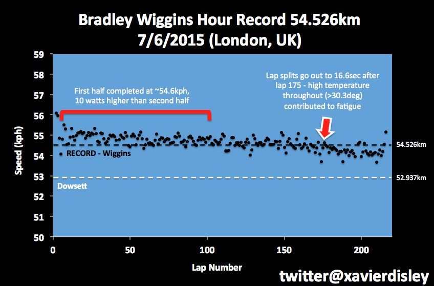
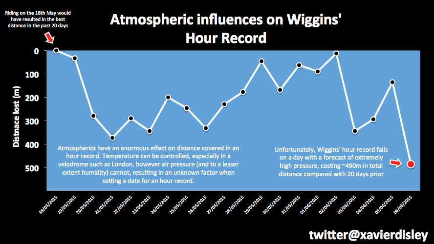
Alex Dowsett rode 52.937km at Manchester earlier this year. At Aguascalientes he could reasonably expect to gain ~3.5% +/-0.5% more speed, or just about precisely what Bradley Wiggins attained in London.Read More......


