It's been a while since I posted. Just too busy for the most part so my apologies. I'll do an update at some stage!
I had a long break from training due to a prosthetic leg changeover in June (had a few transition problems with that) and a lot of travel in August and September.
I've been back on the bike for a few weeks now (the hardest part sometimes). I sure have some fitness to catch up on.
For some personal motivation, I thought I'd post up a couple of charts comparing my performance before and after the leg amputation (I get asked about it occasionally, and my data is being analysed for a science write up at the moment).
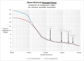
So I thought I would summarise it in a neat chart known as a Mean Maximal Power (MMP) chart.
MMP charts show your best power ouput for all durations from very short periods (seconds) through to very long periods (hours). Because the horizontal axis represents durations from second to minutes to hours, we turn that into a logarithmic scale, so we can inspect best power outputs for durations covering a wide time spectrum. Power is represented on the vertical axis.
As you would expect, one can produce higher power for short periods (seconds), and somewhat lower power over longer periods (hours), so the chart trends downwards as you move to the longer durations on the right.
By using WKO+ software, I made a comparison of my all time personal best power for the time before my accident and amputation and since then.
Two versions plotting mean maximal power to weight ratios, one for Average Power and one for Normalised Power. The blue line is before amputation, the red line is since then.
Click on the chart to see a full sized version:
The chart above shows my best W/kg for all durations.
What is very clear from that chart is the wide performance gap for very short durations but the closeness in performance over durations longer than a minute or so. This suggests my sustainable aerobic power and my anaerobic work capacity hasn't been significantly hampered by riding with a prosthetic, however my neuromuscular power (used for sprinting and short duration hard accelerations and efforts) has been significantly compromised.
What about Normalised Power?
When plotting NP data, WKO+ restricts the output to a minimum of 5-minutes. For most analysis and application, we really don't read too much into NP for durations shorter than about 20- to 30-minutes. But nonetheless, the chart shows an interesting change in my power profile when viewed through the lens of Normalised Power.
NP appears to amplify the difference in performance over a wider part of the primarily aerobic duration spectrum (> 5-minutes) when compared with the Average Power chart
A reduction in my ability to perform those short high power bursts (up to ~ 30 seconds or so) definitely comes though in the NP for durations from 5- minutes to about 30-minutes.
For longer durations than half an hour though, I have been able to equal or somewhat exceed my best pre-amputation NP outputs.
This I think is reflective of the type of racing I do - which is lots of track and crit racing, some road races and only occasional time trials. So for an apples to apples comparison, I certainly think this NP chart is pretty telling.
I no longer have that weapon of short high end power, but have instead found other ways to make up for it.
Of course this is just one way to use MMP charts. Once can plot one season over another and make comparisons as to their overall progress. Or any time periods they care to compare. Read More......


